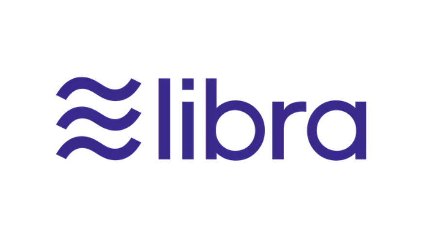
Facebook's Libra logo causes internet meltdown
The cryptocurrency's name doesn't appear to match its logo.

Facebook has come a long way from the days when each status was prefaced with 'is' and all your updates appeared on one ungainly page. In 2019 the social media giant is branching out in new directions, including the announcement that it will launch a cryptocurrency app, Libra. However Libra's logo has lead to confusion thanks to its distinctly Aquarian symbol.
If you missed the announcement earlier this week, let's quickly get you up to speed with Libra. The global cryptocurrency service is Facebook's first step towards blockchain domination. And don't worry if you don't know what blockchain is, our plain English guide explains all.
Basically, Libra is Facebook's answer to Bitcoin. Although unlike Bitcoin, Libra is backed by a reserve of assets. Facebook hopes it will be the first mainstream cryptocurrency, so expect to see a lot more of it in the near future. You'll probably be using Libra to buy all sorts of things, maybe even some sweet Amazon Prime Day deals.
But enough of the technobabble. This is a design site after all, and we were attracted to Libra thanks to its distinctly un-Libra logo (above). Our guide to everything you need to know about logo design stresses that brands need to focus on clarity. But this seems to have passed Libra by as it's gone for a more Aquarian logo. (If your star sign knowledge is a little rusty, the Aquarian glyph is a pair of jagged wave symbols.)
Think we're reading too much into this? We're not alone. Plenty of social media users came to the same conclusion when Libra was unveiled earlier this week.
So Facebook has a "Libra Coin" cryptocurrency, with a logo that looks like the Aquarius symbol. Stressful pic.twitter.com/IU2zpBGK8nJune 18, 2019
Why does the logo for Libra look like the glyph for Aquarius? https://t.co/hS8kBWG4qaJune 18, 2019
#Libra logo is like 1.5 aquariusJune 18, 2019
Other social media users were a bit more off the wall with their reactions to the Libra logo.
The Libra logo symbolizes the air rushing away as Facebook handwaves away everyone's concerns. pic.twitter.com/YdgSwK8gweJune 18, 2019
So the Libra logo is a runover hamburger menu?June 18, 2019
Found the inspiration for Libra’s logo. pic.twitter.com/P7Bzhgv6mkJune 18, 2019
What's all the more frustrating is that the Libra star sign is symbolised by a pair of balance scales. You know, those tools that are used to weigh the value of things. What could be better as a visual shorthand for a cryptocurrency service backed by assets?! We despair.
Get the Creative Bloq Newsletter
Daily design news, reviews, how-tos and more, as picked by the editors.
This isn't the only time Facebook's designs have made waves (sorry) recently. Earlier in the year it came under fire for redesigning its app logo, and as part of its biggest redesign in over a decade, Facebook said goodbye to its distinctive blue bar. Angry reaction emojis all round.
As for Libra though, it's set to launch next year. When it takes, off these controversial waves will probably make a home on your smartphone screen, just like the Facebook app itself.
Related articles:

Thank you for reading 5 articles this month* Join now for unlimited access
Enjoy your first month for just £1 / $1 / €1
*Read 5 free articles per month without a subscription

Join now for unlimited access
Try first month for just £1 / $1 / €1

Dom Carter is a freelance writer who specialises in art and design. Formerly a staff writer for Creative Bloq, his work has also appeared on Creative Boom and in the pages of ImagineFX, Computer Arts, 3D World, and .net. He has been a D&AD New Blood judge, and has a particular interest in picture books.
