Why we're loving the bold new Lexus logo design
Simple yet impactful.

Every big brand we see today, from Apple to Google, has gone through some alterations over time. And Lexus is no different with its vehicles sporting a handful of different logo designs over its lifetime. But its latest logo update is a little different to the ones that came before.
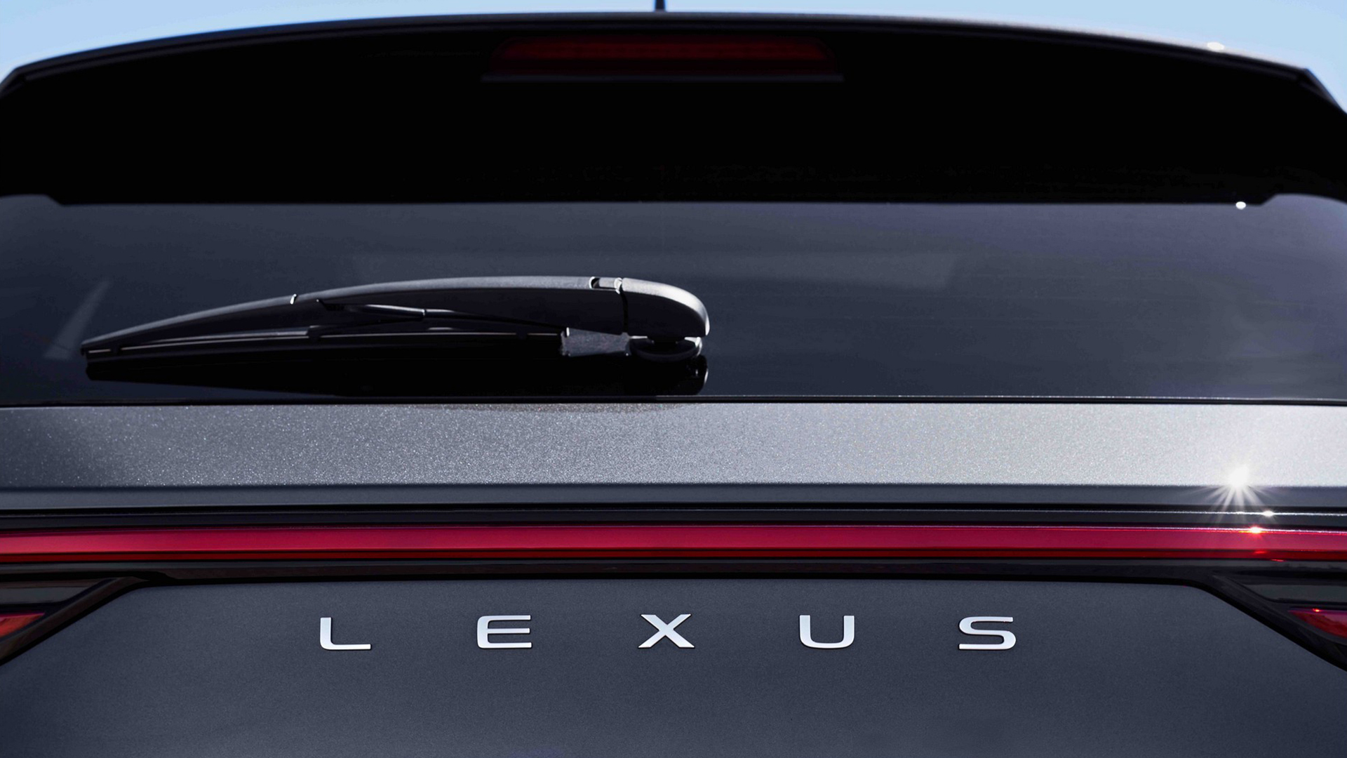
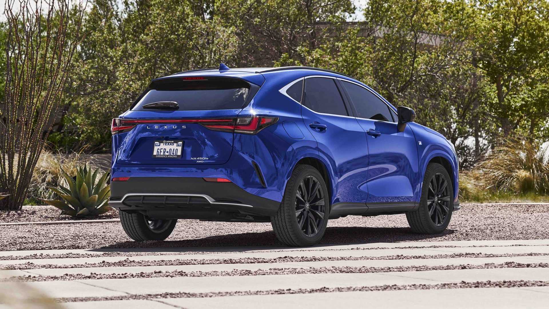
Lexus has announced that all its future models and even some of the models in production right now will now sport simple lettering that reads 'Lexus' on the back of its vehicles instead of its famous logo. The new wordmark design is supposedly set to signify changes coming to the company in the near future. Hoping to design your own logo? Make sure you check out our roundup of the best free logo makers.

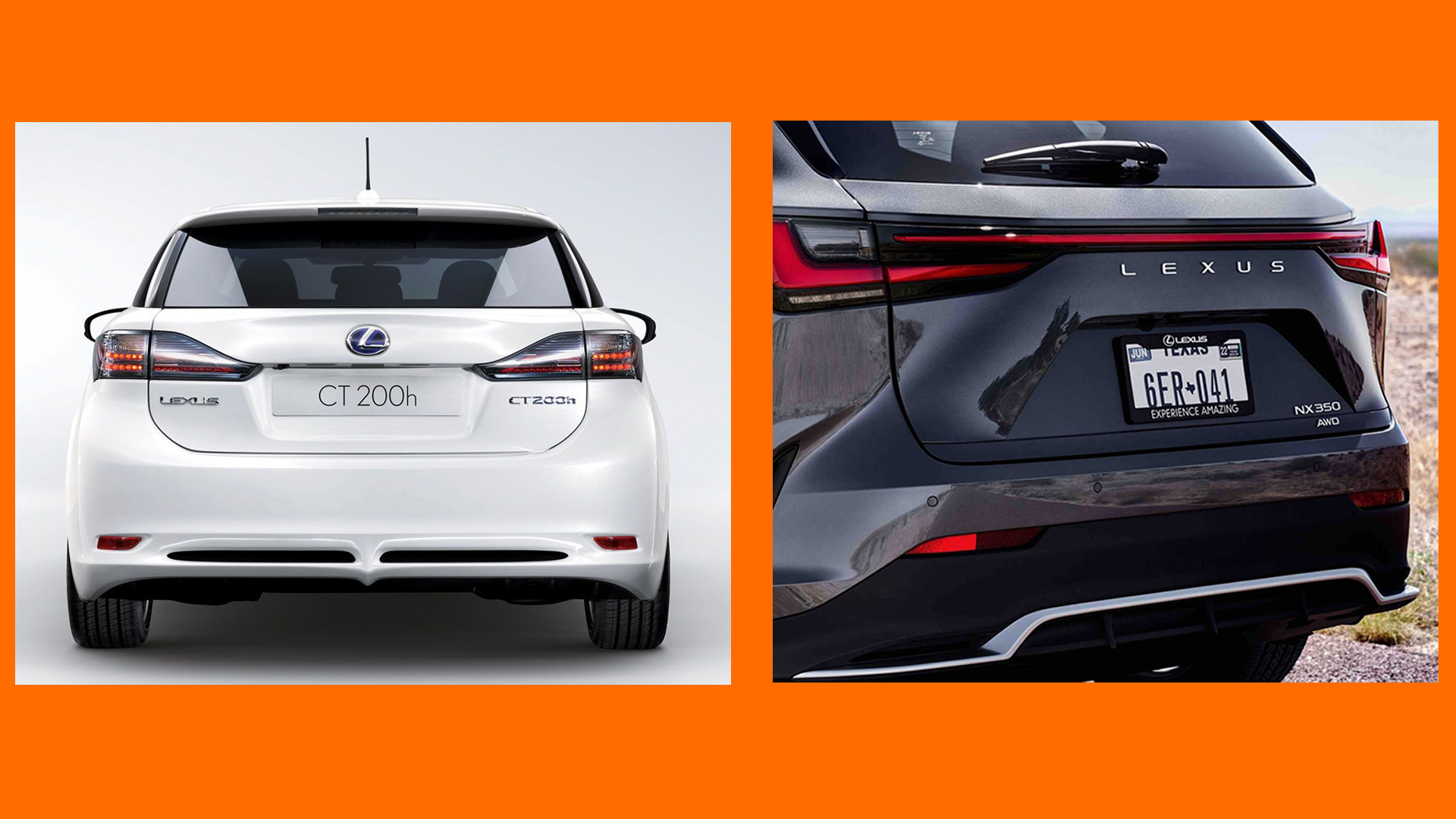
In an interview with MotorTrend, Lexus' head of marketing Brian Bolain explains the reasoning behind replacing the logo on the back of its vehicles. He said that, "We [Lexus] need some way to signify that change is coming to Lexus, and this may seem like a dumb way, but it catches your eye,". And despite how bluntly Bolain put it, we have to admit that we definitely prefer the change (see below).

While the change isn't particularly original, it certainly has changed the look of the car quite substantially. The lettering looks a lot sleeker on the car and arguably makes the original logo look very clunky on the other vehicle. We are loving the minimalistic design, and its bold impact on the aesthetic of the vehicles. Compared with the new wordmark, we think the new logo looks positively awkward and bulky on the back of the car.
This isn't the first vehicle design change we have seen in recent years, but it might certainly be the boldest with its simple lettering. Back in March 2021, BMW redesigned its iconic logo, and just in September Volvo announced its new minimalist logo.
We look forward to seeing how the wordmark looks on future Lexus models, but for the minute we can appreciate that this new minimalistic design looks great. If you're making your own logo, make sure you check out our 15 golden rules of logo design, to make sure you nail your designs every time.
Read More:
Get the Creative Bloq Newsletter
Daily design news, reviews, how-tos and more, as picked by the editors.
- Can you guess the fonts used in these famous logos?
- Behold, the most incredibly detailed photo of a classic painting ever
- Is this Tesla Cybertruck-inspired snowcat already the coolest gadget of the year?

Thank you for reading 5 articles this month* Join now for unlimited access
Enjoy your first month for just £1 / $1 / €1
*Read 5 free articles per month without a subscription

Join now for unlimited access
Try first month for just £1 / $1 / €1

Amelia previously worked as Creative Bloq’s Staff Writer. After completing a degree in Popular Music and a Master’s in Song Writing, Amelia began designing posters, logos, album covers and websites for musicians. She covered a range of topics on Creative Bloq, including posters, optical illusions, logos (she's a particular fan of logo Easter eggs), gaming and illustration. In her free time, she relishes in the likes of art (especially the Pre-Raphaelites), photography and literature. Amelia prides herself on her unorthodox creative methods, her Animal Crossing island and her extensive music library.
