"Car design used to be very shocking": How Lexus's "human-centric" design has evolved
We spoke to the brand at Milan Design Week.
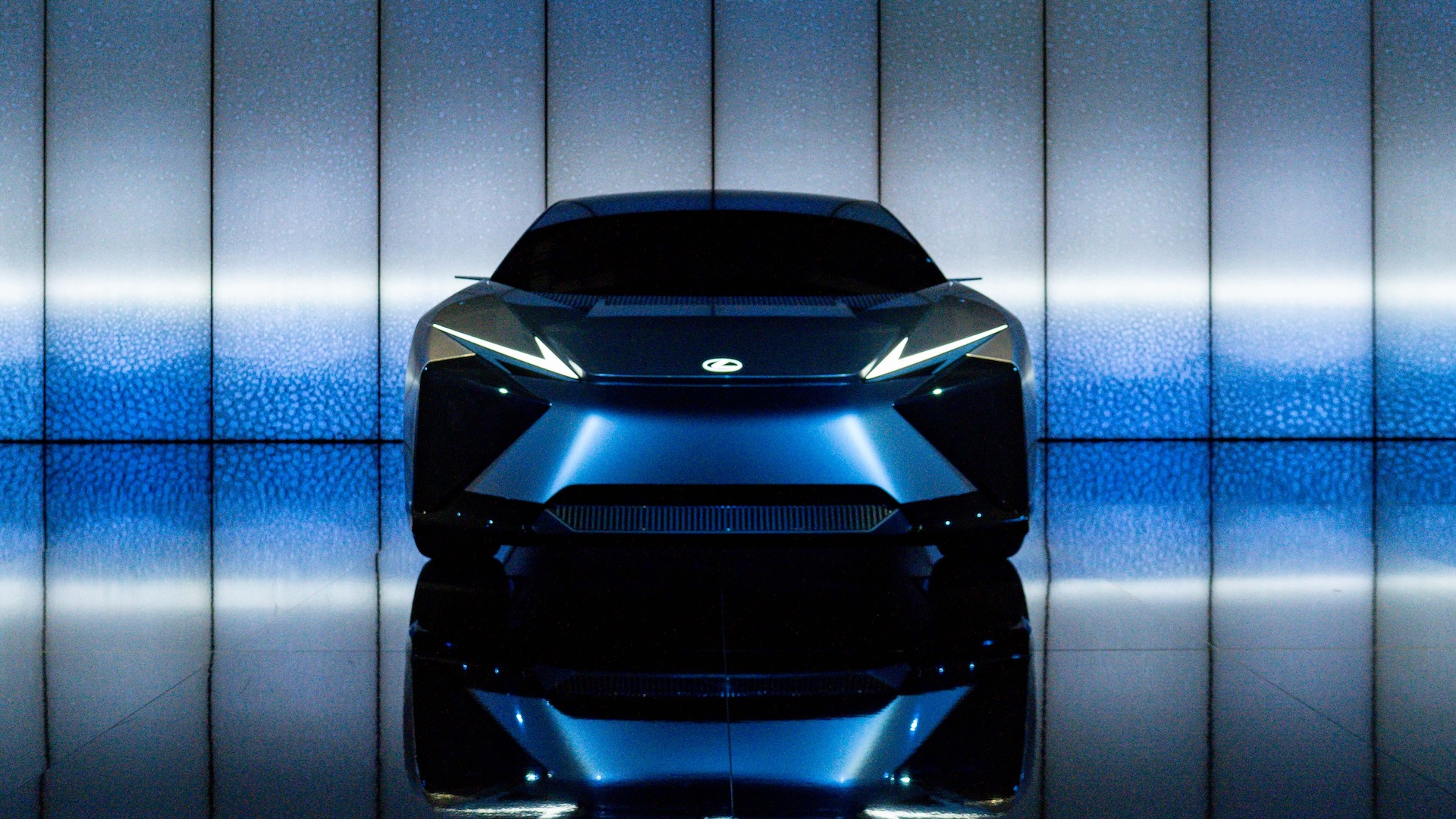
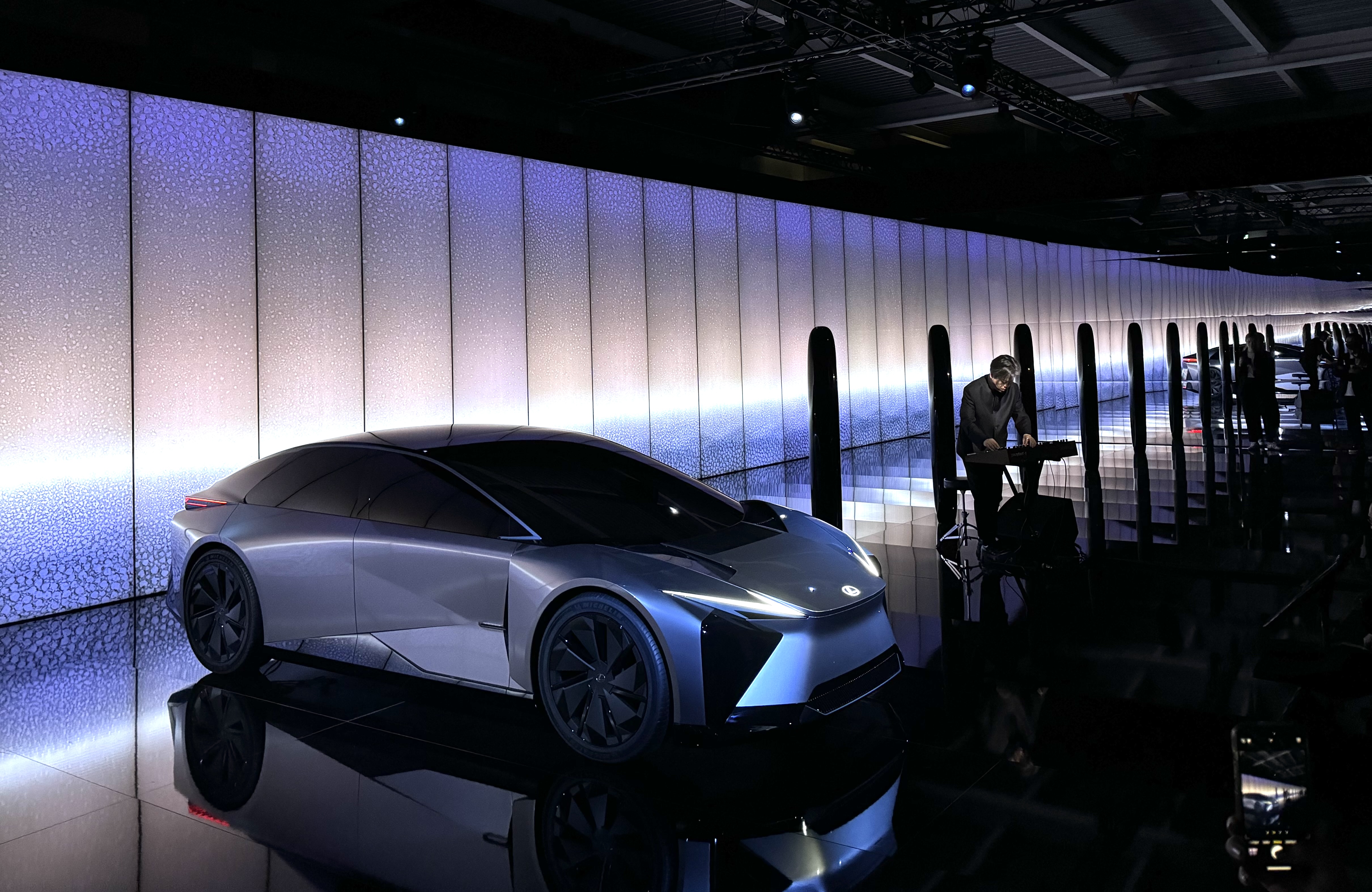
Lexus has exhibited at Milan Design Week for almost 20 years, using the festival as a springboard to showcase various aspects of its design activities, from the Lexus Design Award to brand new vehicle concepts. This month, the company presented 'Time', an immersive art experience inspired by Lexus’s LF-ZC next generation battery electric vehicle concept.
Featuring a light installation by Hideki Yoshimoto with the LF-ZC at its centre, the exhibition is designed to capture Lexus's "firmly human-centred philosophy," with a particular focus on the application of software and energy innovations to help "luxury to co-exist with carbon neutrality." (For more vehicular design inspiration, check out the best car logos on the road today.)
At the launch of the exhibition, we caught up with Koichi Suga, General Manager of Lexus Design Division, to learn more about what makes Lexus's approach to vehicle design unique – and how that approach has changed over the years. "It used to be that car design was very complicated," he told Creative Bloq. "Which can mean a lack of design grammar – being open to anything and everything. Now, as a foundation, we are very focussed on the sense of proportion."
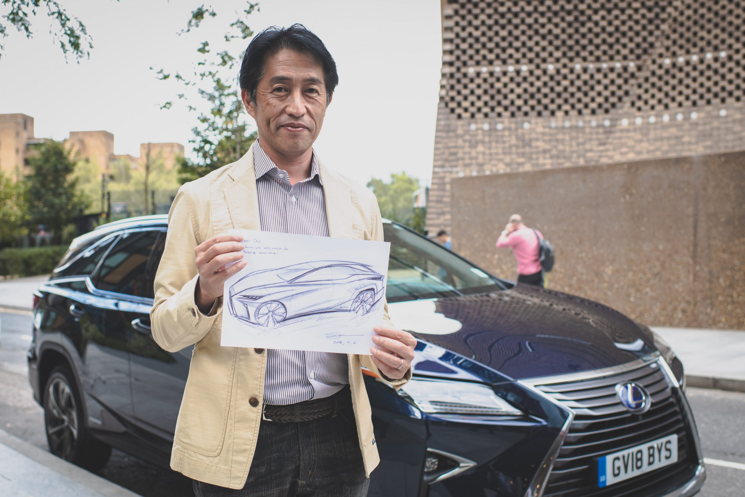
Indeed, the design of futuristic concept cars used to be "very shocking". But, as Suga explains, "if we have good proportions, everything else fits around that". And if that sounds like a somewhat more minimal approach to design, that reflects the customers. "We don't need to overcomplicate details for the younger generation. Especially in Japan, many people dress very simply – these days lots of people wear one type of T-shirt."
The idea that design is about more than the sum of the various parts of the car's interior and exterior parts is echoed by the Lexus's chief branding officer, Simon Humphries. "Design means so much more than style these days," he says. "It's about how a product, in our case a car, connects. How it connects to the heart of the customers, how it connects to their digital life and how it provides a unique personalised experience."
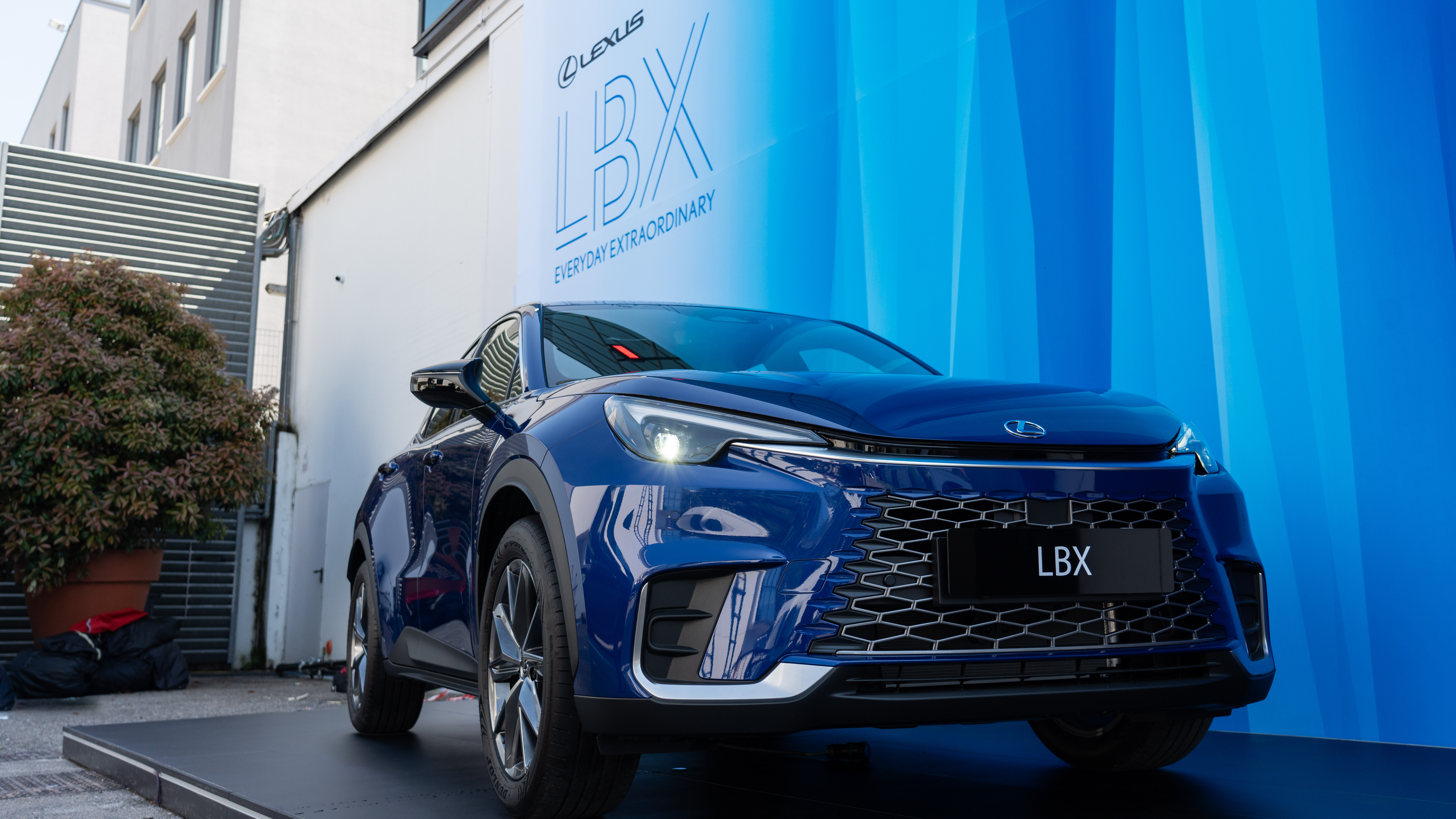
"A car isn't just moving transportation," Suga adds. "Our design pushes boundaries for each customer's personal and emotional experience." And even for customers who might not consider themselves to be car enthusiasts, quality design is essential. "If everything right down to the glass is clearly high quality, it's reassuring. It presents safety."
But while an overall sense of proportion might the driving force behind Lexus's design process right now, is there a single, small design detail that Suga, when pressed, is particularly proud of? "We focussed a lot on the feel of the buttons in teh car, creating a unique thin piece of rubber to create the exact feel that we wanted. It's a small, embedded detail that makes a difference. Sometimes people say the Japanese show too much detail, but I think that's our advantage."
Get the Creative Bloq Newsletter
Daily design news, reviews, how-tos and more, as picked by the editors.
For more coverage from Milan Design Week, check out our experience at the IKEA '1st' exhibition last week.

Thank you for reading 5 articles this month* Join now for unlimited access
Enjoy your first month for just £1 / $1 / €1
*Read 5 free articles per month without a subscription

Join now for unlimited access
Try first month for just £1 / $1 / €1

Daniel John is Design Editor at Creative Bloq. He reports on the worlds of design, branding and lifestyle tech, and has covered several industry events including Milan Design Week, OFFF Barcelona and Adobe Max in Los Angeles. He has interviewed leaders and designers at brands including Apple, Microsoft and Adobe. Daniel's debut book of short stories and poems was published in 2018, and his comedy newsletter is a Substack Bestseller.
