There's nothing like a radical logo redesign to start a debate, and Le Shuttle – sorry, it's now LeShuttle – has certainly done that. It's a very different look for the Channel Tunnel railway service. It's sleek and very now (detouring via the 1920s).
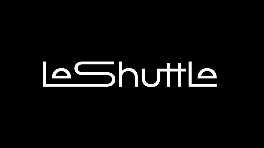
The new logo drops Le Shuttle's nationalistic red and blue for a more universal Uber-like white on black, emphasising speed, efficiency and modernity (complemented by 'Electric Lavendar' highlights in wider branding). But is it readable? (see our tips on how to design a logo for ideas for your own work).

What's with all the hate on railway logo redesigns? The new Eurostar logo attracted a freight train of criticism early in the year – unfairly, we thought. Now it's the turn of LeShuttle, the railway shuttle service for vehicles and passengers that runs between France's Coquelles in Pas-de-Calais, and Cheriton in Kent in the United Kingdom.
The brand revamp from Landor & Fitch, who also worked on the previous identity, sees the name change from Eurotunnel Le Shuttle to LeShuttle to try to avoid confusion with Eurostar. The agency went for a wordmark with a ligature joining the 'L' and 'S' to represent a journey on the underwater tunnel. There are also tunnel shapes for the letter 'e', and in some applications, the 'S' is stretched out to convey a sensation of motion through said tunnel.

The LeShuttle logo looks sleek, and the type does instantly make one think of a train – at least it does for me. The feeling of movement is emphasised in the animated logo, which conveys a sensation of rapid transit (see the tweet below).
All engines running. The countdown to launch has begun! Prepare to experience the extraordinary. pic.twitter.com/lILNaaHIekMay 12, 2023
But some people aren't sure about it at all, especially in real-world physical applications. "Seriously. This is bad. Look at the horrific lack of contrast/lack of readability with the signage," one person wrote on Twitter. Others see it as bland. "Eurotunnel was a far better name, and the branding a million times better than this bland mess!" one person wrote.
That’s… odd. Would love to see the slide deck that justified it all!May 12, 2023
For more recent logo redesigns, see how an agency fixed the Warner Bros logo and how the splat was brought back in the new Nickelodeon logo.

