People still aren’t over the LA Rams logo
NFL logo is attracting a fresh wave of outrage.

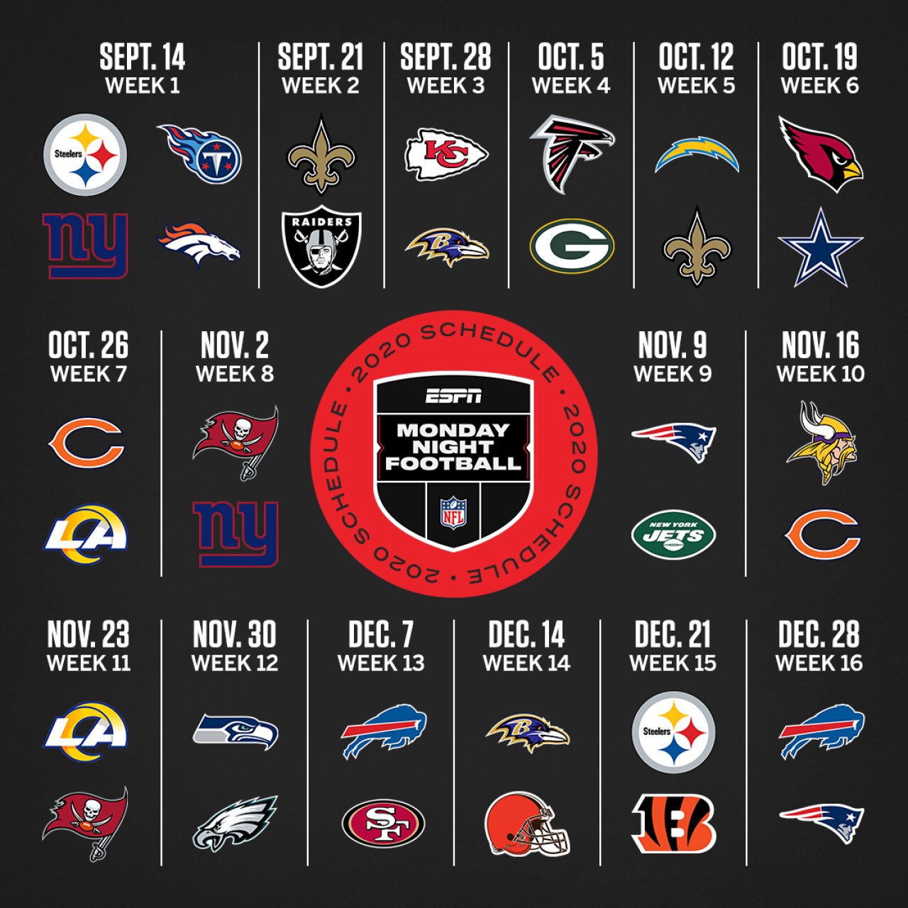
ESPN has revealed its Monday Night Football schedule for September onwards, and in the process reignited one of the most heated design debates of the year. While the main question on fans' lips is whether the NFL will even go ahead in September, ESPN's new graphic (below) has also reminded some fans just how unhappy they are with LA Rams' new logo.
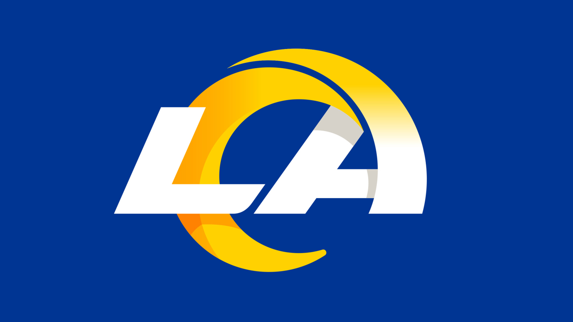
When the new logo was revealed in March, it was met with a barrage of ridicule. Some said it looked like a cheap morning news logo, others thought it resembled the Internet Explorer logo. And while the ESPN graphic features dozens of other team logos, it's LA Rams' that's drawing heat (again). Spoiler alert: it won't be entering our list of the best logos any time soon.

By far the most common complaint is that it could be confused with another logo (thereby breaking one of our golden rules of logo design). And not just another logo, but a logo for another team. While the horn protruding from the 'A' looks silly enough as it is (can anyone else see a croissant?), it also rather resembles a giant 'C'. And with that, it could well be a logo for rival team LA Chargers. Probably not what LA Rams was intending.
Reminder, the #Rams logo is atrociousMay 8, 2020
Still can't get over how bad the Rams new logo is. Who thought that was a good idea?May 8, 2020
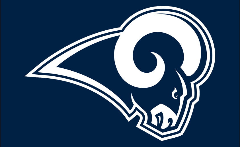
The previous logo (below) didn't feature the letters 'LA', instead focusing solely on the ram itself. "I'm sure it will be a surprise," LA Rams' chief operating officer Kevin Demoff told ESPN, "but lots of things are and I think it's a change that our fans will come to know and love over time." We won't hold our breath.

It almost goes without saying that a petition to scrap the logo has been set up – and in case you weren't sure how seriously fans take the logo of their beloved team, it describes the rebrand as "a dagger to the heart to a lot of die hard Rams fans". Yikes. At present, over 10,000 people agree.
This logo better pic.twitter.com/1A7eEHPCinMarch 23, 2020
The debacle brings to mind Leeds United's similar logo in 2018 – its updated club crest became one of the most hated redesigns of all time and was duly scrapped. But if ESPN's new schedule graphic is anything to go by, it seems LA Chargers' (sorry, Rams') new logo is here to stay – twisting the "dagger" for many unhappy fans.
Related articles:
Get the Creative Bloq Newsletter
Daily design news, reviews, how-tos and more, as picked by the editors.

Thank you for reading 5 articles this month* Join now for unlimited access
Enjoy your first month for just £1 / $1 / €1
*Read 5 free articles per month without a subscription

Join now for unlimited access
Try first month for just £1 / $1 / €1

Daniel John is Design Editor at Creative Bloq. He reports on the worlds of design, branding and lifestyle tech, and has covered several industry events including Milan Design Week, OFFF Barcelona and Adobe Max in Los Angeles.
