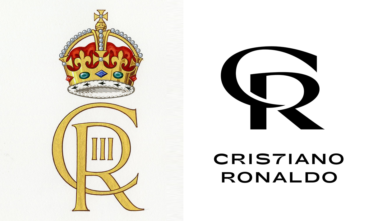
No, King Charles III didn’t steal his new logo from Cristiano Ronaldo
(But it's fun to imagine he did, right?)

We've seen all manner of logo-based disputes over the last few years, with big brands and tiny startups (and, surprisingly often, Kanye West) all doing battle over who came up with this or that design first. Here's one that the internet has almost definitely made up – but it's fun to imagine is real.
The new monogram for King Charles III was revealed by Buckingham Palace this week, and it looks pretty much as you'd expect, depicting a gold 'C' and intersecting 'R', with a nice crown sitting atop them. But social media has been quick to spot a somewhat unexpected similarity. (Looking for inspiration? Check out the best logos of all time.)
The first franking stamp incorporating the Royal cypher dates to 1901, introduced by Edward VII, who was instrumental in setting up the Court Post Offices in Buckingham Palace. The cypher was introduced at a time when the Monarch was seen by very few people, to create identity. pic.twitter.com/IIMMmeTpNxSeptember 27, 2022
Yep, it turns out the new cypher, which will appear on state documents and post boxes, resembles a design made for one Cristiano Ronaldo. As in the world-famous footballer, whose various pieces of merchandise include underwear and perfume.
Sure, they're similar in that both depict a 'C' and an 'R' sitting at a similar angle. But let's be honest, it's hardly likely that the College of Arms, which designed the cypher, turned to football royalty for inspiration. For one thing, the concept of the royal Insignia has been around longer than Ronaldo – dating back to the Tudor period (thanks, Wikipedia), and those creating it "are members of the Royal Household, and act under Crown authority."

And then there's the fact that there was hardly a huge amount of creative licence available to the College of Arms. Like previous cyphers, this was always going to contain two letters in gold (the 'R' in the case stands for Rex, latin for 'King'). And we could hardly expect a flat, mobile-friendly, sans serif affair – this is a Royal insignia, not the new BMW logo.
And perhaps most damningly, it seems this isn't even Ronaldo's official logo, but rather a fan-made concept created by designer Miklós Kiss in 2020 (below). And yet several UK publications, seemingly without Google at their fingertips, have jumped on the story.
@Cristiano Ronaldo logo concept#cr7 #cristianoronaldo #logo #logotype #monogram #monogramdesign #typography #typographyinspiration #dailyinspiration #brand #brandinginspiration #brandingdesign #typographydesign #dailydesign pic.twitter.com/mysGQuf6ABSeptember 8, 2020
Still, it's entertaining to imagine the new King's team huddled around a laptop, exploring various sports stars' logos. Along with Ronaldo's design, did they also check out the Roger Federer monogram? Did they explore Lionel Messi's beach towels? David Beckham's 'Instinct' shower gel?
Get the Creative Bloq Newsletter
Daily design news, reviews, how-tos and more, as picked by the editors.
So there we have it, unlike Kanye vs Walmart and Apple vs Prepear, this logo drama probably isn't about to end in a series of cease-and-desist letters. And it's hardly the most unfortunate logo resemblance we've seen lately – that dubious honour still goes to Amazon.
Read more:

Thank you for reading 5 articles this month* Join now for unlimited access
Enjoy your first month for just £1 / $1 / €1
*Read 5 free articles per month without a subscription

Join now for unlimited access
Try first month for just £1 / $1 / €1

Daniel John is Design Editor at Creative Bloq. He reports on the worlds of design, branding and lifestyle tech, and has covered several industry events including Milan Design Week, OFFF Barcelona and Adobe Max in Los Angeles. He has interviewed leaders and designers at brands including Apple, Microsoft and Adobe. Daniel's debut book of short stories and poems was published in 2018, and his comedy newsletter is a Substack Bestseller.
