I'm shaking my head at KFC's new optical illusion billboard
It's headache-inducing, to say the least.
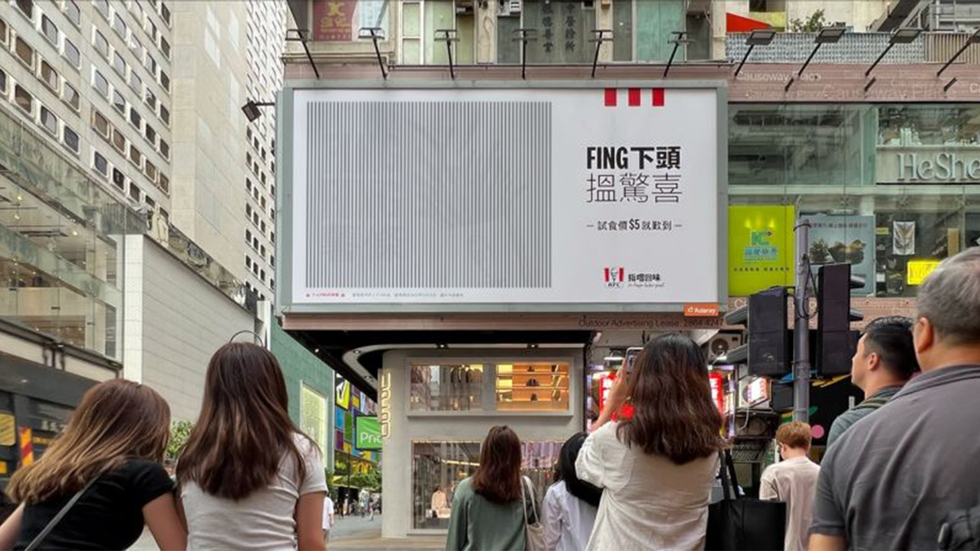
KFC Hong Kong has launched a new ad campaign that's got us shaking our heads – for good reason. The new billboard features a large-scale optical illusion that celebrates the fast food chain's new Fing Fing Cajun spiced fries in a head-turning display that's equal parts interactive as it is headache-inducing.
Launched throughout the city, the billboards invite passersby to solve the op-art by turning their heads from side to side, resulting in a downright silly interactive campaign that embraces the playful nature of its latest product. (If you're after more mind-bending op-art, check out our collection of must-see optical illusions).
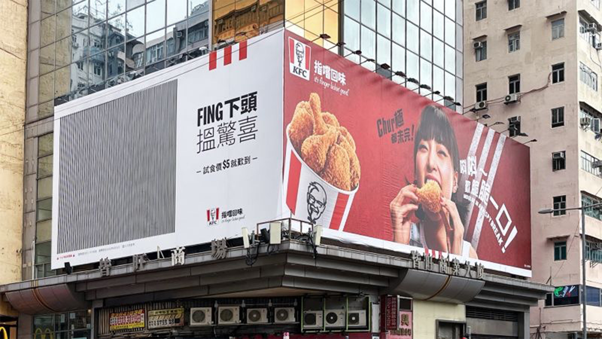
We've seen quite a few optical illusions like this one that incorporate a hidden message within the lines (like this optical illusion that's a designer's nightmare), so what exactly does this one say? Before we give you the grand reveal, take a look and see if you can solve it.
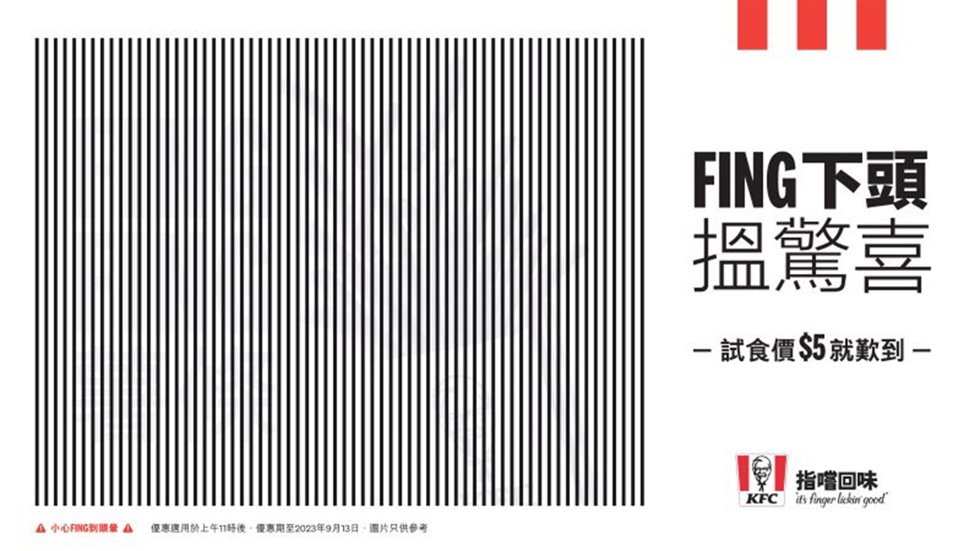
Drumroll...after you've dizzied yourself trying to crack the code, an image of fries bursting from a box should appear, alongside text that reads "FING FING" (of course, we probably could've guessed). The fast food chain's latest fries-based product comes complete with a sachet of Cajun seasoning that customers are encouraged to shake over their fries, creating an interactive and fun way to customise their culinary experience. Hence the name Fing Fing – meaning 'shake' in Cantonese.
The billboard playfully intertwines the product name with the ad's interactive element, creating a visually engaging and mentally perplexing puzzle that's accessible to a range of audiences. While Edelman's regional executive director, John Koay told Little Black Book that the design process went through a number of phases, including AR augmentation or lenticulars, the simplest form seemed the most fun and attention-grabbing for audiences.
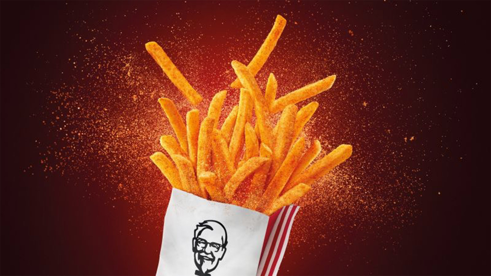
As well as the obvious nod to the interactivity of the product, the optical illusion's physical element aims to create a sense of fun, "It interrupts people as they’re navigating the hustle and bustle of the city and delivers the message in a light-hearted, slightly silly and engaging way – which connects with the fun interactive attribute of the product," Koay states.
Conceptually it's all a bit silly, but passersby seemed to be getting on board with the mind-bending, head-shaking campaign, as seen in the video below.
Get the Creative Bloq Newsletter
Daily design news, reviews, how-tos and more, as picked by the editors.
While I definitely need a screen break after trying to work that out, it's really great to see big brands embracing interactive billboard advertising that makes you work a little for the result. You heard it here first marketing teams – more op-art, please.
If you're after more brain-melting illusions, check out this amazing afterimage Barbie optical illusion, or feast your eyes on Müller's op-art campaign that delivers a dollop of '90s nostalgia.

Thank you for reading 5 articles this month* Join now for unlimited access
Enjoy your first month for just £1 / $1 / €1
*Read 5 free articles per month without a subscription

Join now for unlimited access
Try first month for just £1 / $1 / €1

Natalie Fear is Creative Bloq's staff writer. With an eye for trending topics and a passion for internet culture, she brings you the latest in art and design news. Natalie also runs Creative Bloq’s Day in the Life series, spotlighting diverse talent across the creative industries. Outside of work, she loves all things literature and music (although she’s partial to a spot of TikTok brain rot).
