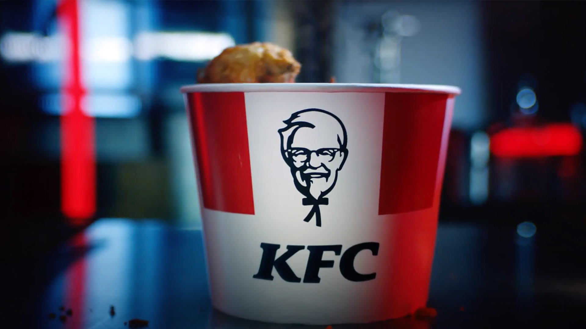
Hilarious viral tweet will change how you see the KFC logo forever
Get a load of Colonel Sanders' body.

He's one of the most recognisable fast food faces around, but have you wondered what Colonel Sanders' body looks like? (Strange question, we know.) A viral tweet is doing the rounds, which might completely transform your view of KFC's famous mascot. Have his (very tiny) arms and legs been right in front of us all along?
Twitter user Freddie Campion (below) recently revealed that his wife has always believed that the Colonel's black bow tie was in fact his tiny stick body – and now we simply can't unsee it. Many of the best logos carry hidden design secrets, but once you see them, they don't normally don't transform an image quite as dramatically as this.
My wife just confessed that for her entire childhood she thought Colonel Sanders’ bow tie was his whole body and now I can’t stop seeing a tiny stick body every time I look at him. pic.twitter.com/qVad6t93SADecember 16, 2020
If we're honest, we'll be filing this one under 'accidental but hilarious'. We're pretty sure the Colonel isn't supposed to have a MASSIVE, realistic head atop a tiny stick body. But that hasn't stop us chuckling at the sight of those miniature outstretched arms and legs – which look like they're about to give someone a hug (not very 2020), or do a little dance. The whole thing is bringing back fond memories of activating DK mode on Goldeneye for the N64 (Google it, Gen Z).
And with over 400,000 likes and 60,000 retweets, bow tie-gate is proving to be quite the sizzling issue. Like us, it seems many Twitter users will never be able to erase the Colonel's tiny stick body from their memory bank:
This is hysterical. I never viewed this image this way, but now... https://t.co/pVmschwMbyDecember 17, 2020
Thanks- you just ruined the Colonel for everybody.#CantBeUnseen 😂 https://t.co/jLAY6AhPcZDecember 17, 2020
Warning: you won’t look at Colonel Sanders the same way again 😂 https://t.co/9gQ9D0jUQoDecember 17, 2020
And it seems the tweet has even opened up a conversation about an important wider issue. We are, of course, talking about mis-readings of other famous logos:
I was like 25 when I realized this was D. When I was a kid, I thought it was a weird treble clef cause all the movies were musical 😅😂 pic.twitter.com/aQjqeiLwY4December 16, 2020
Well I thought the arbys logo was a fish jumping out of water until I was like 17 pic.twitter.com/hpfqXd4Lk2December 16, 2020
Well I thought the arbys logo was a fish jumping out of water until I was like 17 pic.twitter.com/hpfqXd4Lk2December 16, 2020
She’s a genius. Can you ask her to interpret the Starbucks lady. Does she have legs with little crab feet that she’s trying to lift above her head? I don’t get what’s going on here. pic.twitter.com/da5DiBgOYNDecember 16, 2020
The discovery of Colonel Sanders' little legs is by no means the first time we've seen something brand new within a famous design – and it certainly won't be the last. Just yesterday, the internet went wild for this surprising playing card design secret. If you fancy checking out more logo design secrets, this mind-blowing infographic has over 50 of them.
Read more:
Get the Creative Bloq Newsletter
Daily design news, reviews, how-tos and more, as picked by the editors.

Thank you for reading 5 articles this month* Join now for unlimited access
Enjoy your first month for just £1 / $1 / €1
*Read 5 free articles per month without a subscription

Join now for unlimited access
Try first month for just £1 / $1 / €1

Daniel John is Design Editor at Creative Bloq. He reports on the worlds of design, branding and lifestyle tech, and has covered several industry events including Milan Design Week, OFFF Barcelona and Adobe Max in Los Angeles.
