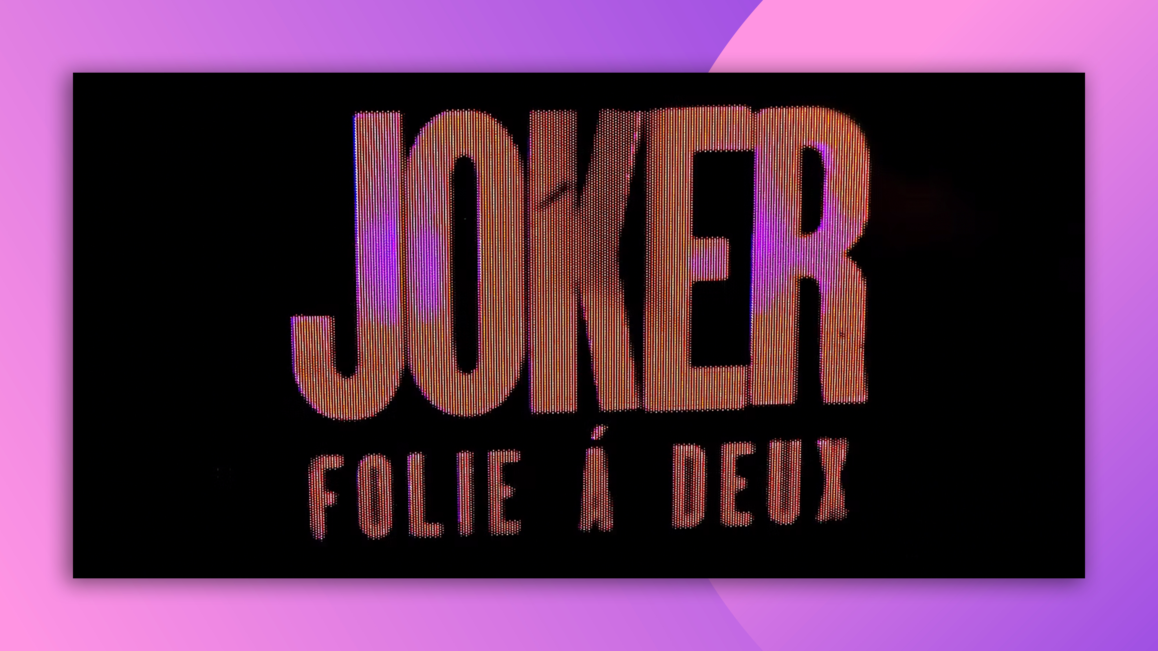
Can you spot the typo in the new Joker movie logo?
The designers need to work on their French accents.
Sign up to Creative Bloq's daily newsletter, which brings you the latest news and inspiration from the worlds of art, design and technology.
You are now subscribed
Your newsletter sign-up was successful
Want to add more newsletters?
We've all done it – spotted a typo in an email after sending it, or application after submitting it, or article after filing it, or global blockbuster movie logo after publicly revealing it. Okay, the last one is less common, so spare a thought for the designers of the logo for the new Joker film.
Collider managed to snap a low quality photo of the logo, which features the 'Joker' title in the same typeface as the original, plus the new subtitle: Folie À Deux. Except it doesn't say Folie À Deux. It says Folie Á Deux.

According to EuroNews's David Mouriquand, the letter 'A' with an accent pointing towards the upper right simply isn't a thing in France. "It will never stop being baffling to me that when you’re dealing with a multi-million Hollywood project, someone can’t do a double-check," he writes. "And if you’re going to dent my sanity, Joker team, then at least get it wrong with a character that exists in French, like 'â'."xt
Article continues belowFolie À Deux is a French term that refers to a "delusion or mental illness shared by two people in close association" (thanks, Wikipedia) – and we can probably safely assume the two in this case are Joaquin Phoenix's Joker and Lady Gaga's Harley Quinn.
Still, with Collider's photo appearing to depict a the logo on a digital screen (presumably at some event or other), there's probably still time for the designers to tweak that accent before the logo goes mainstream. And hey, they can take some solace from the fact that not even ASL posters are immune from typos.
Sign up to Creative Bloq's daily newsletter, which brings you the latest news and inspiration from the worlds of art, design and technology.

Daniel John is Design Editor at Creative Bloq. He reports on the worlds of design, branding and lifestyle tech, and has covered several industry events including Milan Design Week, OFFF Barcelona and Adobe Max in Los Angeles. He has interviewed leaders and designers at brands including Apple, Microsoft and Adobe. Daniel's debut book of short stories and poems was published in 2018, and his comedy newsletter is a Substack Bestseller.
