The surprising story behind the Joker logo
The Joker film's logo designer reveals all on Reddit.

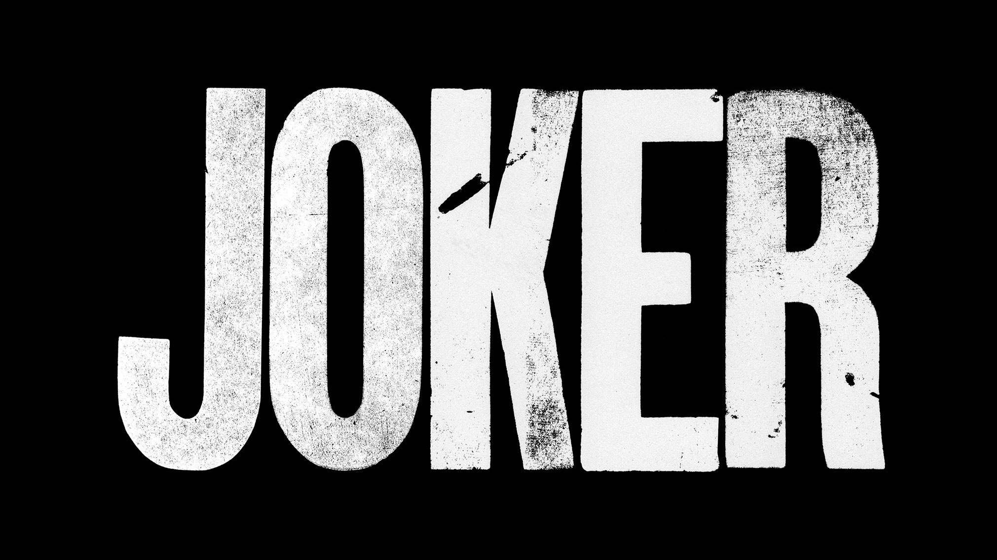
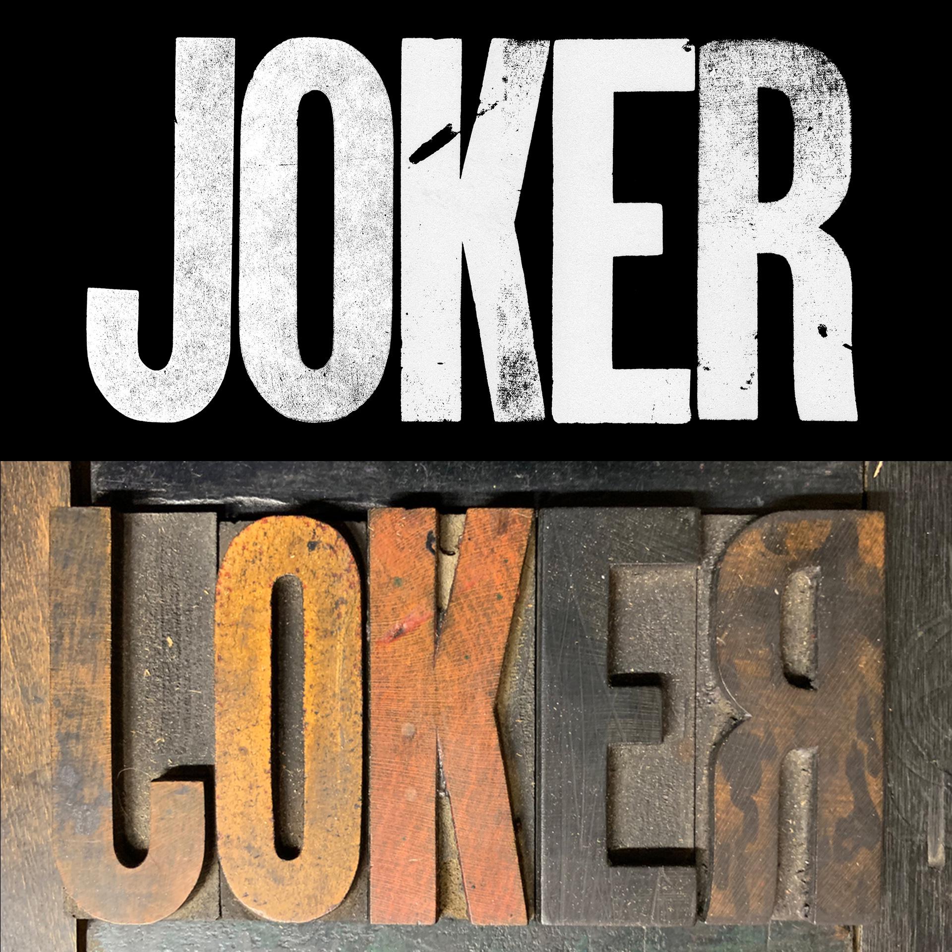
The new Joker film starring Joaquin Phoenix is currently raking it in at the box office and dividing critical opinion. But if there's one thing that designers can agree on, it's that the movie boasts an impressive typography-based logo. And now its designer has revealed that he used an old-fashioned woodblock letterpress to give the logo its distinctive, scratchy appearance.
Our guide to logo design has already examined how typography is a critical part of the design process. And it's something that the designer of the Joker logo, Chad Danieley, has put into action brilliantly.
Over on Reddit, Danieley took the time to share the surprising story of how the logo came to be. The freelance designer and animator revealed that it was created with wood type from his letterpress collection, and that it was the "smoothest approval process I have ever been involved with".

This was surprising news for fans of the gritty lettering, as designers in the audience had suspected that the grain effect was created digitally.
Danieley said that: "I ended up not digitising." Instead, the wood block letters and their grainy textures were exported as PNG files, which he then used to construct an SVG typeface. "Not my first choice especially since After Effects does not recognise SVG fonts," he added.
As well as retaining the scratchy texture of the lettering, this method also allowed him to make the logo transparent.
The spontaneity of the woodblock printing technique resulted in a huge chip in the letter 'K', as well as other faded elements. And while these lend themselves well to the spirit of the film, Danieley is cautious of reading too much into them.
Get the Creative Bloq Newsletter
Daily design news, reviews, how-tos and more, as picked by the editors.
"I can post conceptualise the gash as his 'soul' etc. etc. yawn," he joked in the Reddit comments. "Really I just dropped it on the floor and it felt right so I left it. I'm a huge fan of Brian Eno's method of chance [and] using his oblique strategies when I get stuck."
If you want to learn more about Danieley and his Joker logo, he's being very generous with his time by replying to lots of comments on Reddit. It's an invaluable chance to learn from a top designer and animator, so go and check it out.
And if you're a fan of the Joker film, you can also check out some of the fantastic Joker fan art that's been flooding in.
Related articles:

Thank you for reading 5 articles this month* Join now for unlimited access
Enjoy your first month for just £1 / $1 / €1
*Read 5 free articles per month without a subscription

Join now for unlimited access
Try first month for just £1 / $1 / €1

Dom Carter is a freelance writer who specialises in art and design. Formerly a staff writer for Creative Bloq, his work has also appeared on Creative Boom and in the pages of ImagineFX, Computer Arts, 3D World, and .net. He has been a D&AD New Blood judge, and has a particular interest in picture books.
