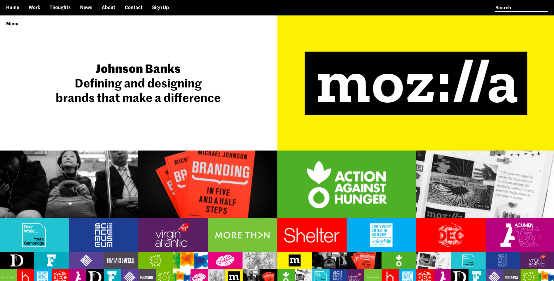
johnson banks' new website is a side-scrolling splendour
The London branding agency has torn up the rule book with its newly redesigned website.

Head over to the 'About' section on the new johnson banks website and you'll see that it describes itself as an agency capable of 'combining the verbal and visual in a way others don't, or can't'. This is definitely the case with London-based design consultancy's own website, which has recently been given a dramatic redesign.
Revealed at the end of March, the new-look site is a collaboration between johnson banks and BONG that tears up the web design rulebook. Instead of going for the long scrolling approach that has come to dominate the online landscape, the new johnson banks site features a horizontal scrolling layout, with different items making their way across the screen at different speeds.
When you first land on the site, the design can be a lot to take in. With a bright colour palette and dozens of rectangular tiles waiting to be clicked on, the homepage looks more like a TV test card than a website. But once you start scrolling you'll quickly figure out how it works and start exploring the many impressive branding case studies. There's also a navigation bar to ensure you'll never get lost.
This is why the new johnson banks site has won heaps of praise in such a short space of time: it's got an experimental design that actually works. There are plenty of whacky websites out there that are brilliantly odd but a nightmare to use. Not so with johnson banks.
The team has taken the same rigorous approach it uses for its branding and design work, and built a site that works smoothly and looks amazing. Don't just take our word for it, though, designers from all over the world have been singing its praises on Twitter...
This makes my head melt in such a satisfying way. Love it! https://t.co/Xb7jmmLpnuApril 3, 2017
Whoa, @johnsonbanks new website is a kaleidoscopic visual adventure! https://t.co/1QEKs5cxOo #scrollaway #design #designstudio #arccs pic.twitter.com/KHCoVGPpviApril 3, 2017
Love the new @johnsonbanks website https://t.co/Pf5OxYaIij Its a sort of Pop Art Josef Albers inspired thing.April 3, 2017
Nice! #design https://t.co/EYI8ETJsLlApril 2, 2017
TBH, I've been growing pretty tired of the "banded" long-scrolling vertical website. Refreshing from @johnsonbanks. https://t.co/HeAl3ABAEqApril 1, 2017
@johnsonbanks Fun and gimmicky website.The work though is faultless. Graphic design at it best.Makes me wish I did more graphic design than software.April 1, 2017
The new @johnsonbanks website is, quite simply, mesmerising. https://t.co/e7RZBJA2cNMarch 31, 2017
Related articles:
- 9 brilliant uses of 3D in web design
- 11 web design tools you can't live without
- 10 great uses of whitespace in web design
Get the Creative Bloq Newsletter
Daily design news, reviews, how-tos and more, as picked by the editors.

Thank you for reading 5 articles this month* Join now for unlimited access
Enjoy your first month for just £1 / $1 / €1
*Read 5 free articles per month without a subscription

Join now for unlimited access
Try first month for just £1 / $1 / €1

Dom Carter is a freelance writer who specialises in art and design. Formerly a staff writer for Creative Bloq, his work has also appeared on Creative Boom and in the pages of ImagineFX, Computer Arts, 3D World, and .net. He has been a D&AD New Blood judge, and has a particular interest in picture books.
