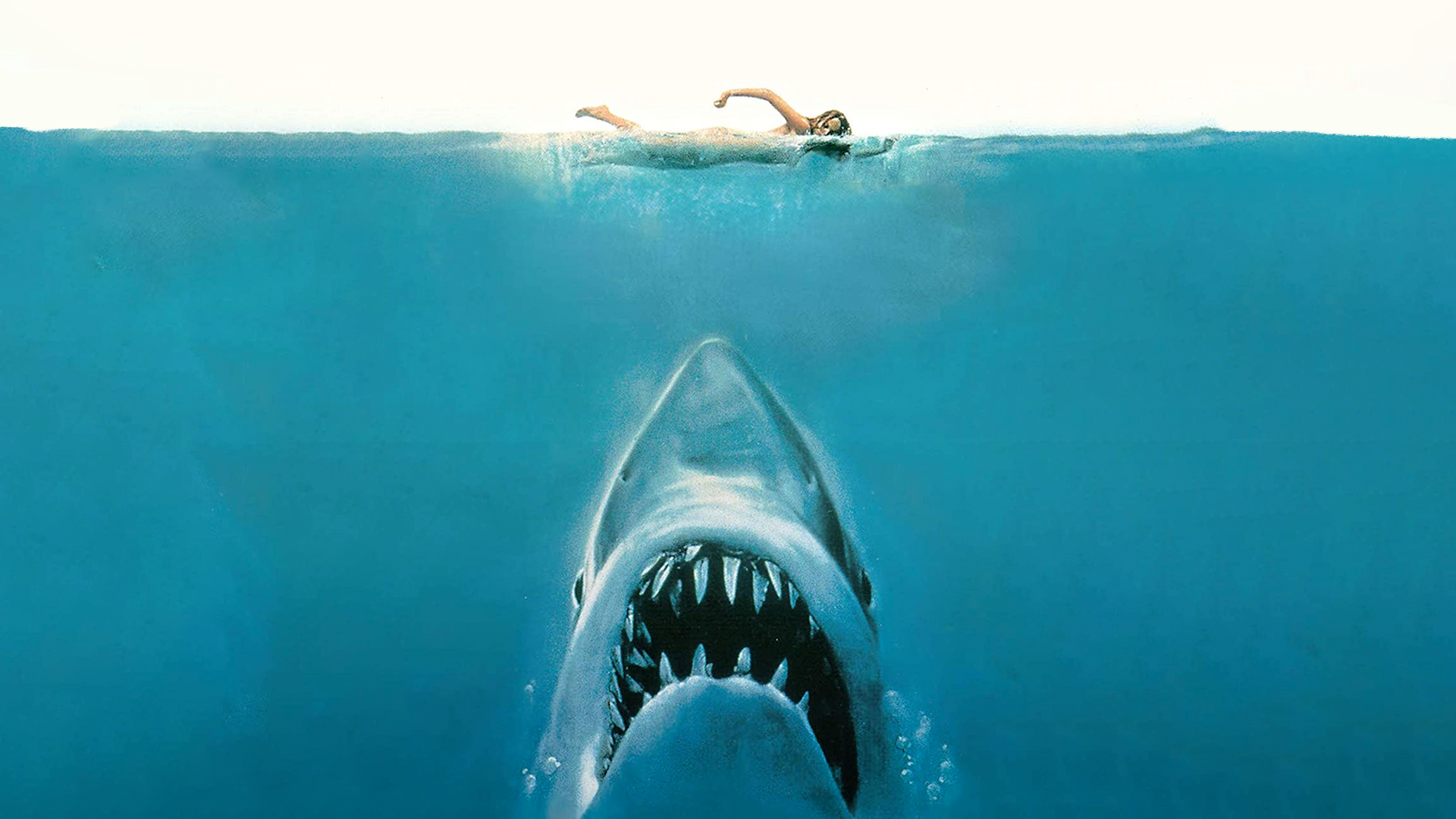
The story behind the iconic Jaws movie poster
Sink your teeth into this.

The marine monster with a two-note theme tune took the cinema world by storm in the '70s. With its ferocious teeth and blood-red mouth, Jaws and its accompanying movie poster have become icons of pop culture. But did you know the film poster started life as something else?
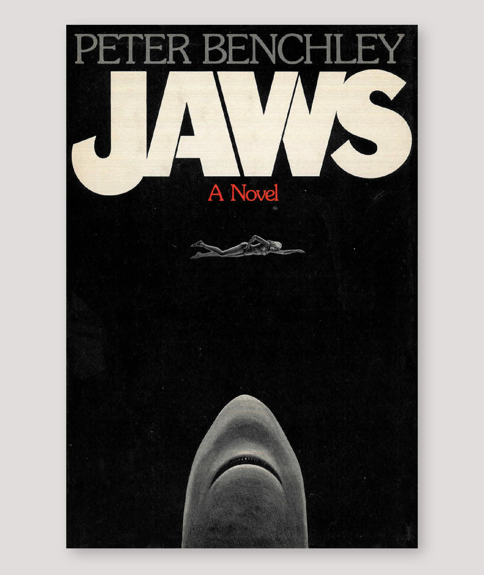
A similar design was originally created by Paul Bacon for the front cover of the book, Jaws, on which the movie is based. The original cover (see below) is based on the opening scene of both the book and film and features the same shark vs swimmer scenario. (If you fancy creating your own iconic poster design, then why not seek inspiration with one of the best graphic design books on our list?)
According to Printmag, the story of how the cover came about was quite a turbulent one. The senior editor of Doubleday (who published Jaws) likened Bacon's design to "a penis with teeth" (now you'll never unsee it, sorry) and was apparently never happy with the design.

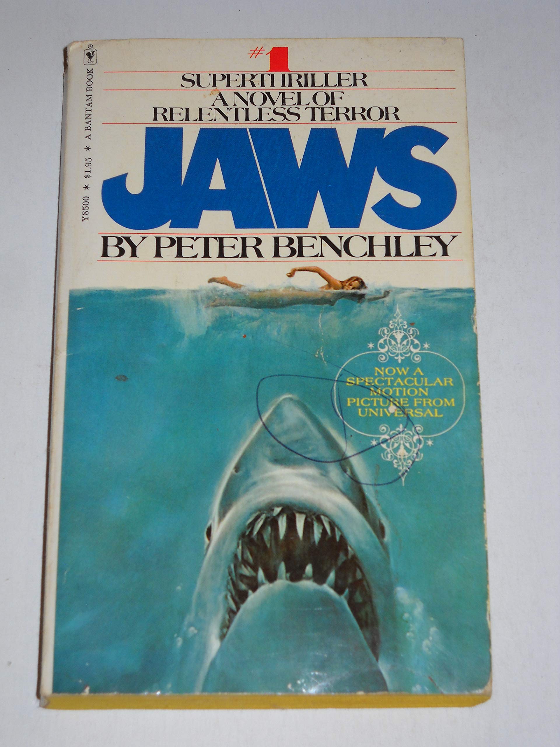
The editor then commissioned Roger Kastel to improve it, which resulted in Kastel's version of the book cover (see below). When the movie was created, Bantman (another of Jaw's publishers) allowed Spielberg to use the cover for his poster. The only difference between Kastel's book cover and the poster is that there is foam covering the swimmer's bare chest in the poster.

While I love the Jaws movie poster with its '70s iconography, bright nautical-themed palette and the ability to trigger thalassophobia (fear of large bodies of water) in pretty much anyone, I prefer the original book cover. Even without a mouth full of teeth, the shark is still morbidly horrifying and the bleak colours give the cover a more gothic feel. The all-black background also really makes it feel as though the swimmer has no escape.
I don't know about you, but all this talk about classic movies has me in the mood for a good old-binge watch. If you're feeling a similar way, then sign up to Disney Plus to find a ton of brilliant movies.
Read More:
Get the Creative Bloq Newsletter
Daily design news, reviews, how-tos and more, as picked by the editors.

Thank you for reading 5 articles this month* Join now for unlimited access
Enjoy your first month for just £1 / $1 / €1
*Read 5 free articles per month without a subscription

Join now for unlimited access
Try first month for just £1 / $1 / €1

Amelia previously worked as Creative Bloq’s Staff Writer. After completing a degree in Popular Music and a Master’s in Song Writing, Amelia began designing posters, logos, album covers and websites for musicians. She covered a range of topics on Creative Bloq, including posters, optical illusions, logos (she's a particular fan of logo Easter eggs), gaming and illustration. In her free time, she relishes in the likes of art (especially the Pre-Raphaelites), photography and literature. Amelia prides herself on her unorthodox creative methods, her Animal Crossing island and her extensive music library.
