Is this iPhone 12 case Apple's ugliest ever design?
And the award goes to...

There's no doubt that the recent release of the iPhone 12's specs has created excitement – and with good reason. But a new accessory has come under fire on Twitter, with a prominent Apple expert calling it "the absolute worst design from apple". Strong words, echoed by the Twitterverse. Though, entertainingly, many other stellar examples of bad Apple design were also thrown out there as strong contenders.
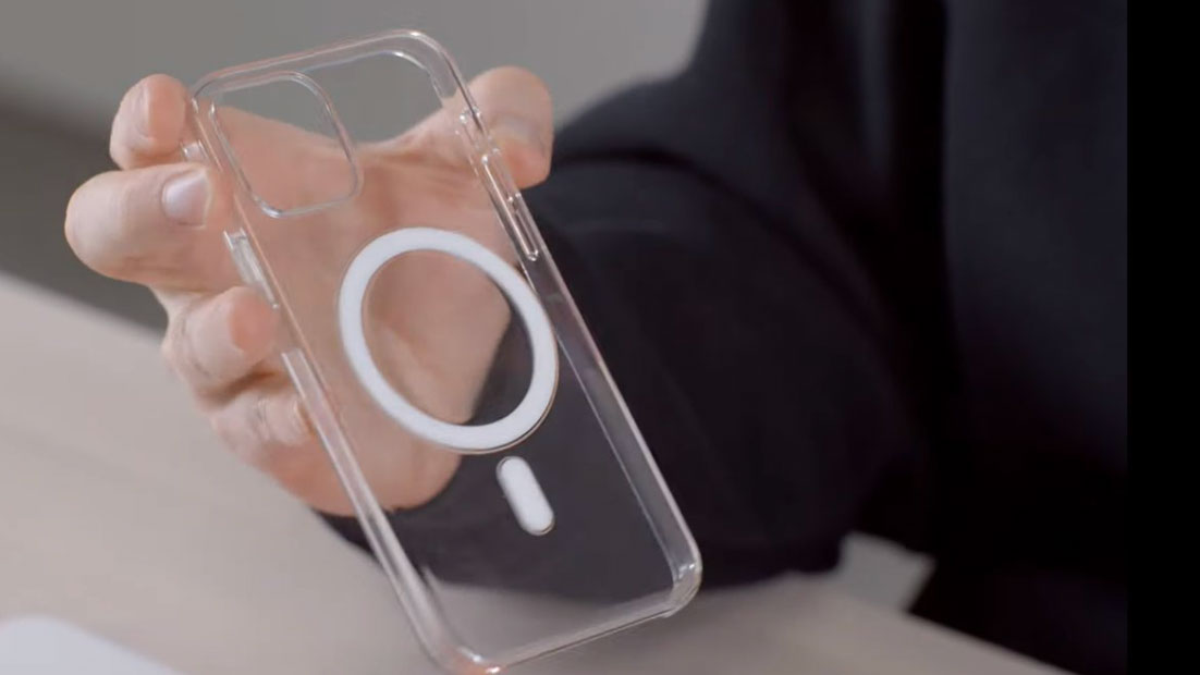
So, what's causing all the drama? A clear, plastic phone case. So far, so unremarkable. Actually, the headline news is the thick white circle plonked in the middle, and vertical line running down the bottom part. What it lacks in style, we assume it must make up for in functionality (perhaps backing up features found only on the best smartphones), because it certainly isn't the most beautiful design we've ever seen, and it's quite a departure from Apple's usual style.
this is the absolute worst design from apple evergodso terrible pic.twitter.com/1GRETDYqWFOctober 20, 2020
Jon Prosser shared the case design on his Twitter feed (above), calling it "terrible", and his followers (almost) totally agreed.
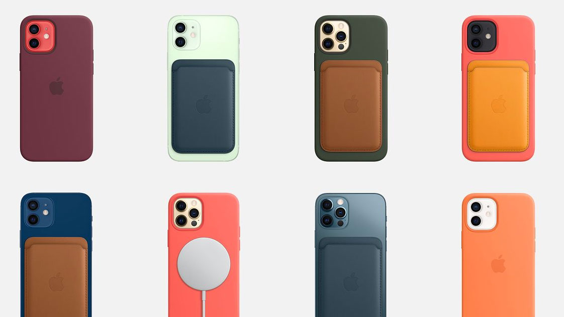
Of course, the circle and line do have a purpose (thank goodness). The shapes allow the new MagSafe system to work. MagSafe, according to Apple, is the new "ecosystem of accessories for easy attachment and faster wireless charging", released with the iPhone 12.

Containing magnets, the circle lets the wireless charging pad do its magic. The vertical line is, apparently, for vertically aligning the other accessories (like the card wallet – see it above) when stuck on the back – making sure they don't spin. But, even though it looks like Apple has just stuck a random sticker on the back of a cheap plastic case, this accessory will set you back a cool £49/$49.
Many couldn't believe their eyes, at first.
Nevermind. lol pic.twitter.com/xa1PFGOg75October 20, 2020
Some are pointing out the ridiculousness of creating systems that require more accessories to be bought (Remember those Mac Pro Wheels, anyone?).
Get the Creative Bloq Newsletter
Daily design news, reviews, how-tos and more, as picked by the editors.
First, create a problem. Then sell the solution.October 20, 2020
👍👍👍🤣🤣🤣🤣October 20, 2020
Though many had their own ideas of terrible Apple design, including different case designs (and yes, this was an official Apple case).
Was this an official Apple case?October 20, 2020
Nah man, this is actually quite good. The case doesn’t feel bulky like other battery cases, it’s just different that’s why people hate itOctober 20, 2020
And, who can forget these disasters?
What is that atrocity in the right?October 20, 2020
For those not in the know, and to answer the above question, the "atrocity on the right" is a mouse with the charging point on the bottom – a design monstrosity that we recently found people are not yet over.
Though a few voices piped up in support of the design, we think Apple could have done better here. Does the circle have to be quite so, well, white? Maybe on a different case it would sit better but we have to agree, it's pretty ugly and looks plasticky. We do think, though, that the mouse will retain the gold medal for the worst design ever, as at least this case makes the phone easier to use and not near-impossible.
Unashamedly like this case? Buy it here.
Read more:

Thank you for reading 5 articles this month* Join now for unlimited access
Enjoy your first month for just £1 / $1 / €1
*Read 5 free articles per month without a subscription

Join now for unlimited access
Try first month for just £1 / $1 / €1

Georgia is lucky enough to be Creative Bloq's Editor. She has been working for Creative Bloq since 2018, starting out as a freelancer writing about all things branding, design, art, tech and creativity – as well as sniffing out genuinely good deals on creative technology. Since becoming Editor, she has been managing the site and its long term strategy, helping to shape the diverse content streams CB is known for and leading the team in their own creativity.
