iPad users are very (very) cross about one aspect of iPadOS 15
Turning homescreens into hellscapes.

There's a lot to like about iPadOS 15, with the new update bringing enhanced widgets and much improved multi-tasking options to Apple's tablets. But a few days after the new software dropped, one particular aspect seems to have irked plenty of iPad users.
Users have been complaining that the update has messed up their carefully curated homescreens, thanks to a layout that now changes between portrait and landscape. It might not sound a big deal, but if you're someone who likes your icons just so, prepare for frustration. (In the market for new kit? Check out the best Apple deals.)
iPadOS 15 first thoughts:MY PERFECTLY ORGANIZED & COLOR-COORDINATED HOMESCREEN IS RUINED 🥴😭😂Observation - to make widgets “work”, they changed the grid layout again (from 6x5 to 4x6 just like on iPhone) ~ that’s 30 down to 24 apps shownat least we got app library now! pic.twitter.com/8aEKlfNeapJune 8, 2021
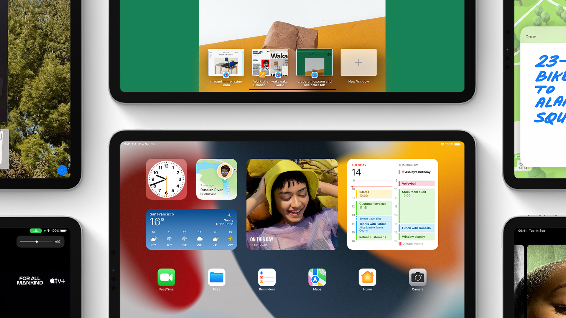
The issue seems to stem from the enhancement of homescreen widgets. In iOS 14, widgets were limited to landscape mode, and sat in their own box on the left of the display. Now, they can replace app icons – and to accommodate them, Apple has changed the portrait icon configuration from 6x5 to 4x6, while landscape is still the former. In short, icons are going to move around when you rotate the iPad.
I can’t be the only iPad user to install iPadOS 15 and frown at seeing how its home screen widgets broke up a painstakingly-organized app icon grid.September 20, 2021
And the internet isn't happy. Countless irate iPad users have taken to Twitter to complain about their spoiled (nay, ruined) homescreen layouts. And as we know from the sea of awesome custom iOS 14 icons that did the rounds last year, some people take their homescreen curation very, very seriously.
#iPadOS15 widget and icon placement is absolute madness, especially when changing orientation pic.twitter.com/wQrFZ7rXYKSeptember 20, 2021
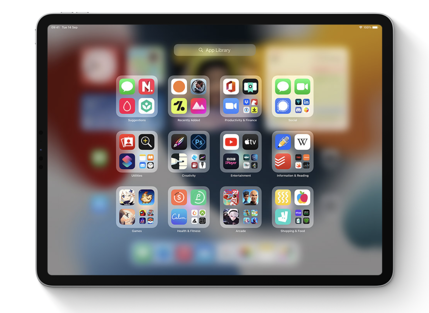
Thankfully, one of the other main changes iPadOS 15 brings with it is the addition of App Library, which allows users to hide icons from their homescreen without deleting the app. Hey, perhaps Apple is trying to push users towards App Library by messing up their icons? The plot thickens.

The iPad homescreen isn't the only aspect of Apple's latest software drop to have users up in arms – iOS 15's Safari redesign has baffled many an iPhone user over the past week. Thankfully, that particular change is reversible. If all of this has got you in the mood to curate some app icons, check out today's best iPad deals below.
Get the Creative Bloq Newsletter
Daily design news, reviews, how-tos and more, as picked by the editors.

Thank you for reading 5 articles this month* Join now for unlimited access
Enjoy your first month for just £1 / $1 / €1
*Read 5 free articles per month without a subscription

Join now for unlimited access
Try first month for just £1 / $1 / €1

Daniel John is Design Editor at Creative Bloq. He reports on the worlds of design, branding and lifestyle tech, and has covered several industry events including Milan Design Week, OFFF Barcelona and Adobe Max in Los Angeles. He has interviewed leaders and designers at brands including Apple, Microsoft and Adobe. Daniel's debut book of short stories and poems was published in 2018, and his comedy newsletter is a Substack Bestseller.
