Is this new iPad mini design touch genius – or terrible?
It has users divided.

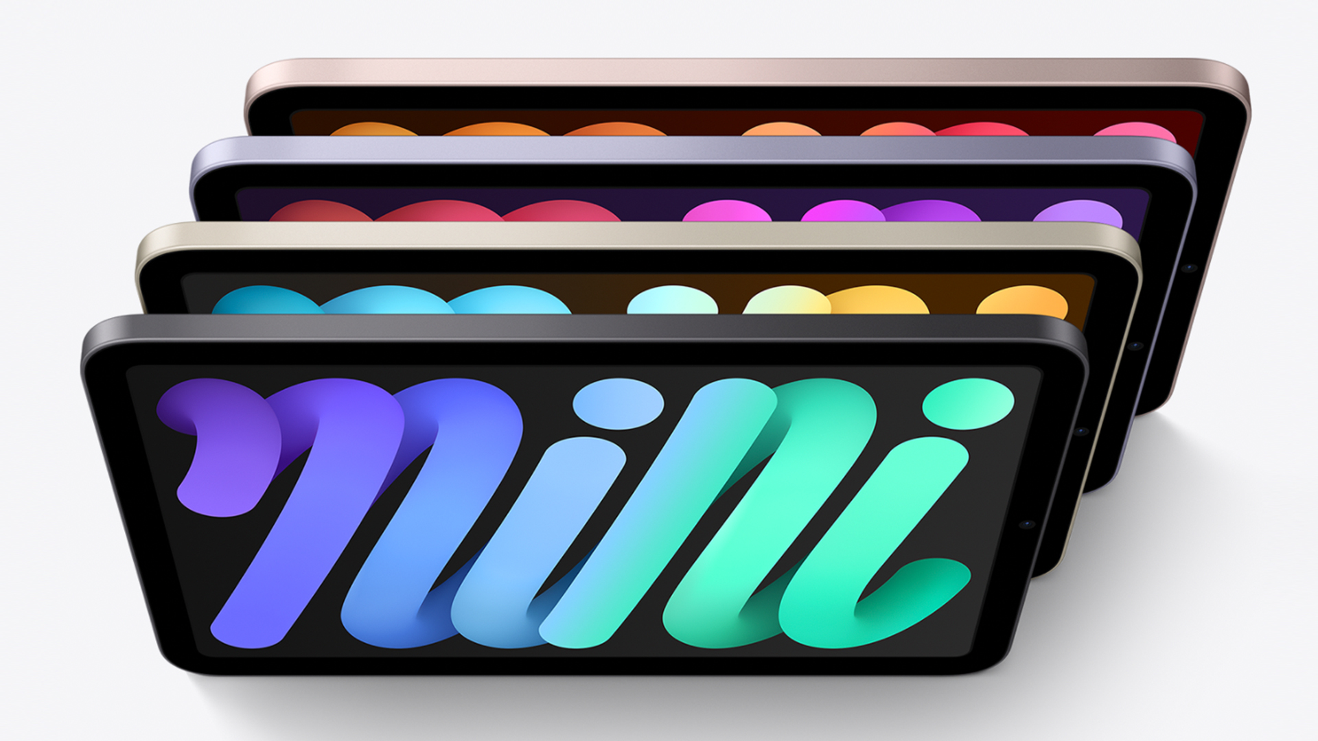
It's fair to say the new iPad mini is a hit, particularly from a design perspective. Users and critics alike are loving the iPad Pro-inspired flat-edged design, which brings the mini in line with higher end tablets at long (long) last. But one aspect of the design is proving rather contentious.
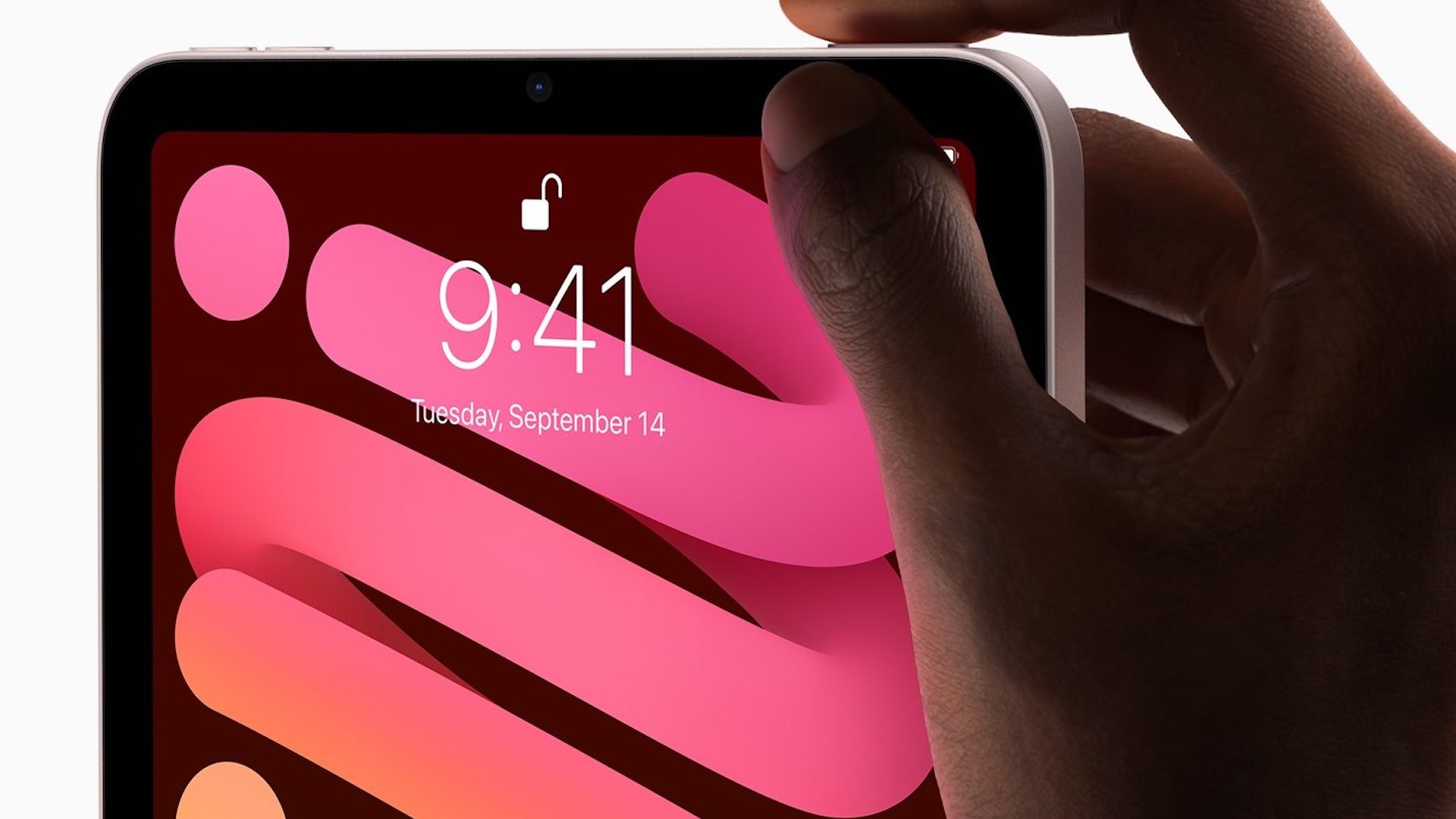
For the first time on an iPad or iPhone, Apple has moved the volume buttons from the side to the top of the device – and the change has clearly got plenty of users' heads in a spin. But it turns out there's a nifty in-built feature which means the decision makes a lot more sense. (In the market for new kit? Check out the best Apple deals.)

Indeed, it seems the muscle memory of Apple users is not to be trifled with –countless disgruntled iPad fans have taken to Twitter to express their utter shock, distress and alarm at the configuration change. Just like when Apple moved the Safari address bar in iOS 15 (a change the company uncharacteristically backpedalled on), this one has plenty of users up in arms.
Placing the volume buttons on the top of the iPad mini 6 chassis was the worse decision Apple ever made! Makes changing the volume a choreSeptember 24, 2021
WTF APPLE why did you move the volume buttons! Hate this! 😡🤬 #iPadMini6 pic.twitter.com/F1ryrrHnbsSeptember 30, 2021
But what Apple didn't seem to mention during the launch presentation for the iPad mini is that the buttons themselves actually change configuration depending on how the user has the iPad orientated. Hold it in portrait and the left button turns the volume down, and the right turns it up. Hold it in landscape, and they do the opposite. It's a nifty touch that means the volume buttons actually make more sense for a device that's meant to be held in various different ways.
The new volume buttons on the iPad mini change their function depending on the orientation of the device. The same button that increases the volume in portrait mode, decreases it in landscape left. It's logical, but has any other iPad ever been this way?September 27, 2021
Still, that doesn't mean it won't still be confusing for long-time iPad users that the buttons now sit at the top when the device is held in portrait mode. But with the Apple Pencil 2 sitting on the right of the iPad mini, and the hinge of the smart folio accessory on the left, it's understandable that Apple had to move them – and we have a feeling users won't be complaining about it for long.
And besides, Apple is clearly trying to push users towards landscape use – and with rumours suggesting the logo of the iPad is about to rotate, landscape could soon become the default mode. Don't like the buttons at the top? Perhaps that top will soon be the side. Problem solved.
Regardless of the location of the volume buttons, we're big fans of Apple's new tiny tablet. Check out our iPad mini (6th gen) review, and take a look at today's best iPad deals below.
Get the Creative Bloq Newsletter
Daily design news, reviews, how-tos and more, as picked by the editors.
Read more:

Thank you for reading 5 articles this month* Join now for unlimited access
Enjoy your first month for just £1 / $1 / €1
*Read 5 free articles per month without a subscription

Join now for unlimited access
Try first month for just £1 / $1 / €1

Daniel John is Design Editor at Creative Bloq. He reports on the worlds of design, branding and lifestyle tech, and has covered several industry events including Milan Design Week, OFFF Barcelona and Adobe Max in Los Angeles.
