Is the new Apple Music icon our first glimpse of iOS 15?
Your iPhone could soon look a lot more Mac.
It's no stretch to say that Apple's iOS software is beginning to look a little long in the tooth. You have to look back as far as 2013 to find the last major design overhaul of iOS when the company's realistic skeuomorphism was dramatically eschewed in favour of stark, flat design with iOS 7. But it seems a touch of texture could finally be back on the cards for iOS 15.
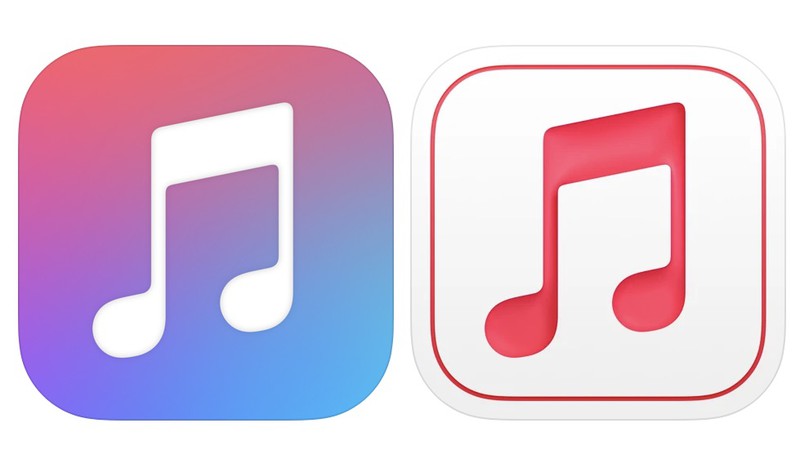
A brand new app icon was quietly released by Apple yesterday, and this is the source of the rumours. The new Apple Music for Artists icon (below) is a simpler, more streamlined affair. And it features – shock, horror – shadow. (Check out our best Apple deals if you're ready to join the iOS ecosystem.)

Now, at first glance, a new logo for Apple's artist-specific music stats app might not seem a huge deal. Apple Music for Artists has a naturally small audience, and the average iPhone user won't even see the new icon on their homescreen.
What's curious here is that the new icon so closely resembles another new iOS icon – also aimed at a relatively small audience. The icon for App Store Connect, designed for content producers, was recently updated in the exact same style, complete with white background, thin outer frame and, yep, shadows.
This is urgent information, see the App Store Connect icon made in the style of macOS Big Sur, but now Apple has updated the Apple Music for Artists icon which is now in the same style, this now definitely means that the new Material design will be in the new iOS 15? pic.twitter.com/MD7nVfcdvIApril 6, 2021
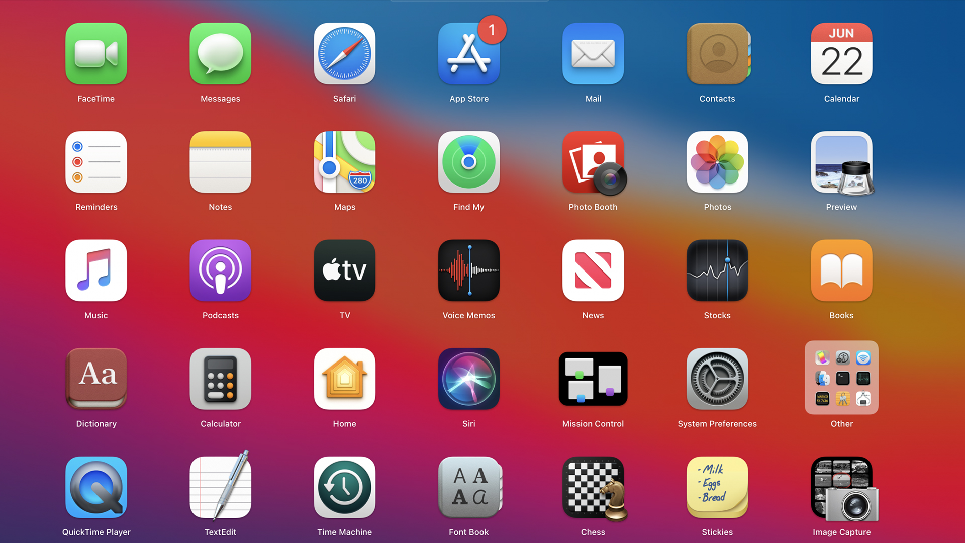
Now, that might not seem a big deal either – Apple has updated two iOS app icons, so what? As many users have spotted, these new designs look rather a lot like the icons introduced with macOS Big Sur – which means they sit somewhere between skeumorphism and flat design (hello, neumorphism).

Put these coincidences together, and it's starting to look like Apple could be planning to make iOS look a lot more like macOS. Which means iOS 15 could be a lot less, well, flat. And with several corners of the internet suffering from flat design fatigue, a more three-dimensional iPhone UI could well prove popular (even if the reaction to macOS Big Sur's icons was initially mixed).
There are already a ton of exciting iPhone 13 leaks doing the rounds, but it looks like it isn't just the hardware that's in for a fresh coat of paint. And with Apple's virtual WWDC event confirmed for June, we'll no doubt find out exactly what iOS 15 will look like in just a couple of months. If you want the best iPhone experience available right here and now, check out today's best iPhone 12 deals below.
Get the Creative Bloq Newsletter
Daily design news, reviews, how-tos and more, as picked by the editors.
Read more:

Thank you for reading 5 articles this month* Join now for unlimited access
Enjoy your first month for just £1 / $1 / €1
*Read 5 free articles per month without a subscription

Join now for unlimited access
Try first month for just £1 / $1 / €1

Daniel John is Design Editor at Creative Bloq. He reports on the worlds of design, branding and lifestyle tech, and has covered several industry events including Milan Design Week, OFFF Barcelona and Adobe Max in Los Angeles. He has interviewed leaders and designers at brands including Apple, Microsoft and Adobe. Daniel's debut book of short stories and poems was published in 2018, and his comedy newsletter is a Substack Bestseller.
