Twitter roasts Apple's new iOS 14 home screen
Updated design isn't as original as it seems.
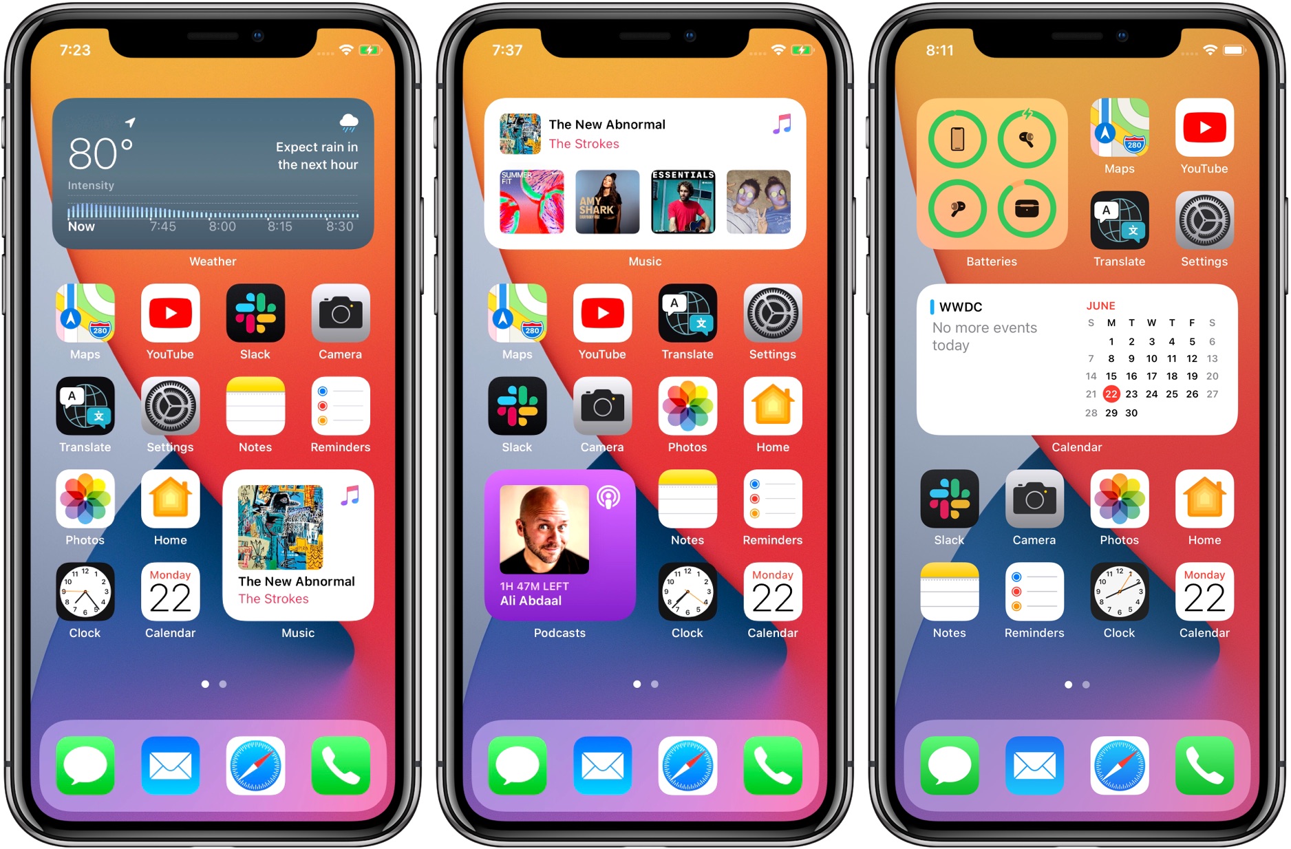
While yesterday's WWDC event wasn't the hardware announcement fest that some were hoping for, it still gave us a tantalising glimpse of what's in store for Apple's latest software cycle. Front-and-centre was iOS 14, which will see big changes to its home screen. But those changes might not be quite as original as Apple might want us to think.
The iPhone home screen has looked the same for years, with its utilitarian grid of app icons. But that's set to change with the introduction of widgets. These will be available in a variety of sizes, offering much more information than traditional, tiny icons. But while it'll be great to get more use out of the best iPhone apps right from the home screen, one community is a little less impressed: Android users.

- Browse iPhones at Apple.com
Indeed, Android phones have allowed widgets to mingle freely with app icons on the home screen for years now – and users have delighted in taking to Twitter to mercilessly mock Apple for its supposed innovation:
Android saying: pic.twitter.com/I4xHMXnEoWJune 22, 2020
Android users listening to Apple talk about widgets rn pic.twitter.com/g8FTPA18VJJune 22, 2020
Android users watching Apple release decade old Android features #WWDC20 pic.twitter.com/ltVPHJCZqrJune 22, 2020
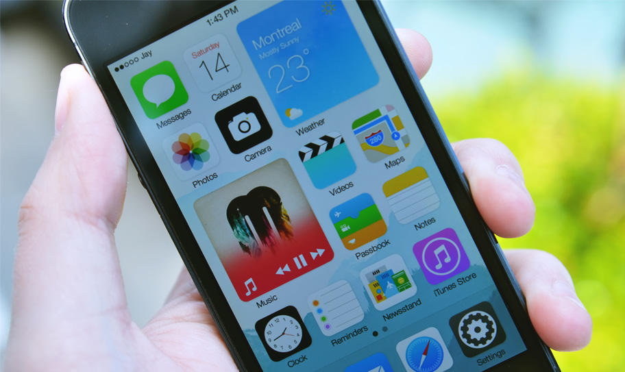
Not only are home screen widgets a mainstay of Android phones, but they've also made their way into many a concept artist's mockup for future iOS versions over the years. The official version looks remarkably similar to a fan concept that appeared in April, while one designer has pointed out a striking similarity between iOS 14 and his own concept (below) for iOS 8 – way back in 2014.

All told, the general consensus is that the introduction of widgets isn't exactly the most innovative move from Apple. That said, by giving it a fresh coat of Apple paint, the company has made a rather basic feature look better than ever. And the new Smart Stack feature, which lets the iPhone swap widgets based on time or location, sounds pretty nifty (dare we say innovative?).
For iPhone-toting digital creatives (and there are many – it's our best camera phone, don't you know), an enhanced home screen can only be a good thing – even if its features aren't entirely brand new. If you're thinking of grabbing an iPhone in time for iOS 14, check out today's best deals below.
Read more:
Get the Creative Bloq Newsletter
Daily design news, reviews, how-tos and more, as picked by the editors.

Thank you for reading 5 articles this month* Join now for unlimited access
Enjoy your first month for just £1 / $1 / €1
*Read 5 free articles per month without a subscription

Join now for unlimited access
Try first month for just £1 / $1 / €1

Daniel John is Design Editor at Creative Bloq. He reports on the worlds of design, branding and lifestyle tech, and has covered several industry events including Milan Design Week, OFFF Barcelona and Adobe Max in Los Angeles. He has interviewed leaders and designers at brands including Apple, Microsoft and Adobe. Daniel's debut book of short stories and poems was published in 2018, and his comedy newsletter is a Substack Bestseller.
