Intel's new logo loses its swirl (and some of its personality)
Intel goes back to basics.

Intel has rebranded with a new logo (above), aiming to modernise the brand in its first design update since 2006. As with many recent rebrands, the design has been simplified, dropping its circular swirl in favour of a pared back wordmark.
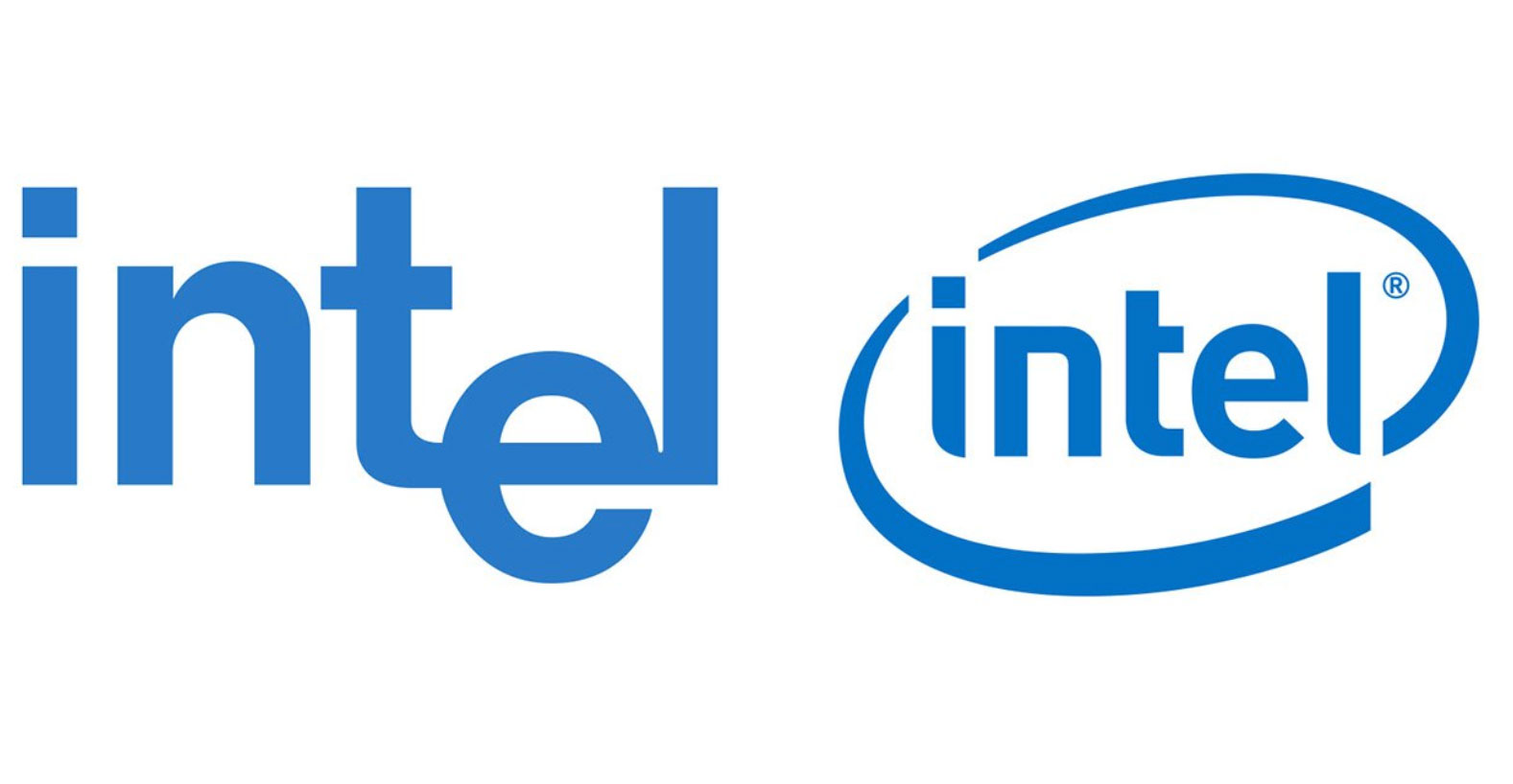
It's only the third new look for Intel in its entire 51-year-history, making this a significant refresh but, dare we say it, one that has resulted in a distinct loss of personality (unlike the designs on our list of best logos). Intel says the rebrand "honours the past to forge the future", and the swirl-less design is indeed reminiscent of the original logo, in use from 1968 to 2006. But, even that mark had more quirk, with its lowered 'e' and joined up 't' and 'l' (see the previous two incarnations below).

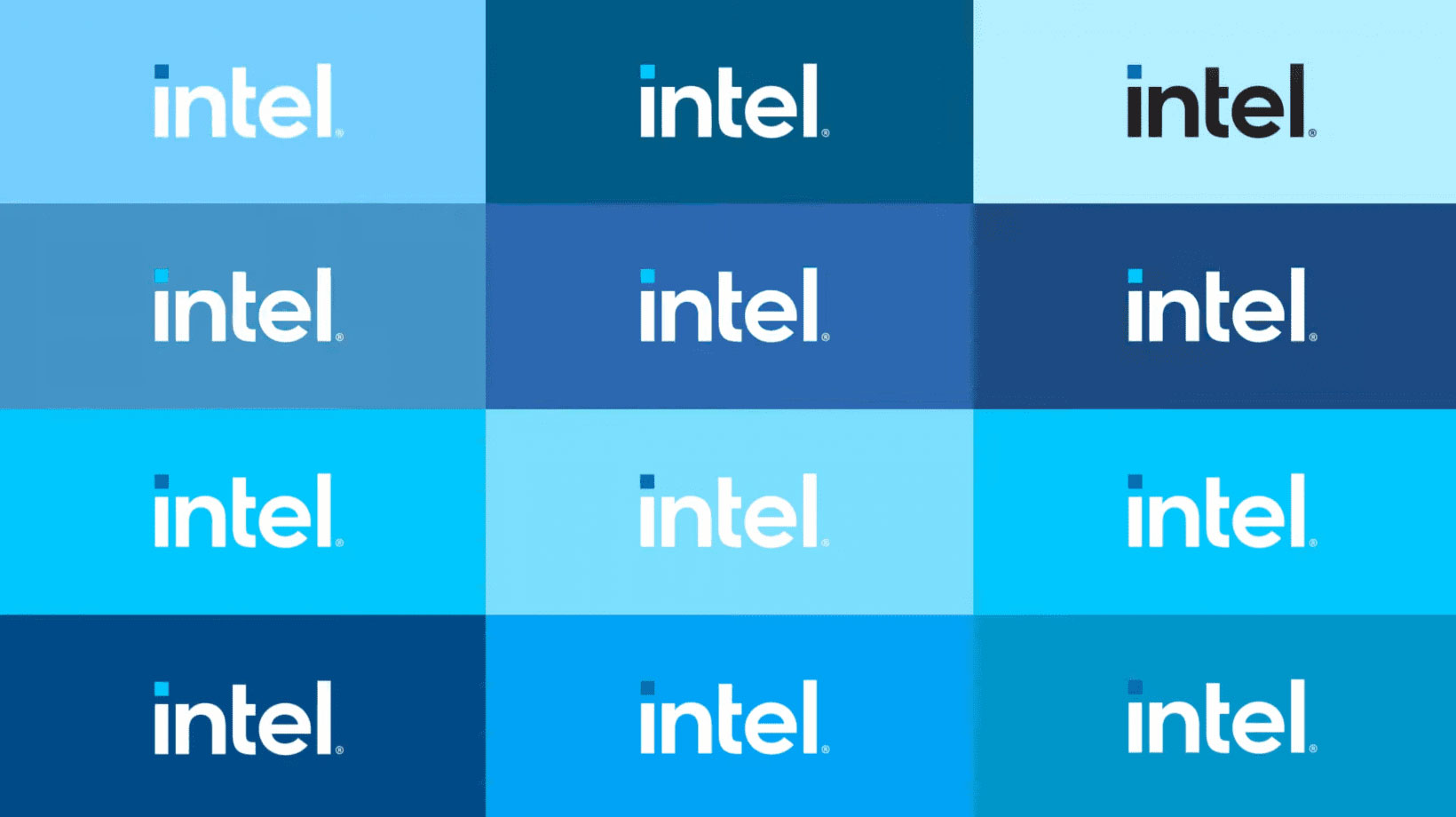
A simpler, smoother and more rounded typeface has replaced the one found in the circular logo. The colour palette remains blue-toned, but brighter and with extended variants. It's a gorgeous set of blues when set side-by-side, as in the picture below, and seeing it like this definitely ignites more spark than viewing the logo on its own. Atop the 'i' is a square dot, which represents a processor, and is a different shade of blue in every setting.

Once the go-to producer of processors, Intel has taken a few knocks recently, with Apple announcing its own ARM processor. The rebrand comes alongside the unveiling of its new 11th generation Core PC processors, and a new chip brand, Evo. Though slick, is the updated design enough to take it into a new era of competition?
We think Intel has definitely succeeded in its mission to make the logo seem both new and familiar. The new logo looks clean, and we love the colour palette, even if the transformation has sacrificed a little personality in the process.
Read more:
- Disney's new 20th Century Fox TV logo is a real head-scratcher
- Infographic reveals 50 huge logo design secrets
- New iPhone 12 leak is the most exciting one yet
Get the Creative Bloq Newsletter
Daily design news, reviews, how-tos and more, as picked by the editors.

Thank you for reading 5 articles this month* Join now for unlimited access
Enjoy your first month for just £1 / $1 / €1
*Read 5 free articles per month without a subscription

Join now for unlimited access
Try first month for just £1 / $1 / €1

Georgia is lucky enough to be Creative Bloq's Editor. She has been working for Creative Bloq since 2018, starting out as a freelancer writing about all things branding, design, art, tech and creativity – as well as sniffing out genuinely good deals on creative technology. Since becoming Editor, she has been managing the site and its long term strategy, helping to shape the diverse content streams CB is known for and leading the team in their own creativity.
