People aren't loving Instagram's bright new app icon
They're blinded by the lights.

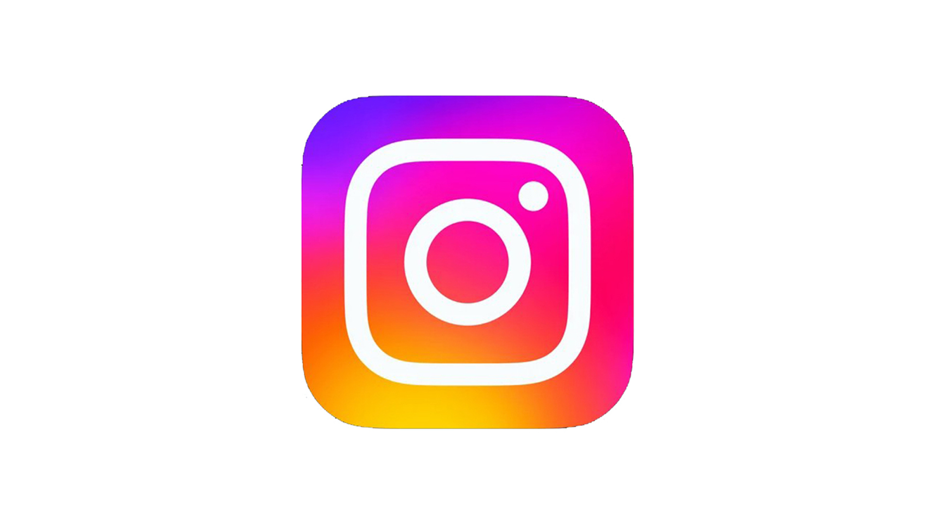
When a logo sits on millions of users' home screens, you can bet that not even the slightest change will go unnoticed. Instagram appears to have rolled out a slightly updated icon design – and it seems some users are, just like The Weeknd, blinded by the lights.
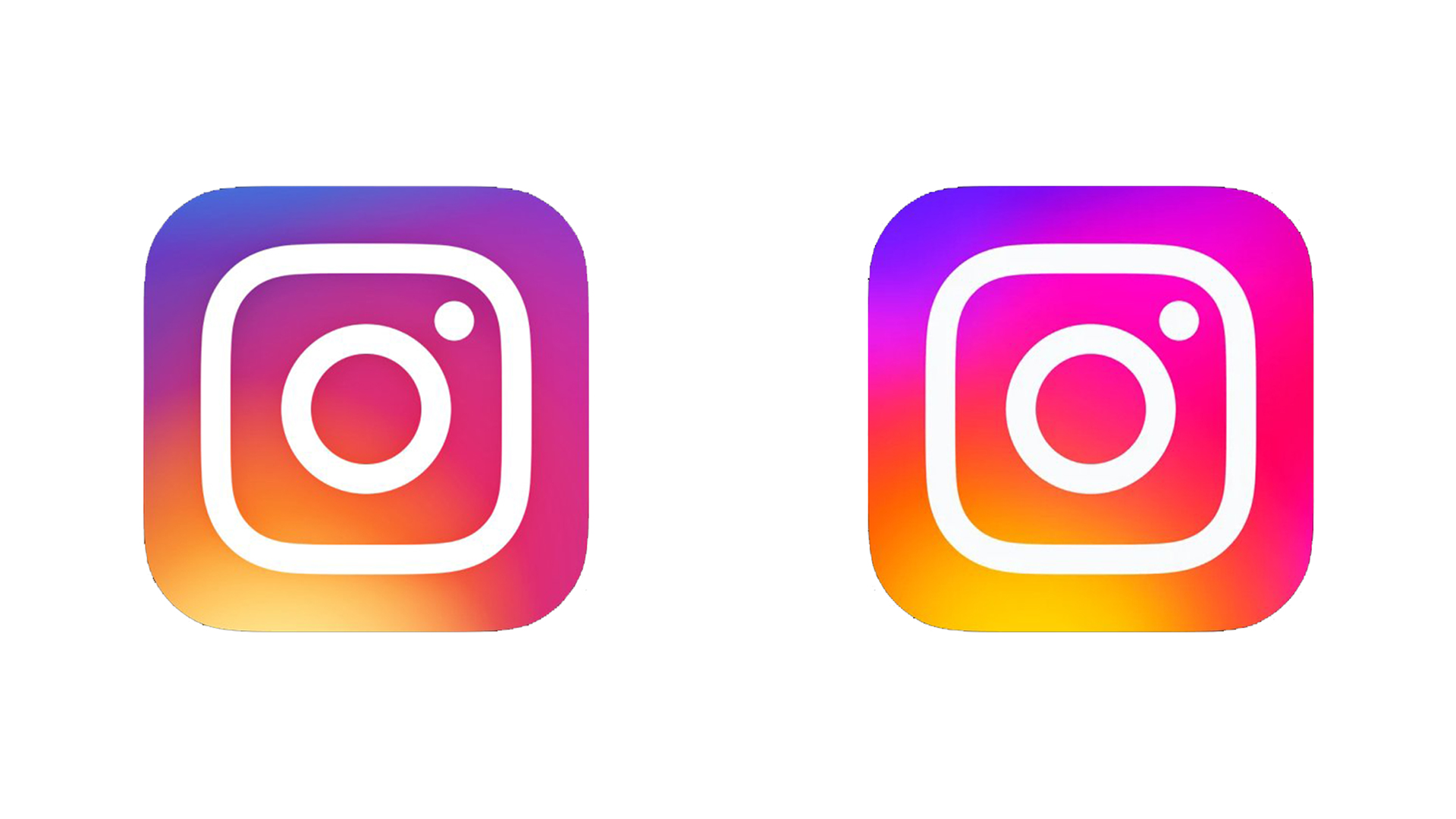
It looks like the Meta-owned app's new icon is essentially a brighter version of the previous design, with the vibrancy of the gradient behind the logo turned up a notch (or three). But some users – and some smartphones – aren't handling the change well. Looking for logo inspiration? Check out the best logos of all time.

"I'm going to have to reduce my screen brightness for that," one Twitter user complains, while another adds, "New Instagram icon is way over-saturated. Gross." And lots have users have shared screen recordings of iOS seeming to struggle with the new icon – when closing the app, the icon appears to judder between the old and new design.
why is the new instagram logo so bright... like how am i supposed to see my friends pics if the app icon blinds me firstMay 16, 2022
what the hell happened to the instagram iconwhy are the colors oversaturated now (left is the new icon) pic.twitter.com/N3DiQGmEBGMay 16, 2022
gonna take a while to get used to Instagram’s new app iconsaw this on IG for Android a while ago and thought something’s wrong with my phone’s display or that I’m going crazy :P pic.twitter.com/T7w3bVsK9zMay 16, 2022
Indeed, while the original iteration of the gradient logo seemed hugely vibrant back in 2016, it looks positively restrained next to the new version. I shudder to think how saturated the 2028 version is going to look.
Still, it's hardly the most dramatic – or indeed worst – new app icon we've seen in recent months. At least it doesn't resemble Hitler – looking at you, Amazon. But if you're looking for the best of the bunch, check out our list of the best iOS app icon designs.
Read more:
- Apple's iPhone 15 could finally get one of the most long-requested features
- Apple iPhone 14: from design to features, this is what we know
- The 21 best iPhone apps for designers
Get the Creative Bloq Newsletter
Daily design news, reviews, how-tos and more, as picked by the editors.

Thank you for reading 5 articles this month* Join now for unlimited access
Enjoy your first month for just £1 / $1 / €1
*Read 5 free articles per month without a subscription

Join now for unlimited access
Try first month for just £1 / $1 / €1

Daniel John is Design Editor at Creative Bloq. He reports on the worlds of design, branding and lifestyle tech, and has covered several industry events including Milan Design Week, OFFF Barcelona and Adobe Max in Los Angeles.
