Innocent Drinks' new rebrand is hilariously bad
Fortunately, that's the joke.

It's not often that we get to see the process that goes into a rebrand – normally we just get the final product along with a few words about the rationale behind it (if we're lucky). But Innocent Drinks has done things a little differently when it comes to introducing its new rebrand, or as Innocent calls it, Re-Re-Re-Re-Re-Re-Re-Re-Re-Rebrand.
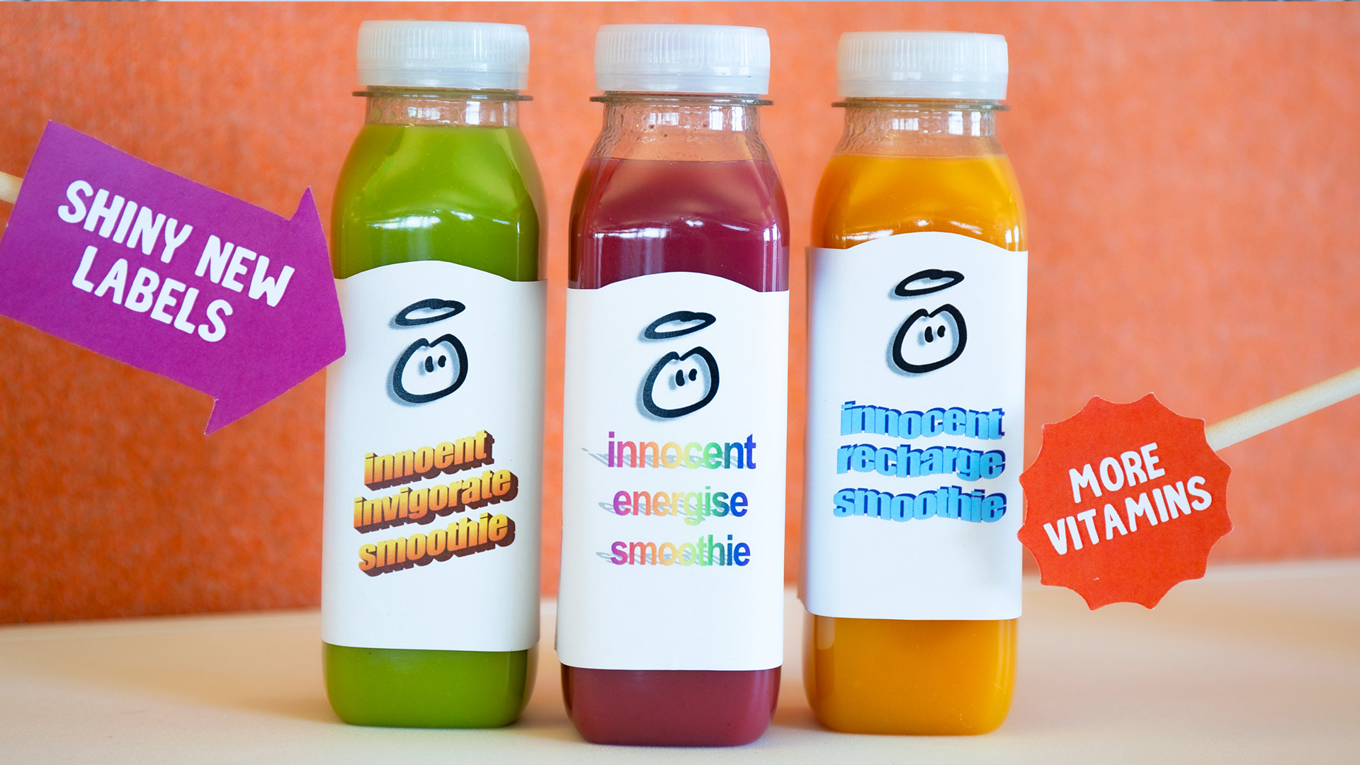
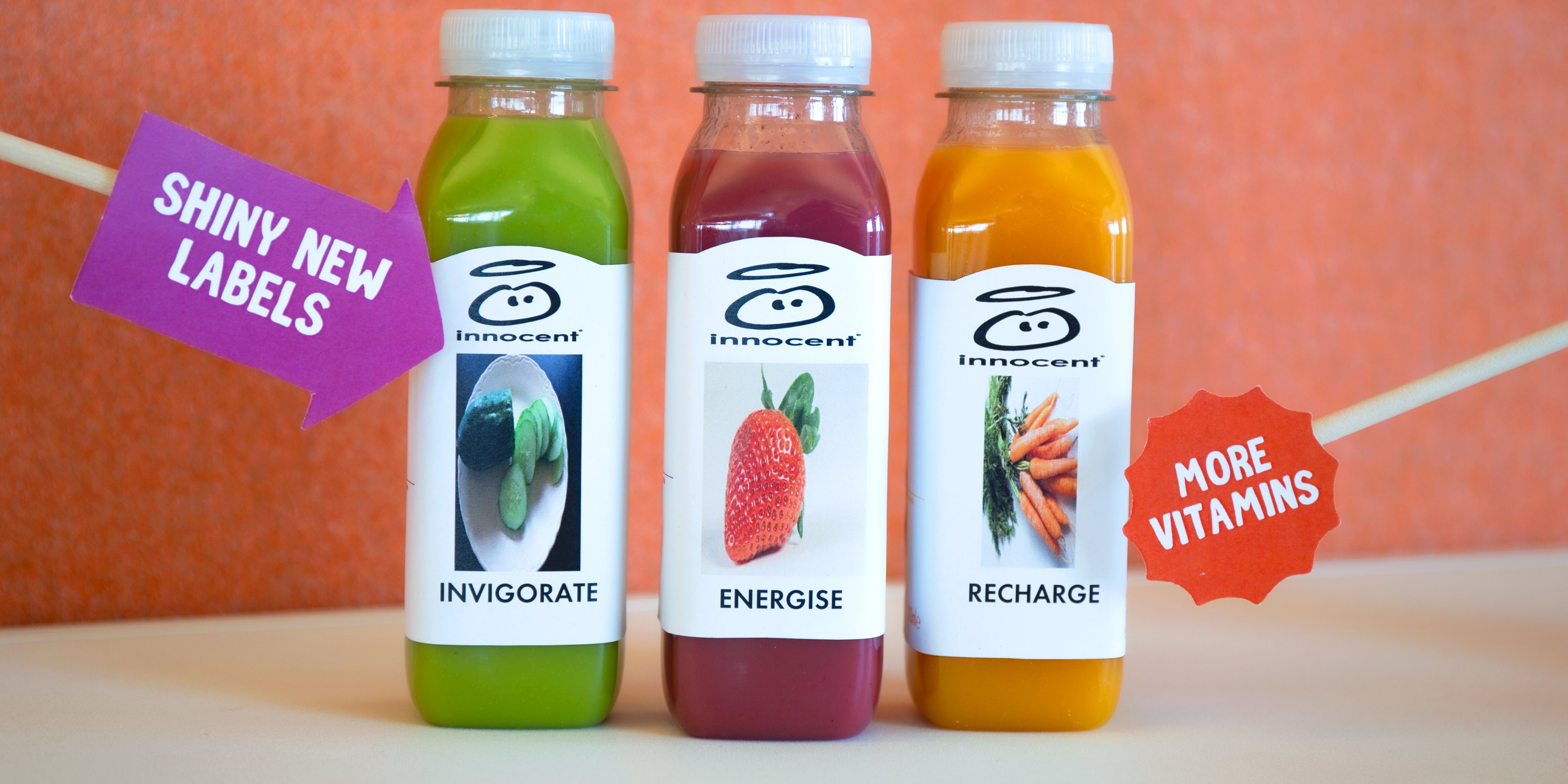
In a tongue-in-cheek video posted on Twitter, the brand shows several unused options for the rebrand of its Super Smoothie range packaging (maybe the team should have looked at our stand out examples of packaging design for inspiration). It also depicts a humorous email back-and-forth with the marketing team, which will be familiar to any graphic designer. It's fair to say that Innocent's work-in-progress versions are pretty dire, which is, of course, the joke.
innocent super smoothies: The Final Re-Re-Re-Re-Re-Re-Re-Re-Re-Rebrand More vitamins than you can shake a stick at. More label redesigns than we know what to do with.And just three months later than we originally planned. Please don't tell our boss. pic.twitter.com/V5ZJ0TwuxsJune 29, 2020
From the abundance of Microsoft Word Art (remember that?) and stretched images, to the fake characters (it took us far too long to spot that Innocent's pretend marketing officer has been named Mark Eting), the video is a hilarious parody of the rebranding process. And was no doubt a fun project for whoever got to come up with the bad designs. Innocent might want to lay off mocking Comic Sans, though – as we recently discovered, the font has more fans than you might think.

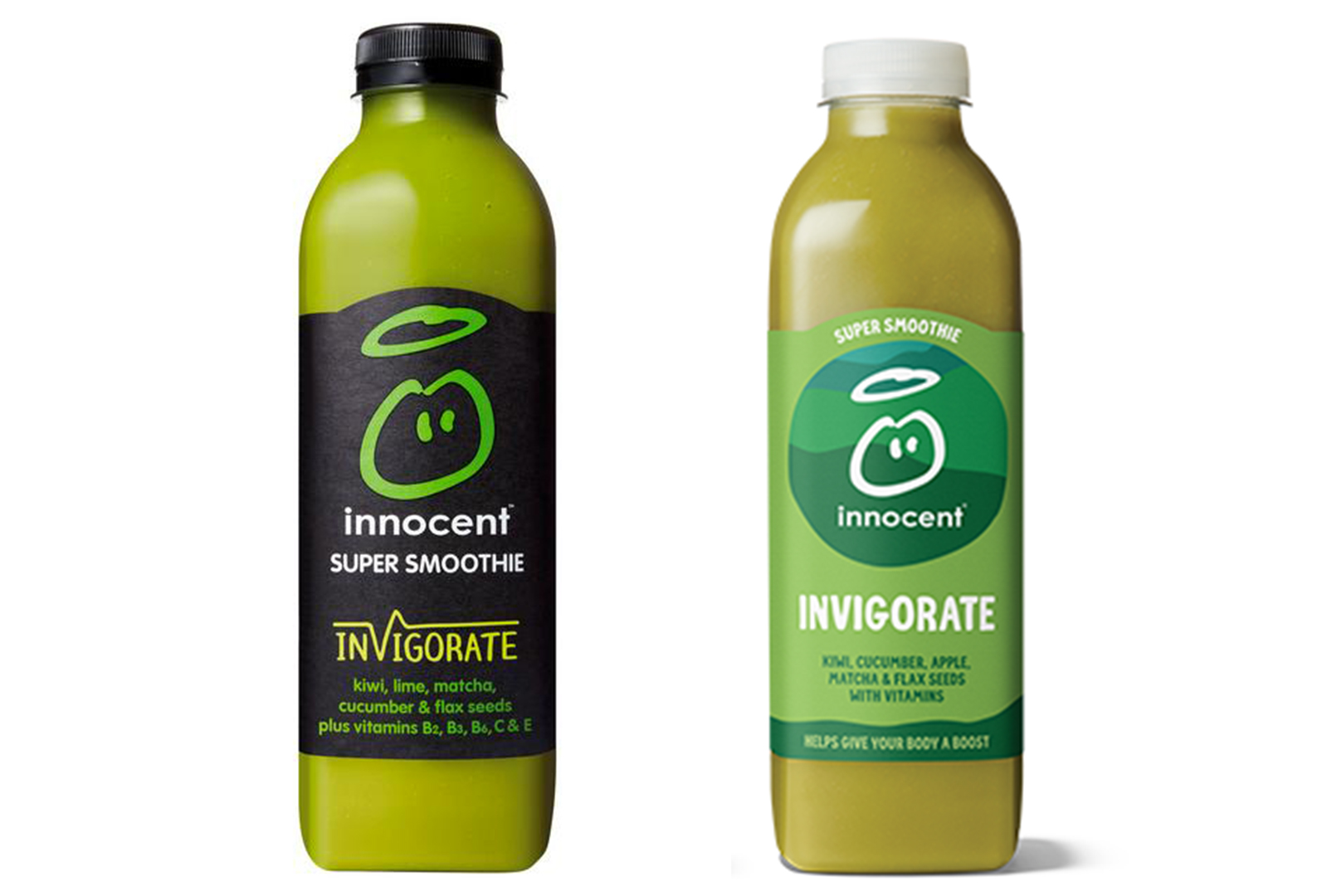
The video is all fun and games, but what about the actual rebrand? After the distraction of all those comedy options, the finished version (below) can't help looking a little, well, safe. That said, the splash of colour feels decidedly more on-brand than the previous, bizarrely grungy black aesthetic.

As rebrands go, we'd say Innocent's effort, while not hugely exciting, is a serviceable success – and it scores bonus points for the hilarious accompanying video. It's certainly safe from our list of the most hated redesigns, which is more than we can say for TGI Fridays' new look.
Read more:
- The best photo apps in 2020
- Is Toyota’s logo cleverer than it looks?
- Milton Glaser's unseen final logo could be his best ever
Get the Creative Bloq Newsletter
Daily design news, reviews, how-tos and more, as picked by the editors.

Thank you for reading 5 articles this month* Join now for unlimited access
Enjoy your first month for just £1 / $1 / €1
*Read 5 free articles per month without a subscription

Join now for unlimited access
Try first month for just £1 / $1 / €1

Daniel John is Design Editor at Creative Bloq. He reports on the worlds of design, branding and lifestyle tech, and has covered several industry events including Milan Design Week, OFFF Barcelona and Adobe Max in Los Angeles. He has interviewed leaders and designers at brands including Apple, Microsoft and Adobe. Daniel's debut book of short stories and poems was published in 2018, and his comedy newsletter is a Substack Bestseller.
