6 super-cool things you can do with Illustrator on iPad
A tantalising taste of the in-progress features coming your way on Illustrator on iPad.
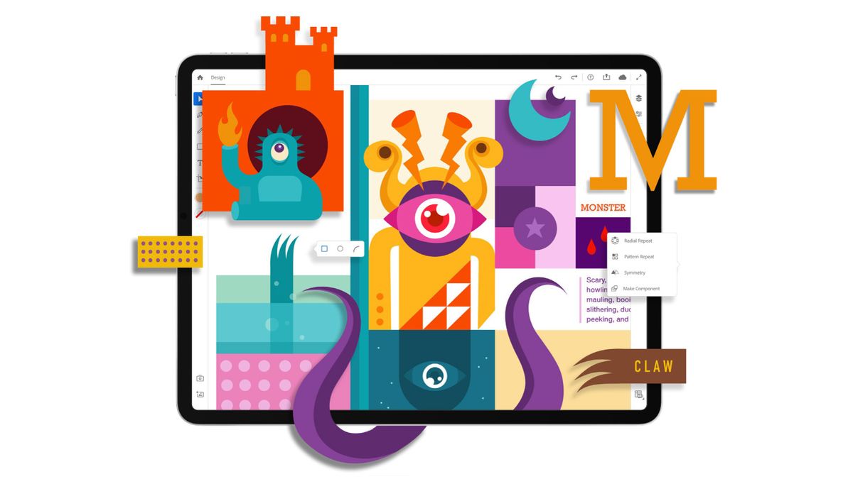
Adobe has announced that it has been busy developing Illustrator on the iPad. This dedicated tablet version is still in its early stages – an exclusive private beta has just launched (read on to find out how to sign up for early access). Adobe says the first version will be with us sometime in 2020.
The tool will be rebuilt from the ground up to take advantage of touch capabilities and the possibilities offered by the Apple Pencil. It will join the just-released Photoshop on the iPad and dedicated tablet painting and drawing app Adobe Fresco in Adobe's slightly-late-to-the-party collection of mobile creative tools. If you've been holding out for a iPad Black Friday deal but you've been on the fence, this could be the incentive you need to click 'add to basket'.
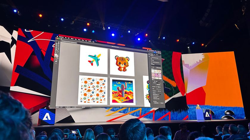
Illustrator on the iPad was one of the big announcements from Adobe MAX 2019, where we were treated to an early preview of the tool and an interview with senior director of design Eric Snowden. We were impressed with what we saw – we can easily see it joining our ranking of the best iPad apps for designers when it is finally released. Read on for six of the coolest features and tools that will be included in Illustrator on the iPad.
While Illustrator on the iPad is still in its early stages, the predicted list of version one features is complete. These were the standout features we previewed in the Adobe MAX keynote presentation and during our chat with senior director of design Eric Snowden. Here are just some of the things you'll be able to do with Illustrator on the iPad...
01. Edit outlined fonts (sort of)
Many designers will know the pain of receiving an Illustrator file where the sender has outlined the font, making it uneditable. Illustrator on the iPad will offer a solution: Retype, one of last year’s Adobe Sneaks (check out this year’s Sneaks here). Click on the Retype icon, and the programme will analyse and identify the outlined font and replace it with the live version. Then you can easily the text – no need to email the designer and ask which font and size, then re-lay it out.
02. Access the camera directly in the tool
Adobe is making the most of the fact that it has a built-in camera to play with for Illustrator on the iPad. While the demo we saw was just a bit of fun (although it's good to know that if you do need to instantly put a colleague’s face into a cutout of a happy octopus, you can), it looks like it’ll be a handy time-saver in practice too.
A typical workflow of taking a photo on your phone, sending it to your laptop/computer, downloading, uploading into Illustrator and masking it before you can work with the design is replaced with just a couple of clicks in the new iPad version. You'll be able to access your iPad's camera from directly within Illustrator, meaning you can capture and position images in one step.
Get the Creative Bloq Newsletter
Daily design news, reviews, how-tos and more, as picked by the editors.
03. Magic your scrappy sketches into vectors
A feature called Drawing Guides will enable you to take a messy pencil drawing and turn it into clean vector shapes. “When Drawing Guides is on, it’ll take a photo, place it on the canvas, auto-trace it, give you the vectors. It just helps you get started much more quickly,” says Snowden. You can then of course edit the vectors however you need. Want to use the photo as is? You can toggle Drawing Guides on and off as required.
The feature is powered by Sensei technology and uses a machine learning algorithm to work. “We don’t want to do the work for you, we just want to get you most of the way there, and you can go in and tweak to your heart’s content,” he adds.
04. Access 17k fonts instantly
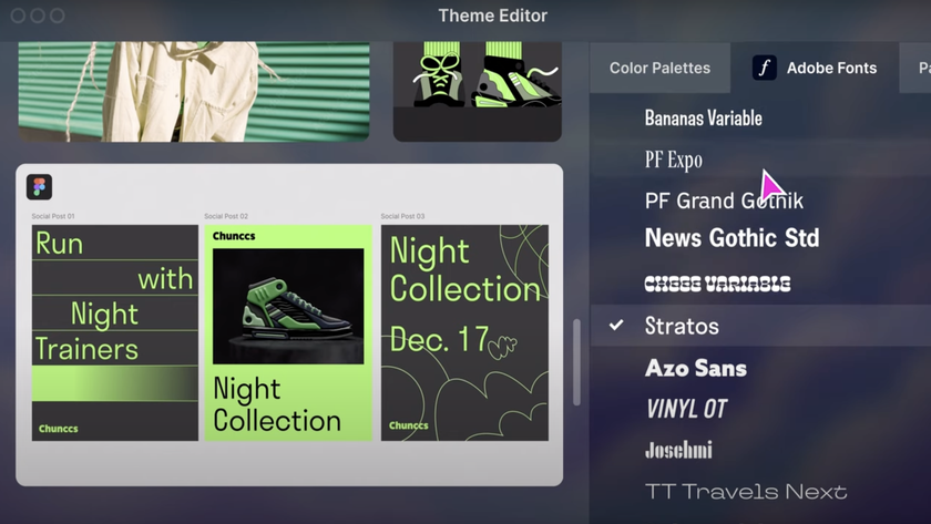
One of the features the team is particularly proud of is Illustrator on the iPad’s type engine. Users will be able to access all 17,000 Adobe Fonts from within the tool, and try them out in their designs instantly. “Type is crucial for this tool, and getting Adobe Fonts onto the iPad is a big part of that,” says Snowden.
Because sorting through several thousand fonts is a little intimidating to say the least, the team is busy refining different filters and search functions to make it nice and painless. As well as traditional design classifications (serif, script and so on), the tool will also offer mood-based classifications such as ‘fancy’ or ‘clean’ fonts. You’ll be able to choose how you want to search.
Fear not though, all these fonts aren’t actually on the device. “We’re not actually downloading 17,000 fonts onto your poor iPad,” smiles Snowden. You’ll be able to preview and experiment with the fonts, and then click on one to download it from Adobe Fonts from within Illustrator. The aim is to take the pain out of what can be a tedious process.
“As a user you’re not thinking about activation and curation, you’re just working the way you’d normally work,” he continues. “It’s just like you have this amazing font superpower you didn’t have before.”
05. Create and manipulate symmetrical designs
The demo that got the most enthusiastic audience response during the MAX keynote was on the symmetry functions. The presenter showed off a range of different tools for creating and manipulating symmetrical designs, whether that’s mirrored or radial. Perhaps the most impressive thing about it was how smooth and responsive these tools were – all edits appeared instantly across all instances of the object.
“We’re really focused on making this incredibly performant,” says Snowden. “Even when you’re using multiple repeats inside each other, we’re still getting this really great performance.”
06. Keep your canvas super-clean
One of the challenges of designing for the iPad screen, especially assuming the user hasn’t hooked up a keyboard, is making all the different options and tools available without cluttering up the entire canvas with menus. The solution the team came up with was to display different options based on the context of what the user is doing.
“From UI perspective we’re really looking at progressively disclosing things,” says Snowden. "We’re showing you the things you need to see when you need to see them.”
There are essentially three levels of control. So with an object selected, you’re first shown basic actions such as Duplicate and Delete, and you can click through to slightly more involved manipulations, such as changing the opacity, or stroke width. Or if you want high-level finessing, you can go into the Properties panel and carry out pixel-precise manipulations.
The team wanted to offer different ways of working with the tool: one for ideation, and one for precision work. “If you’re in the ideation phase, you’re probably mostly on the canvas, working very quickly,” says Snowden. Those users can play around freely without things cluttering up their creative workspace. Then to refine the design, you need to get much more exact with your measurements. “When you get into production mode you need precision. You have these exact controls.”
Sign up for private beta
A dedicated tablet version of the software is overdue, and Adobe promises a tool that brings the precision and versatility of the desktop experience to the iPad. Adobe is working with the global Illustrator community to develop the tool. It’s currently running an exclusive private beta, which you can sign up to here.
Adobe promises seamless connection across devices, with no loss of detail. So you’ll be able to pick up your desktop Illustrator design and work on it on your iPad while you’re out and about, saving your changes to the cloud.
Adobe also says the tool will be powerful and precise, so you’ll be able to use it to create complete illustrations, from start to finish. However, the first version of Photoshop on iPad is not a complete version, so we expect this full-fat iPad version of Illustrator might also take a while to materialise.
Read more on the official Adobe blog.
Relates articles:

Thank you for reading 5 articles this month* Join now for unlimited access
Enjoy your first month for just £1 / $1 / €1
*Read 5 free articles per month without a subscription

Join now for unlimited access
Try first month for just £1 / $1 / €1
Ruth spent a couple of years as Deputy Editor of Creative Bloq, and has also either worked on or written for almost all of the site's former and current design print titles, from Computer Arts to ImagineFX. She now spends her days reviewing small appliances as the Homes Editor at TechRadar, but still occasionally writes about design on a freelance basis in her spare time.
