Do these iconic album makeovers improve on the originals?
Classic album artwork reimagined.

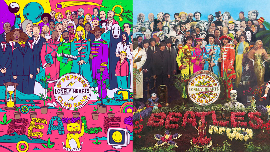
Imagine if the classic Beatles album Sgt. Pepper’s Lonely Hearts Club Band cover art was redesigned for 2019. What would it look like? What would you want it to look like? Should such a classic cover even be tampered with? A design experiment by freelance platform Fiverr sought to find out, reimagining this album along with 11 other classics.
German artist, TrippieSteff, has redesigned the Beatles cover to make it relevant for the 21st century. (If you want to do something similar make sure that you check out our best Illustrator brushes post, or our Photoshop tutorials).
Gone are the likes of Oscar Wilde, Marilyn Monroe, Laurel and Hardy, Karl Marx and Lewis Carroll. All have been replaced with modern day influencers, thinkers, politicians and celebrities, including activist Greta Thunberg, ex-president Barack Obama, singer Beyoncé, Tesla CEO Elon Musk and chef and restaurateur Jamie Oliver.
But, perhaps more controversially the Beatles themselves have been removed. Who have these musical gods been replaced with? Taylor Swift is the new Paul McCartney and Kanye West is a modern day John Lennon. We'll let you make your own mind up on those choices. George Harrison and Ringo Starr have been replaced by Drake and Lil Nas X.

Sgt. Pepper’s Lonely Hearts Club Band is just one in a series of 12 reimagined classic album covers from Fiverr graphic designers and artists. Included in the collection are Blondie’s Parallel Lines, Nirvana’s Nevermind, Pink Floyd's Dark Side of the Moon and Joy Division's Unknown Pleasures.
We're not really into the animated Parallel Lines remake, but we are loving the cutesy nature of the new look Dark Side of the Moon. You can make your own mind up by scrolling down to see the complete reimagined collection, with each individual designer giving their creative reasoning behind the redesign. Let us know which ones you love/hate on Twitter.
Nirvana - Nevermind

Brought together by gagadesign, the redesign sticks closely to the original in colour and concept, with the artist adding social comment by including a phone. “We have a parent who is not only approving this culture of chasing money, but it also proudly films the baby, with the intention to share it on social media to gain likes which are becoming the new supreme goal,” says the artist.
David Bowie - Aladdin Sane

Designer jetzon from Chile takes a drastic redirection with no Bowie in this redesign, but keeps the lightning symbol. “The podium reflects the influence that an artist has on a crowd. It is symbolic of their need to feel seen and be heard. The empty podium symbolises the anticipation spectators have waiting for the person to come out.”
Get the Creative Bloq Newsletter
Daily design news, reviews, how-tos and more, as picked by the editors.
Bruce Springsteen - Born In the U.S.A

Canadian designer boxofwolves says goodbye to this album's bum and focuses on the US flag and national flower. "The red rose is the national flower. I don’t like to have one gender or race represent a group of people, especially a diverse country like the U.S," says boxofwolves. "So I took a dark grey headless figure and had the rose be the face, with the American flag wrapped around it, representing how America has blossomed into the highly diverse society."
Prince - Purple Rain

Influenced by the artist formerly known as Prince, designer dvincentgomez from Brazil was keen on adding energy. We're not so sure about the flower pattern edge. "I love the space tones used a lot in his songs, and it's something that has always been very present in my work. So I wanted to make this mix of the original concept, mixing with elements of my work that have the same rhythm of the songs.”
Elvis Presley - Elvis Presley

Designer lizardsalt adds colour, soul and energy to a classic, but it hardly says 2019. “The inspiration for this design was for it to be a Pablo Picasso style meets a colourful psychedelic vintage comic book aesthetic," says the designer. "Elvis in this cover has such a powerful, passionate expression, and I wanted to display his emotions in colour and shape.”
Velvet Underground - Velvet Underground

Reimagined by designer Georgefairbairn, this really does take an album from the '60s into the present day. “I wanted to modernise his (Andy Warhol) iconic work whilst keeping it true to its original self. Bringing movement to it and adding complementary colours is something Warhol started doing himself and something I draw inspiration from.”
Pink Floyd - Dark Side of the Moon

Argentinian designer melinarobledo wanted to add context to Pink Floyd's classic. We're not so sure they did but we still love its cute aesthetic. “I think my greatest challenge here was to add some sort of context to that iconic picture of the prism. So, I started thinking outside the frame and came up with this idea where the prism itself could be playing around with lights and hallucinating with the results."
Joy Division - Unknown Pleasures

This redesign is by Indonesian designer tonymidi, and has us wondering whether some covers should simply be left alone. "Listening to this album, you feel a deeper understanding for Ian Curtis’ life and the struggles he went through over the course of his career," says tonymidi. "When I look at this album cover, I see how it captures beauty and mystery, but I also see how this can represent a heartbeat and vision, where the heartbeat and eye become one.”
Supertramp - Breakfast in America

Redesigned by Leonardo_araujo, the new look to Supertramp's album adds a little humour with breakfast cereal. “I read that the original album cover was originally supposed to include Cheerios in the Grand Canyon. In order to honour that concept, I decided to put that in my version of the cover as well.”
Blondie - Parallel Lines

Designer viz_a_viz wanted a contemporary feel for this album. “We added the rainbow colours to the Blondie cover, with each member of the band wearing an individual colour. The rainbow often represents diversity and we wanted to make a statement that the world is more fluid today.”
NWA - Straight Outta Compton

This is a rap classic redesigned by lannyhoang, and is perhaps lacking real intensity. “N.W.A’s stance and history with police brutality reminded me of what’s happening to black men, women and children today. I wanted to visualise what it’s like to stand up against the police, which often seems like a very large shadow that must be overcome," says the artist.
Read more:

Thank you for reading 5 articles this month* Join now for unlimited access
Enjoy your first month for just £1 / $1 / €1
*Read 5 free articles per month without a subscription

Join now for unlimited access
Try first month for just £1 / $1 / €1
Steven Jenkins is a freelance content creator who has worked in the creative industry for over 20 years. The web and design are in his blood. He started out as a web designer before becoming the editor of Web Designer magazine and later net magazine. Loud guitars, AFC Bournemouth, Photoshop, CSS, and trying to save the world take up the rest of this time.
