How to design a handwriting font that isn't boring
Give your lettering some spontaneity with this expert advice.
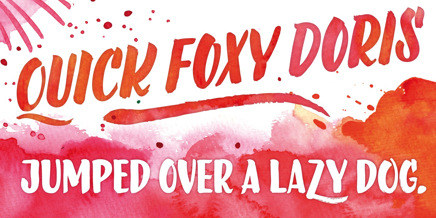
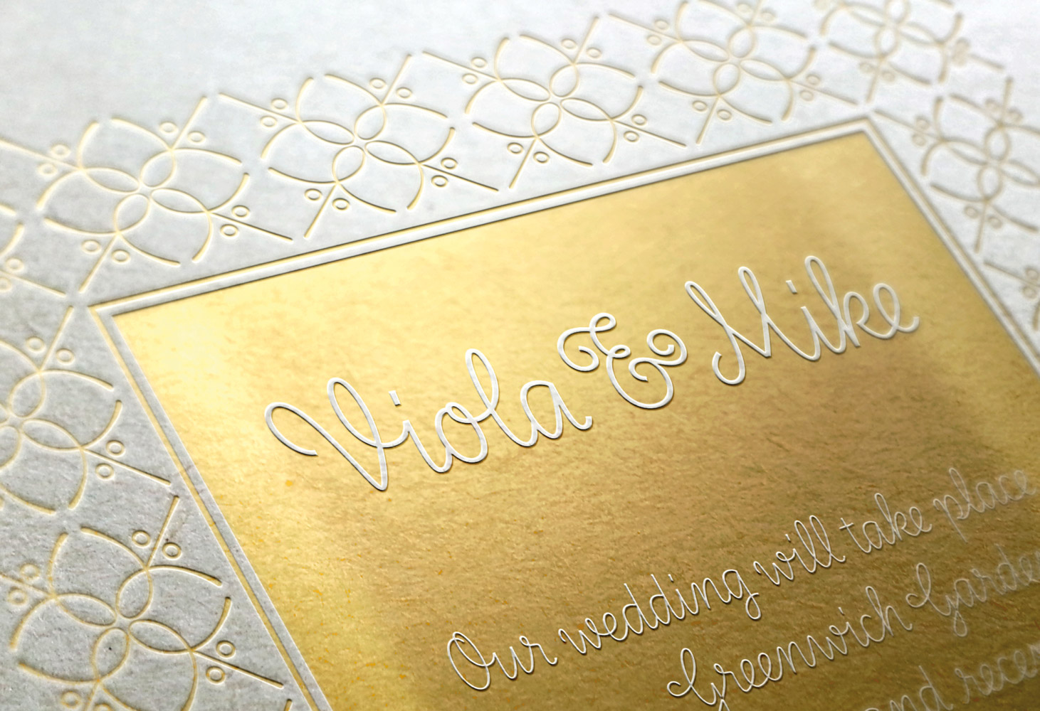
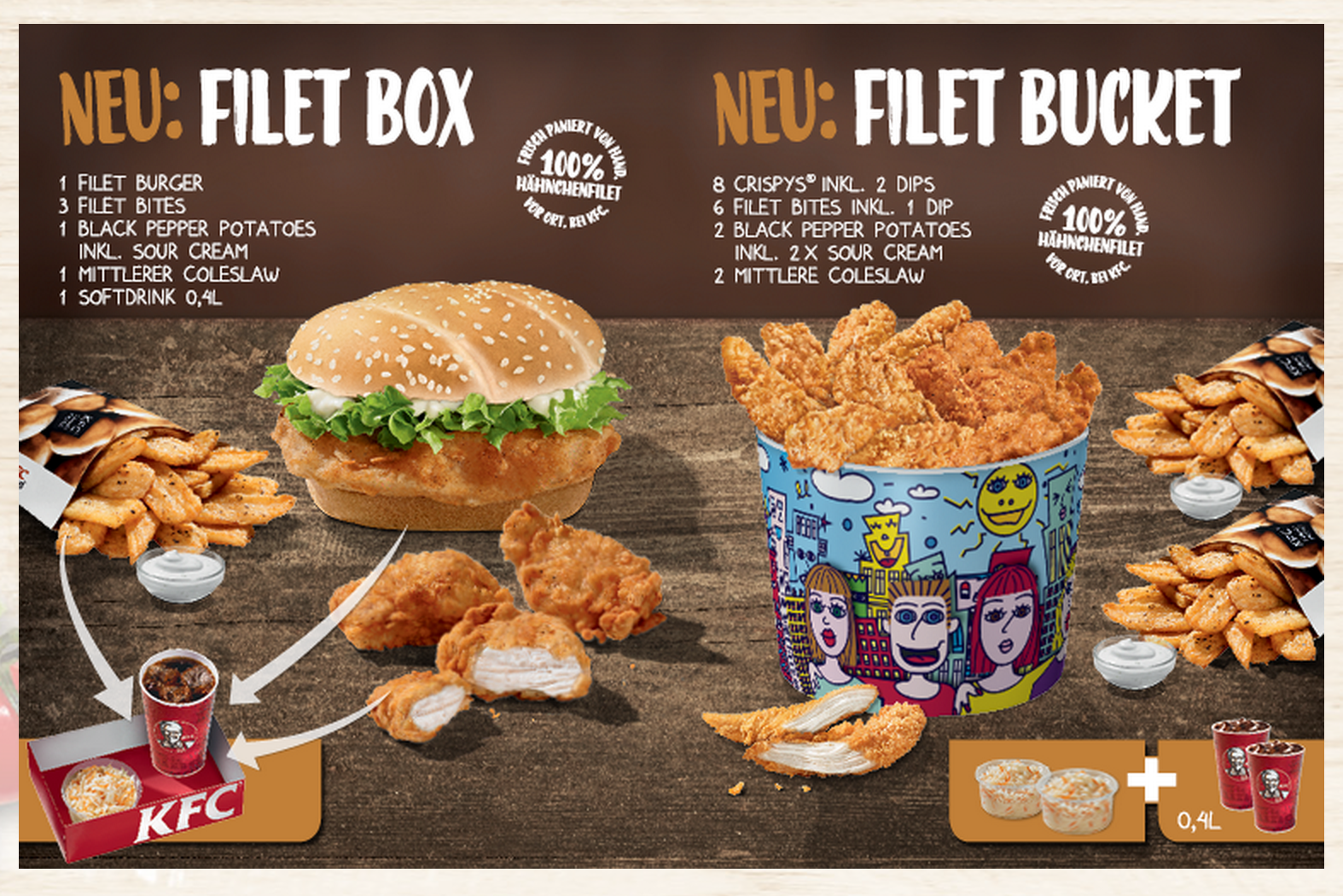
Ulrike Rausch is a type designer and letterer, and the founder of her own type foundry, LiebeFonts. Her studio is dedicated to crafting handwriting fonts with love, with the likes of KFC using her lettering to give its branding a personal touch.
In her talk at TYPO Berlin 2018 (tune in to the livestream here), Rausch shattered some of the romantic illusions surrounding font design and pointed out that handwritten fonts can go from unique to boring very quickly if they’re used unimaginatively.
So how do typographers keep their work fresh? In her talk, 'Brush, Ink and Code - The Making of a Font', Rausch revealed some advice for combining digital know-how with traditional methods in order to create a handwritten font with a sense of individuality.
Here are some of the key tips from the talk, which Rausch says help “preserve the liveliness of irregularities.”
01. Create handwritten alternatives

Repetition of letter shapes can kill the charm of a handwritten font dead in the water. After all, even the neatest human handwriting contains subtle idiosyncrasies between one use of a letter and the next. Why should handwriting fonts have an uncanny sense of uniformity about them?
One way around this is to create handwritten alternatives. This is what Rausch did for her KFC lettering, with the project taking around a year and a half to complete thanks to this extra level of effort with the type design. By creating different variations of each letter by hand, the branding team had the flexibility to shake-up the lettering in its marketing and stop the font from becoming stale.
02. Use OpenType features

If there was one message Rausch was keen for typographers to take away from her talk, it was to use OpenType features. If you’re unfamiliar with OpenType features, don’t worry. According to Rausch, design software tries its hardest to hide these features from its users.
Get the Creative Bloq Newsletter
Daily design news, reviews, how-tos and more, as picked by the editors.
So what are they? Put simply, they’re a series of tools that make fonts look and behave differently, which is perfect for changing characters in handwritten fonts. When used with a batch of handwritten alternatives, OpenType features, in particular the contextual alternate feature, are a way of jumbling up the occurrence of a letterform.
There’s a lot of scope for flexibility with OpenType features. For example, they can be programmed to sniff out repetitions of a letter shape that appears twice in a row, or multiple times in the same sentence. Perfect for keeping handwritten fonts lively.
03. Make sure the client uses the features

If OpenType features are hard for designers to find and use, just think how difficult it is for clients with no typography skills. For Rausch, her KFC lettering was sure to be the pride of her portfolio, with the alternate lettering set to spice up the fast food chain’s marketing.
This wasn’t quite the case. When she saw it in reality, the lettering had that handwritten yet uniform look she dreaded. The reason? KFC had not turned on the OpenType alternate features option when it came to writing out its branding messages.
04. Beware the glyph palette

Even if you’ve been extra careful and alerted the client to the OpenType alternate features, this doesn’t mean you’re home and dry yet. That’s because each piece of design software, as well as making OpenType features hard to find, apparently doesn’t make them straightforward to use, either.
One particular glitch Rausch pointed out could be found in the glyph palette. If this is opened up while working with a set of alternate fonts it has the annoying habit of turning off the contextual alternate feature. Definitely one to point out to your client before you see your hard work become another repetitive handwritten font out out in the wild.
Related articles:

Thank you for reading 5 articles this month* Join now for unlimited access
Enjoy your first month for just £1 / $1 / €1
*Read 5 free articles per month without a subscription

Join now for unlimited access
Try first month for just £1 / $1 / €1

Dom Carter is a freelance writer who specialises in art and design. Formerly a staff writer for Creative Bloq, his work has also appeared on Creative Boom and in the pages of ImagineFX, Computer Arts, 3D World, and .net. He has been a D&AD New Blood judge, and has a particular interest in picture books.
