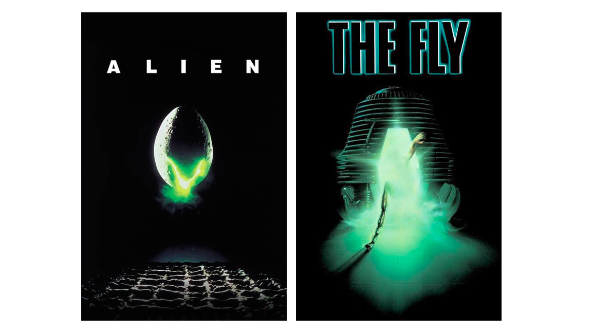
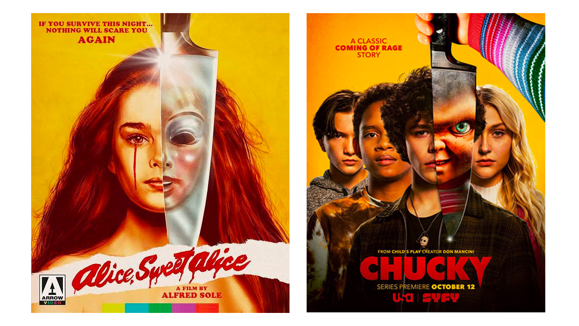
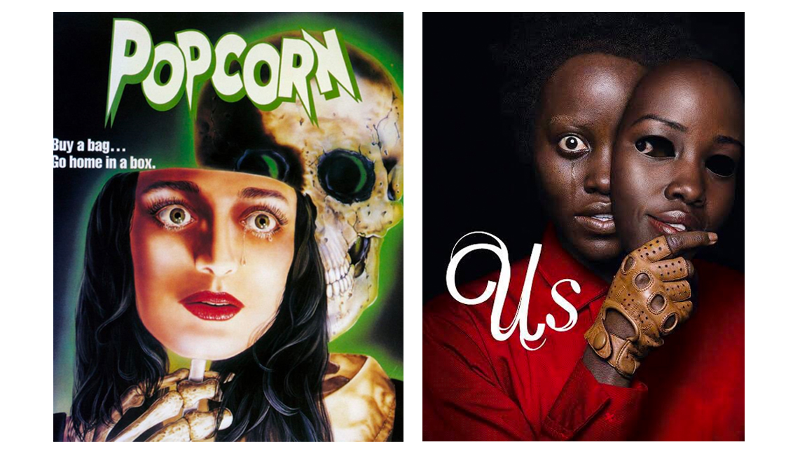
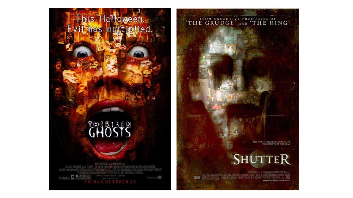
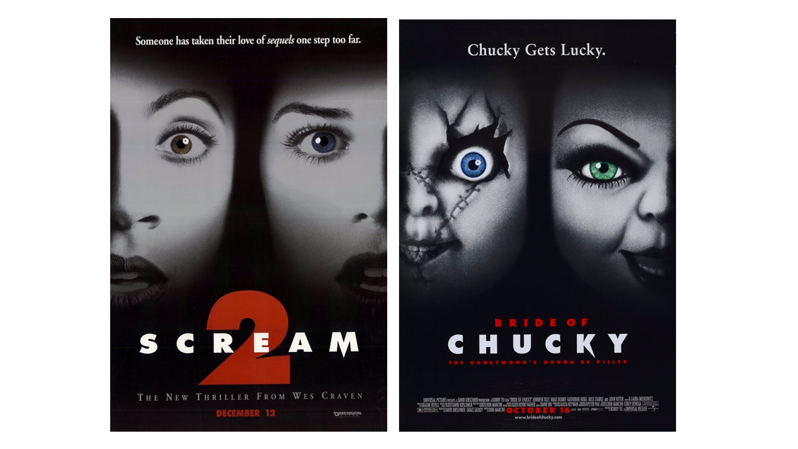
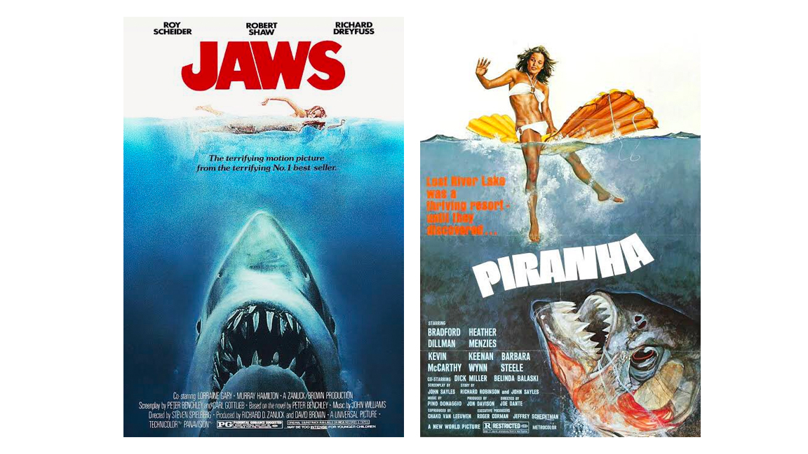
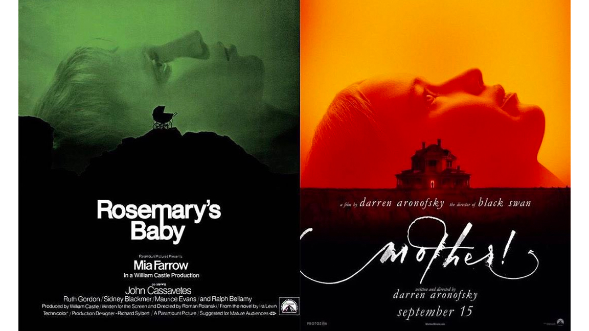
There's a fine line between a design fail and flattery, but when it comes to the horror genre there's an unspoken rule that replicating the look of a classic movie film poster for your post-modern slasher is, well… essential.
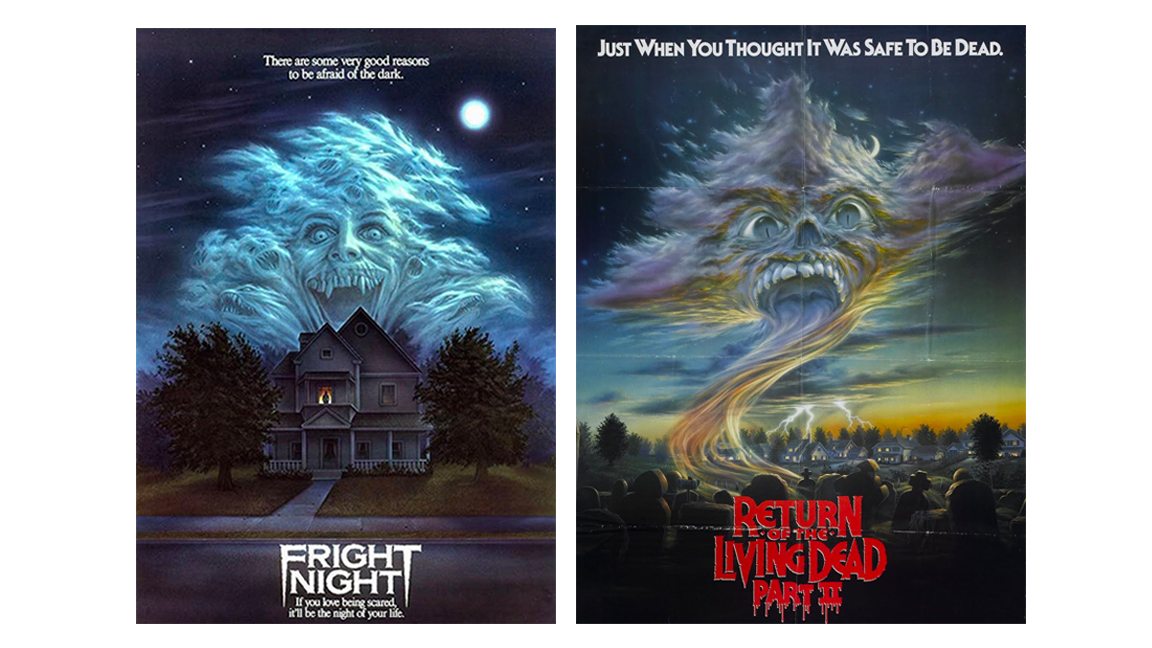
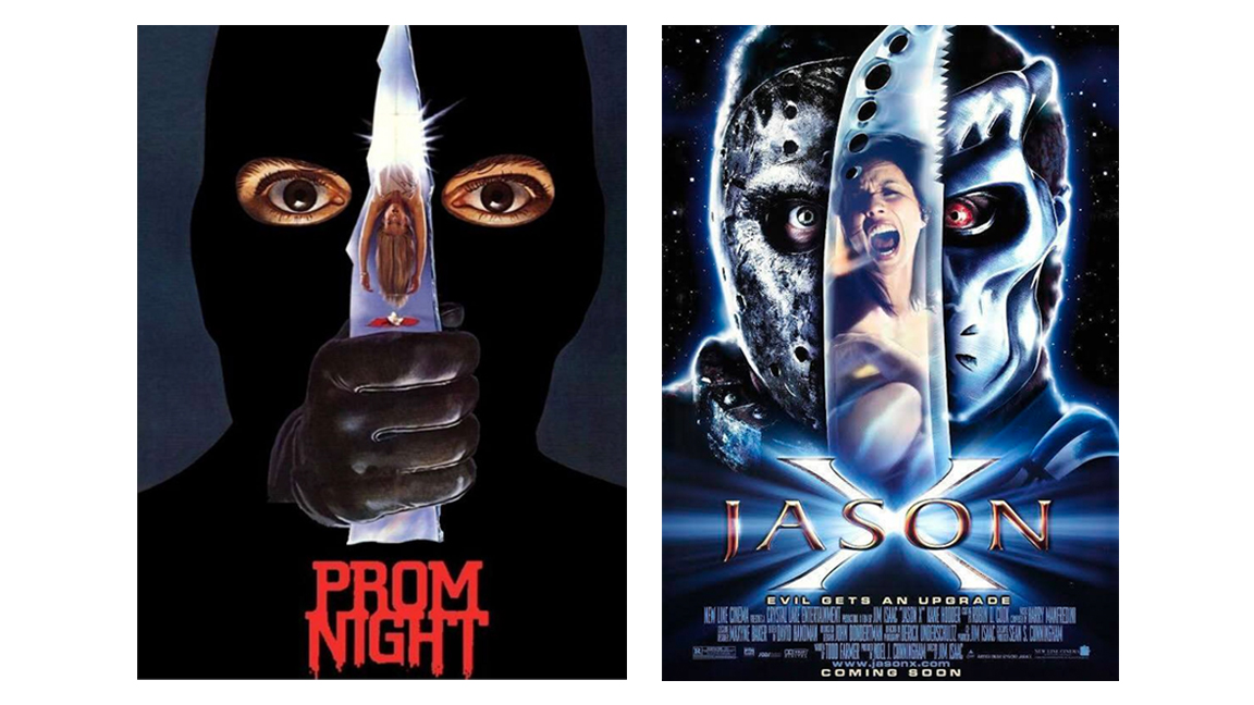
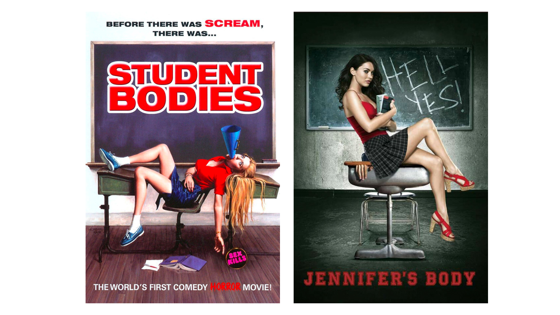
While Scream may have kickstarted the love-in for self-referential horror tropes, the posters below reveal that imitating the design of a popular films to sell a new movie in a similar vein has been a staple of the horror genre for decades.
While we may be asking 'Why does every movie poster design look like this?' when it comes to some lazy modern choices, for horror movies it's all about letting the audience know that you know – the best horror movies tend to be made by people who love the genre. Take a look below at some of the best movie posters that appeared in Twitter account The Vampire Show , which shared a thread of the best horror film like-by-like poster designs. Some are clearly homages, some common designs, and maybe one or two are just shocking imitations.
Read more:
- A designer's guide to printing a poster
- HBO Max's censored movie posters look kind of ridiculous
- How iconic fantasy film posters were made
Get the Creative Bloq Newsletter
Daily design news, reviews, how-tos and more, as picked by the editors.

Thank you for reading 5 articles this month* Join now for unlimited access
Enjoy your first month for just £1 / $1 / €1
*Read 5 free articles per month without a subscription

Join now for unlimited access
Try first month for just £1 / $1 / €1

Ian Dean is Editor, Digital Arts & 3D at Creative Bloq, and the former editor of many leading magazines. These titles included ImagineFX, 3D World and video game titles Play and Official PlayStation Magazine. Ian launched Xbox magazine X360 and edited PlayStation World. For Creative Bloq, Ian combines his experiences to bring the latest news on digital art, VFX and video games and tech, and in his spare time he doodles in Procreate, ArtRage, and Rebelle while finding time to play Xbox and PS5.
