The Coca-Cola bottle is recognised all over the world. At various times described as the 'hobbleskirt' or 'Mae West' bottle for its curved contours, it's seen a few tweaks over the years. But, incredibly, despite the addition of new forms of packaging, the general shape of the original glass bottle remains in use more than a century after it was designed.
But spare a thought for the designers who got the original brief. While creatives today sometimes struggle with a lack of specifics and clients who expect them to be telepathic, the request put out by Coca-Cola in 1915 was as stunningly succinct as it was ambitious. The result was a design that's appeared in some of the best billboard advertising.
A Reddit member recently shared a photo of the 1915 Coca-Cola bottle design brief as displayed on a wall at the World of Coca-Cola museum in Atlanta. According to the brand, it asked the companies that competed to design the bottle for nothing less than a bottle “so distinct that it could be recognised by touch in the dark or when lying broken on the ground.” Bold and concise, the brief has reignited a debate about design briefs (and much more) in the comments.
Some praise the brevity of the brief, which gives a huge amount of freedom to the designer. "If only briefs were as succinct as this today. Now there’s 4-5 pages of assumptions, out of scope items, deliverables etc. A lot of overthinking goes into them," one person writes. But others say they would be pulling their hair out if they received a brief so scant on detail or guidance.
Some have commented on how well the winning Coca-Cola bottle design responded to the brief. "Making an object distinct is an easy enough task. Making it distinct, familiar (it's clearly a bottle for drinking) AND practical is quite another," one person notes.
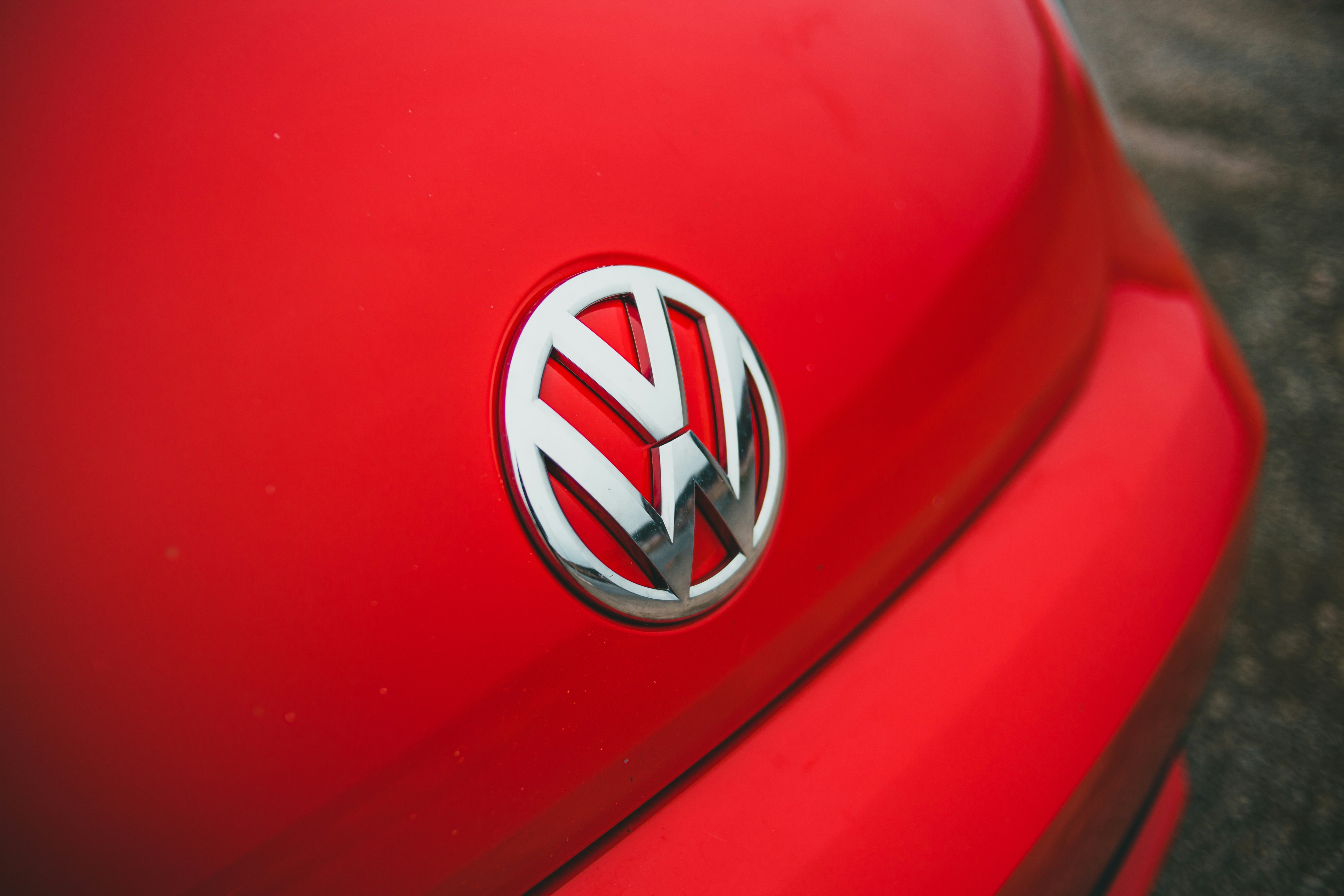
The Coca-Cola bottle remains in use today (Image credit: Coca-Cola)
The winning design for the Coke bottle had several benefits for the company. It made the brand more difficult to imitate, and it made it easier to recognise without a label (and labels would sometimes fall off back when bottles were often sold from barrels of iced water). But, along with the Coca-Cola logo, it became an integral part of one of the world's most recognised brands.
Some disagree about how much of this is down to the design. "While it must have been a pretty good design for its time, it seems that literally anything you invented in 1915 hadn't been thought of before. So many low hanging fruit inventions to pick," one person said. Others suggest that there are plenty of unique bottles around and that the Coca-Cola bottle is so recognisable merely because of its ubiquitous presence in the brand's advertising.
Get the Creative Bloq Newsletter
Daily design news, reviews, how-tos and more, as picked by the editors.
I also wonder why Coca-Cola was so keen for its bottles to be recognisable when they lie broken on the ground. That instruction might not make it to the brief today when it highlights a brand's contribution to waste.
The history of the Coca-Cola bottle
The evolution of the Coca-Cola bottle (Image credit: Coca-Cola)
Like most drinks at the time, Coca-Cola was originally sold in straight-sided bottles when it first made the move from soda fountains. The bottles were embossed with logos, while later designs added labels. There was a problem with this approach, though.
Similar-sounding competitors proliferated, including Koka-Nola, Ma Coca-Co, Toka-Cola and Koke, and they often copied or only slightly modified Coca-Cola's Spencerian script logo. The company sued them, but the cases took time to pursue and bottlers wanted more protection.
According to to Coca-Cola, on 26 April, 1915, the Trustees of the Coca-Cola Bottling Association voted to spend the sum of $500 to develop a distinctive bottle. At least eight glass companies were invited to compete to create the design, receiving the succinct brief above. The winning design came from the Root Glass Company in In Terre Haute, Indiana.
Andy Warhol painted the Coca-Cola bottle many times (Image credit: Andy Warhol at Whitney Museum of American Art)
The company's team comprised C.J and William Root, Alexander Samuelson, Earl Dean and Clyde Edwards. Their design is said to have been inspired by an image of a cocoa bean that they found on research trip to a local library. Dean took the bean's elongated shape and distinct ribs to inspired the shape of a bottle that he initially sketched on linen paper. They then filed a patent registration for the bottle without the inclusion of the Coca-Cola script in order to conceal the identity of the end client.
The bottles were originally green and came with the name of the city that placed the order embossed on the base. The company initially had to convince bottlers to invest in making the switch to the new design. Some stuck with the previous bottles for a time due to the cost, but by 1918 Coca-Cola was promoting the unique bottle design heavily with calendars and ads. By 1920, most bottlers were using a design that became so recognisable it was painted by Andy Warhol and described by industrial designer, Raymond Loewy as the “perfect liquid wrapper".
Joe is a regular freelance journalist and editor at Creative Bloq. He writes news, features and buying guides and keeps track of the best equipment and software for creatives, from video editing programs to monitors and accessories. A veteran news writer and photographer, he now works as a project manager at the London and Buenos Aires-based design, production and branding agency Hermana Creatives. There he manages a team of designers, photographers and video editors who specialise in producing visual content and design assets for the hospitality sector. He also dances Argentine tango.