Hilarious sketch pokes fun at Avatar's Papyrus logo
Did the expensive film have a cheap design budget?

Have you ever looked at a logo design and just been floored at how basic it is? Dumbfounded by the sheer audacity of the designer who apparently just typed up some text, selected a distinctive font then called it a day? There are plenty of designs out there that look too simple to be true, but this brilliant sketch about Avatar’s Papyrus logo pushes the idea of apparently lazy logos to the limit.
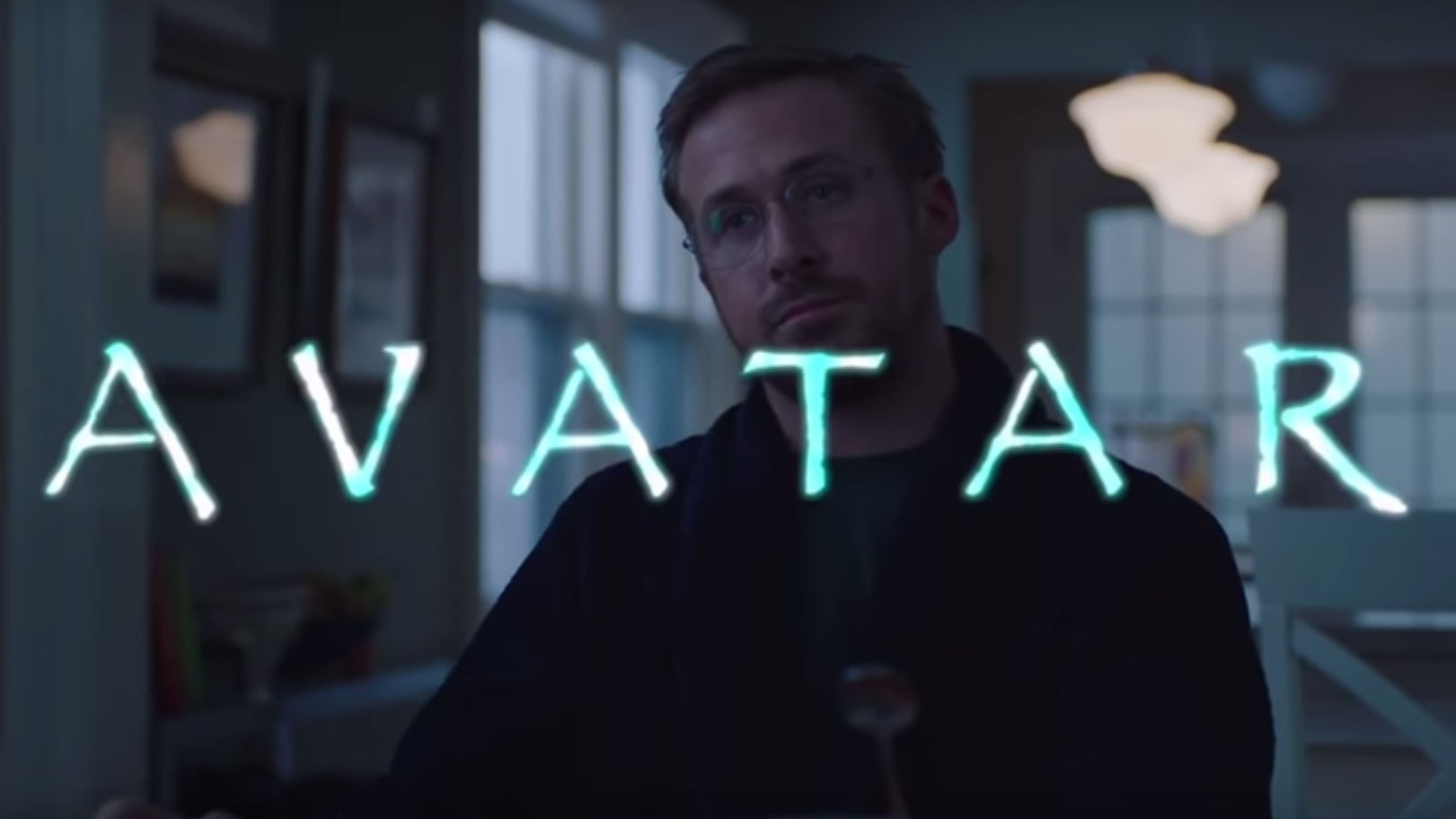
In the sketch, which was broadcast on a recent edition of American comedy show Saturday Night Live, host Ryan Gosling plays a man frustrated by the logo of James Cameron’s 2009 blockbuster Avatar.
Unable to sleep, haunted by visions ‘Avatar’ written in Papyrus font, Gosling’s character seeks professional help before hunting down the monster that designed the branding for the film. Watch it below.
Over the years we’ve posted a fair few new logo stories here on Creative Bloq that have met with a critical response. And thanks to the inhuman filter that's the social media comments section, we can say that based on that feedback, the actions in this sketch aren’t entirely unrealistic.
We’ve heard from keyboard critics slamming simple designs for their apparent laziness. And when it comes to font choices, let’s just say it's a very contentious issue.
The makers of this sketch are clearly aware of some of the heated opinions among the design community. At the end of the sketch they spell out 'Papyrus' in the font that designers love to hate (or defend, really, it could go either way knowing you lot), Comic Sans.

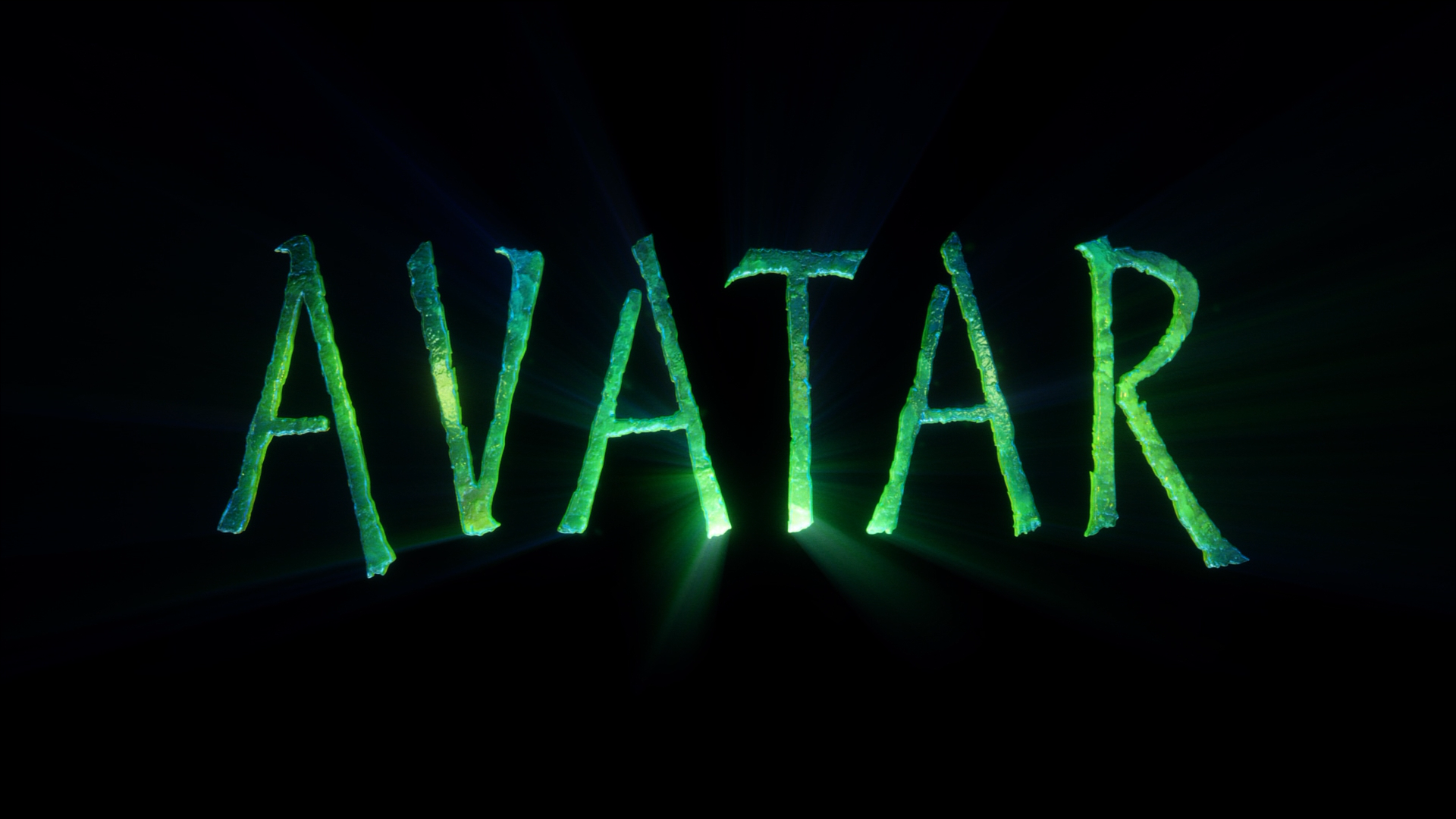
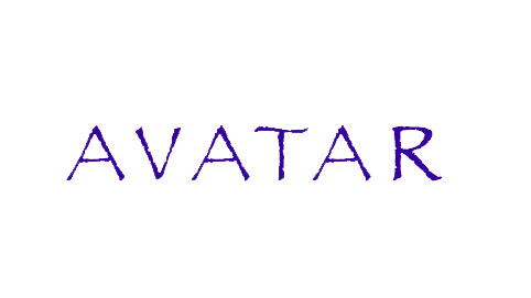
So, is the Avatar logo really just made by slapping Papyrus onto the title? Well, yes and no. Judging by the title card at the end of the 2009 film (above), it has been tweaked ever so slightly from how it would look from a straightforward font selection (below) to make it a bit unique. But only a bit. There's an uncanny resemblance to say the least.
Get the Creative Bloq Newsletter
Daily design news, reviews, how-tos and more, as picked by the editors.

Either way, designers are sure to get a chuckle out of this clever sketch. And don't feel too sorry for the creator of Papyrus, Chris Costello. He's got a good sense of humour and can appreciate where the sketch is coming from, as he told CBS News.
"I woke up this morning Sunday and my email was full," he revealed. "I had a lot of people telling me, ‘Did you see this ‘Saturday Night Live’ thing?’ I took a look at it and me and my wife were like cracking up, I mean we couldn’t stop laughing. It was one of the best things I’ve seen.
"I designed the font when I was 23 years old," he adds. "I was right out of college. I was kind of just struggling with some different life issues, I was studying the Bible, looking for God and this font came to mind, this idea of, thinking about the biblical times and Egypt and the Middle East. I just started scribbling this alphabet while I was at work and it kind of looked pretty cool. I’m a graphic designer as well, I’m an illustrator … I believe it’s a well-designed font, it’s well-thought [out].”
Related articles:

Thank you for reading 5 articles this month* Join now for unlimited access
Enjoy your first month for just £1 / $1 / €1
*Read 5 free articles per month without a subscription

Join now for unlimited access
Try first month for just £1 / $1 / €1

Dom Carter is a freelance writer who specialises in art and design. Formerly a staff writer for Creative Bloq, his work has also appeared on Creative Boom and in the pages of ImagineFX, Computer Arts, 3D World, and .net. He has been a D&AD New Blood judge, and has a particular interest in picture books.
