Hilarious parody posters reveal the truth behind Oscar-nominated movies
Posters get brutal.
The Oscars ceremony is almost upon us. If you're not quite clued up on the movies leading the nominations this year, we invite you to join us in our favourite guilty pleasure: TheShiznit's annual collection of honest Oscar-nominated movie posters. This is the 10th edition of 'If Movie Posters Told the Truth', and they're as top quality as ever.
Shoddy mockups these are not – creator Ali Gray has gone to the trouble to match the fonts, balance the layouts and keep the colour schemes, all whilst delivering the most cutting put-downs. Heck, we think you could swap these parody posters in for any of the official efforts at your local Odeon and it'd take a good week or two before anyone noticed. (See our roundup of Photoshop tutorials if you want to replicate Gray's efforts.)
Judging from his introduction, Gray seems to be having something of a personal crisis right now – "I have forced the movies tell the truth, even though the concept of truth is now meaningless. I'm writing on the face of God. Does that make me God? Yes, yes it does" – but that hasn't impacted on the quality of this year's takedowns. And, as he says, no one ever reads introductions anyway.
For more info on the Oscars themselves, check out our sister site GamesRadar's full rundown of Oscars nominations 2020 (or the biggest Oscars snubs from this year's list). Alternatively, read on for our favourites from this year's honest movie posters.

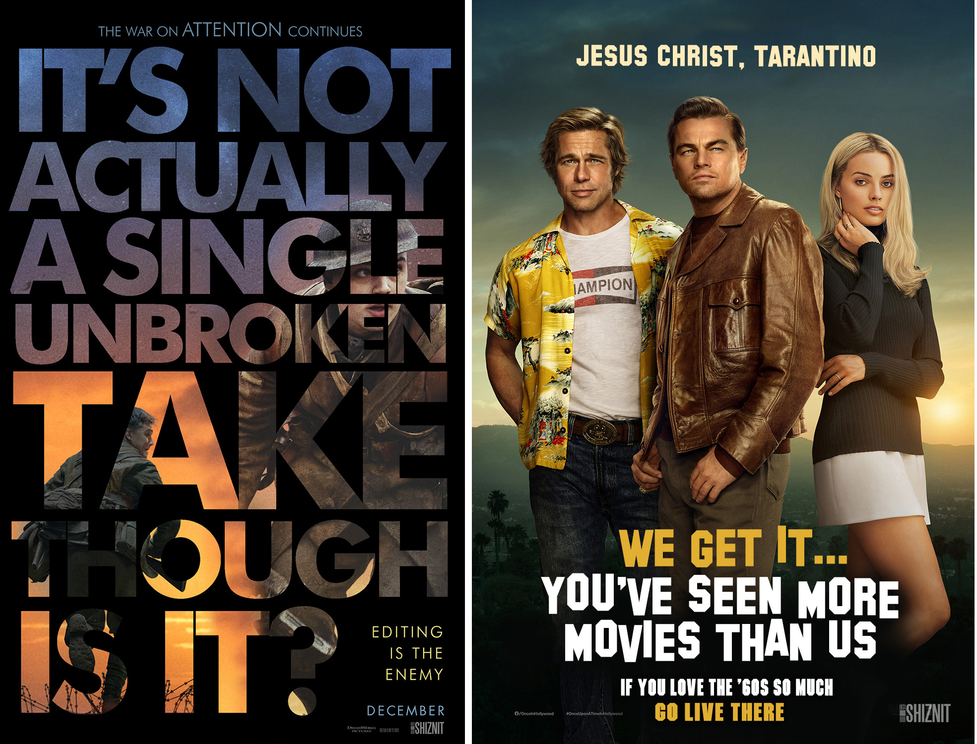
Sam Mendez's 1917 is a powerful WWI story with a mammoth stylistic triumph up its sleeve: it was filmed as one, epically long, unbroken shot. Or it looks that way, anyway. The truthfulness of the movie's big USP comes under fire in TheShiznit's poster parody (above, left). There's also a cheeky nod to dwindling attention spans, and the challenges of such an approach for the poor, distractible audiences.
Quentin Tarantino's much anticipated Once Upon a Time... in Hollywood thrilled many and bored almost as many to tears. But its makers were certainly laughing when it came to Oscar shortlist time – it's nominated in a whopping 10 categories (the same as 1917). There have been a few criticisms thrown at the movie, including that there is no storyline to speak of for at least the first two hours, but TheShiznit's poster (above, right) offers a gentle ribbing about the vast number of niche and nerdy movie references Tarantino manages to pack into his tale of Tinseltown.

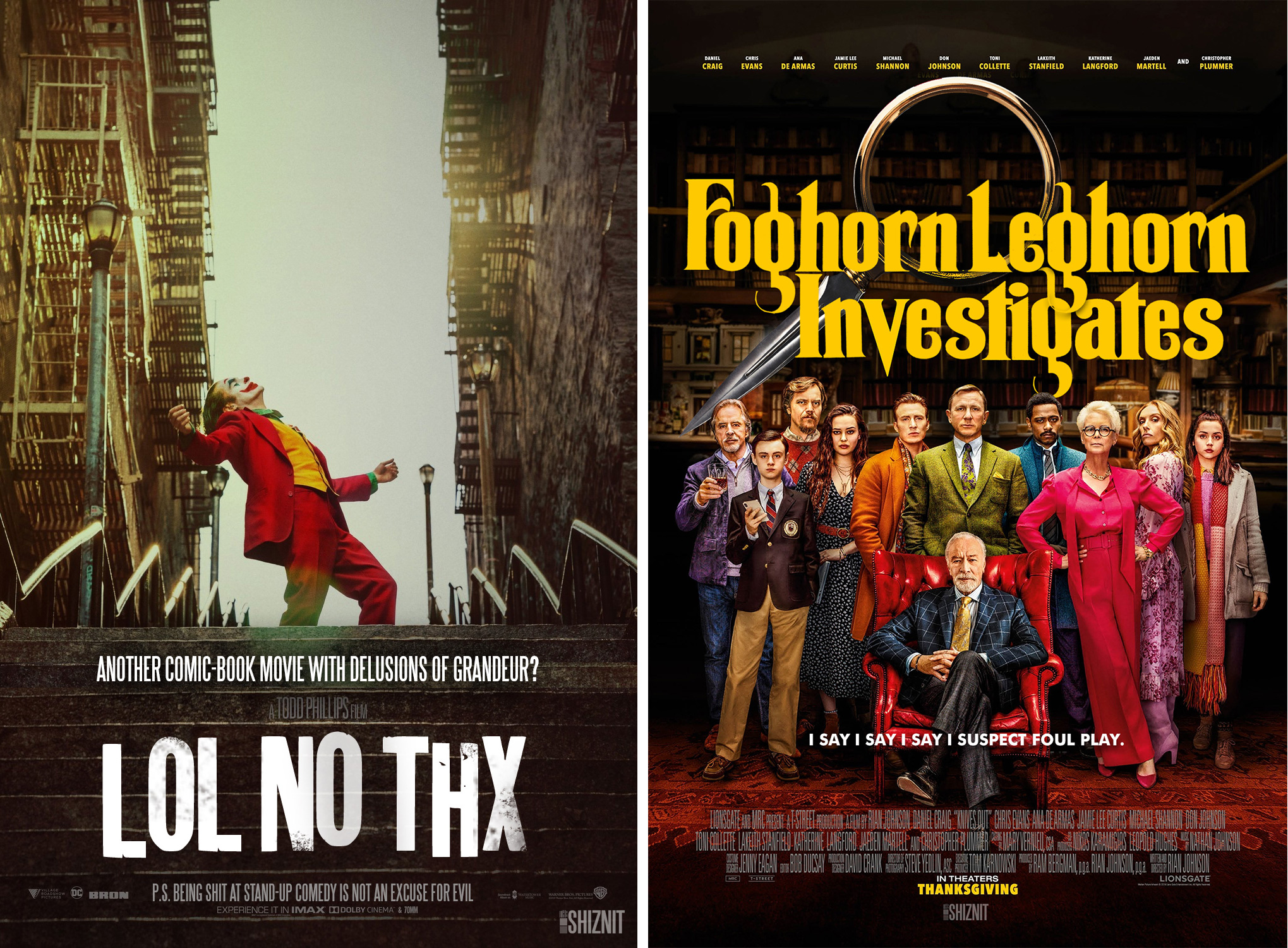
For Joker, director Todd Phillips seems to have set out to make a superhero movie that's as unenjoyable to watch as is humanely possible. That's not to say it's not a valuable and impressive bit of movie-making, as those 11 Oscar nominations will attest. TheShiznit takes issue with this comic book film's seriousness in its honest poster (above, left), and also has an important message for Arthur Fleck (that's the Joker day-to-day, if you're not up to speed) in the strapline.
Get the Creative Bloq Newsletter
Daily design news, reviews, how-tos and more, as picked by the editors.
Finally, there's Knives Out, Rian Johnson's hugely entertaining whodunnit, which is up for Best Original Screenplay. It's all wonderfully ridiculous, but nothing more so than Daniel Craig's droning southern accent as Benoit Blanc. The private detective may have Bond's face, but that voice is pure Looney Tunes.
That's just a taster, so make sure you check out the full range of posters, including a Jo-Jo Rabbit effort with some incredible cringeworthy puns. And if you haven't tired of laughing at critically acclaimed movies, you can also explore last year's honest movie poster series.
Read more:

Thank you for reading 5 articles this month* Join now for unlimited access
Enjoy your first month for just £1 / $1 / €1
*Read 5 free articles per month without a subscription

Join now for unlimited access
Try first month for just £1 / $1 / €1

Ruth spent a couple of years as Deputy Editor of Creative Bloq, and has also either worked on or written for almost all of the site's former and current design print titles, from Computer Arts to ImagineFX. She now spends her days reviewing small appliances as the Homes Editor at TechRadar, but still occasionally writes about design on a freelance basis in her spare time.
