This guide highlights everything that's wrong with modern branding
The Bland Book is a parody branding deck that takes a swipe at dull guidelines.

Sometimes creative briefs can get a bit, well, boring. After all, there are only so many times designers can read the same buzzwords before their eyes glaze over and their creativity dries up. If this sounds familiar, this parody branding deck that pokes fun at bland guidelines is sure to make you laugh.
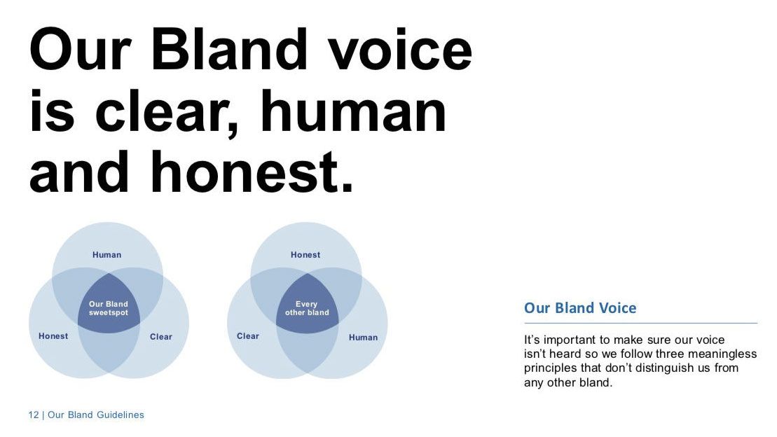
Created by copywriter Vikki Ross in partnership with ad agency Mellor&Smith and its junior designer Grace State, the Bland Book is a parody of the decks that brands give designers to help them get a feel for a company. In particular, the Bland Book takes a swipe at companies who describe themselves with mundane and meaningless phrases like 'dedicated', 'authentic' and 'passionate'.
The Bland Book is so spot on because surely a company should be all of these things anyway? Businesses that use these terms are missing the point of what makes their brand tick. For an example of creative outlines done right, check out our feature on how to make a style guide.
Originally the guide was launched on April Fool's Day. However pages from the Bland Book can now be found in Ross' hilarious Twitter thread roundup (below). Chances are its witty contents will look familiar to projects you've either seen or worked on. All the main culprits (generic fonts, boring stock photos, uninspiring copywriting) are all present and correct, with each one coming in for an overdue mocking.
So if you're in need of a chuckle, check out some of the pages from the Bland Book below.
If your client briefs you to write their brand guidelines and the brief says they’re dedicated, authentic, passionate, honest and trusted, @mellorandsmith, @Gracie_EG and I have done the work for you. Present our Bland Book. Thank us later. #BlandBook pic.twitter.com/CRfzEuVFVcMay 21, 2019
We particularly like the keen attention to detail in the Bland Book. For starters, the colour scheme is so generic yet so accurate, that you get the impression that Ross and the team created this project out of bitter experience.
Our Bland Logo Rule#BlandBook pic.twitter.com/HnU3h45oqnMay 21, 2019
'Always make the logo bigger' is one of the most frequent and irritating requests to bug designers. So of course, the Bland Book dedicates one of its pages to really ramming home how annoying it is.
Get the Creative Bloq Newsletter
Daily design news, reviews, how-tos and more, as picked by the editors.
Our Bland Imagery#BlandBook pic.twitter.com/jB8EzwXp9DMay 21, 2019
Generic stock photos of happy smiling people also get a dressing-down by the Bland Book. And rightly so. How is a brand meant to stand out if its imagery looks similar to the photos uses by plenty of other companies?
To download the Bland Book, head over to Mellor & Smith's site. As Ross says herself, "thank us later".
Related articles:

Thank you for reading 5 articles this month* Join now for unlimited access
Enjoy your first month for just £1 / $1 / €1
*Read 5 free articles per month without a subscription

Join now for unlimited access
Try first month for just £1 / $1 / €1

Dom Carter is a freelance writer who specialises in art and design. Formerly a staff writer for Creative Bloq, his work has also appeared on Creative Boom and in the pages of ImagineFX, Computer Arts, 3D World, and .net. He has been a D&AD New Blood judge, and has a particular interest in picture books.