Monotype redesigns Helvetica for the digital age
Helvetica Now is the first update to the popular font in 35 years.
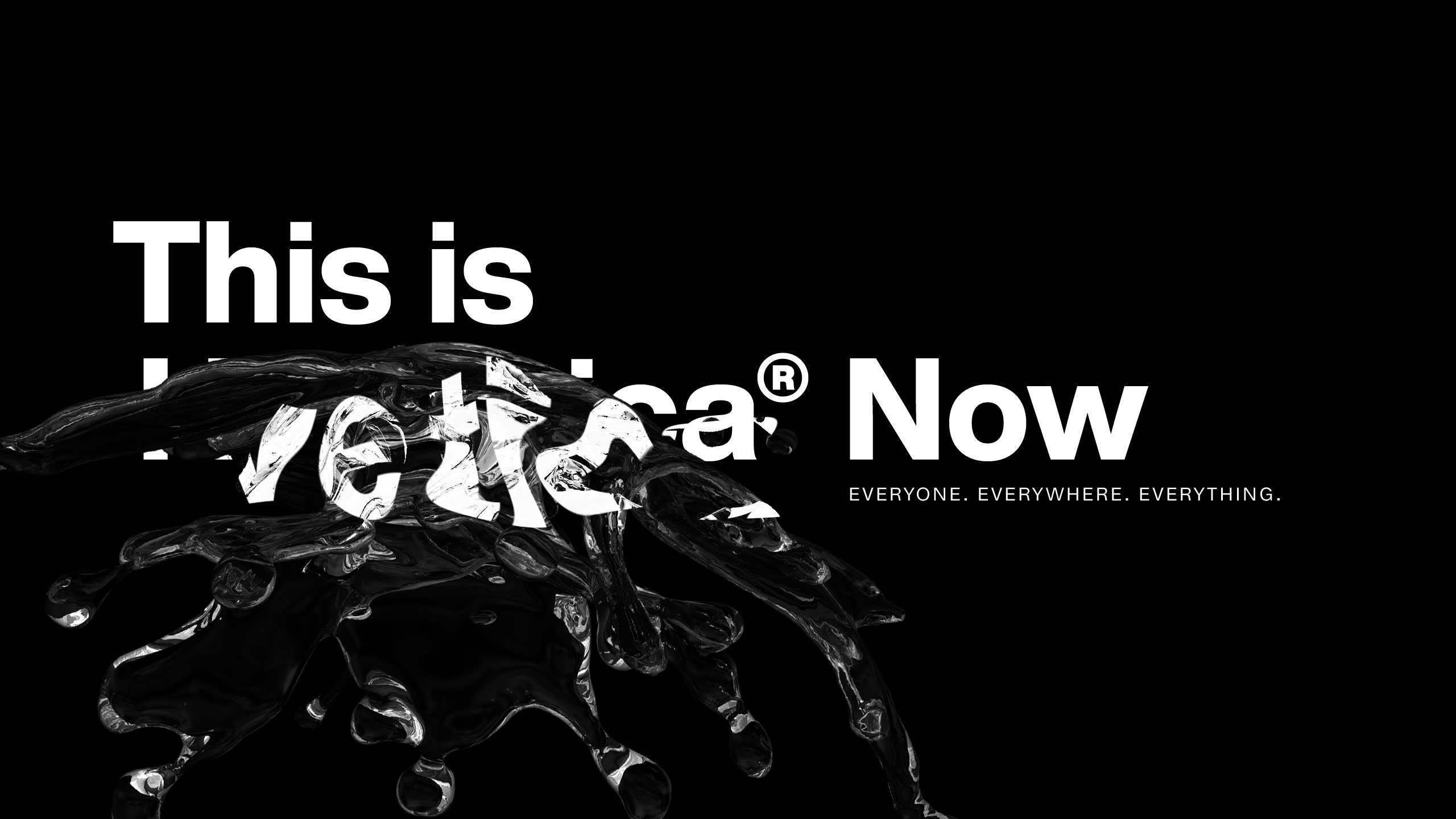
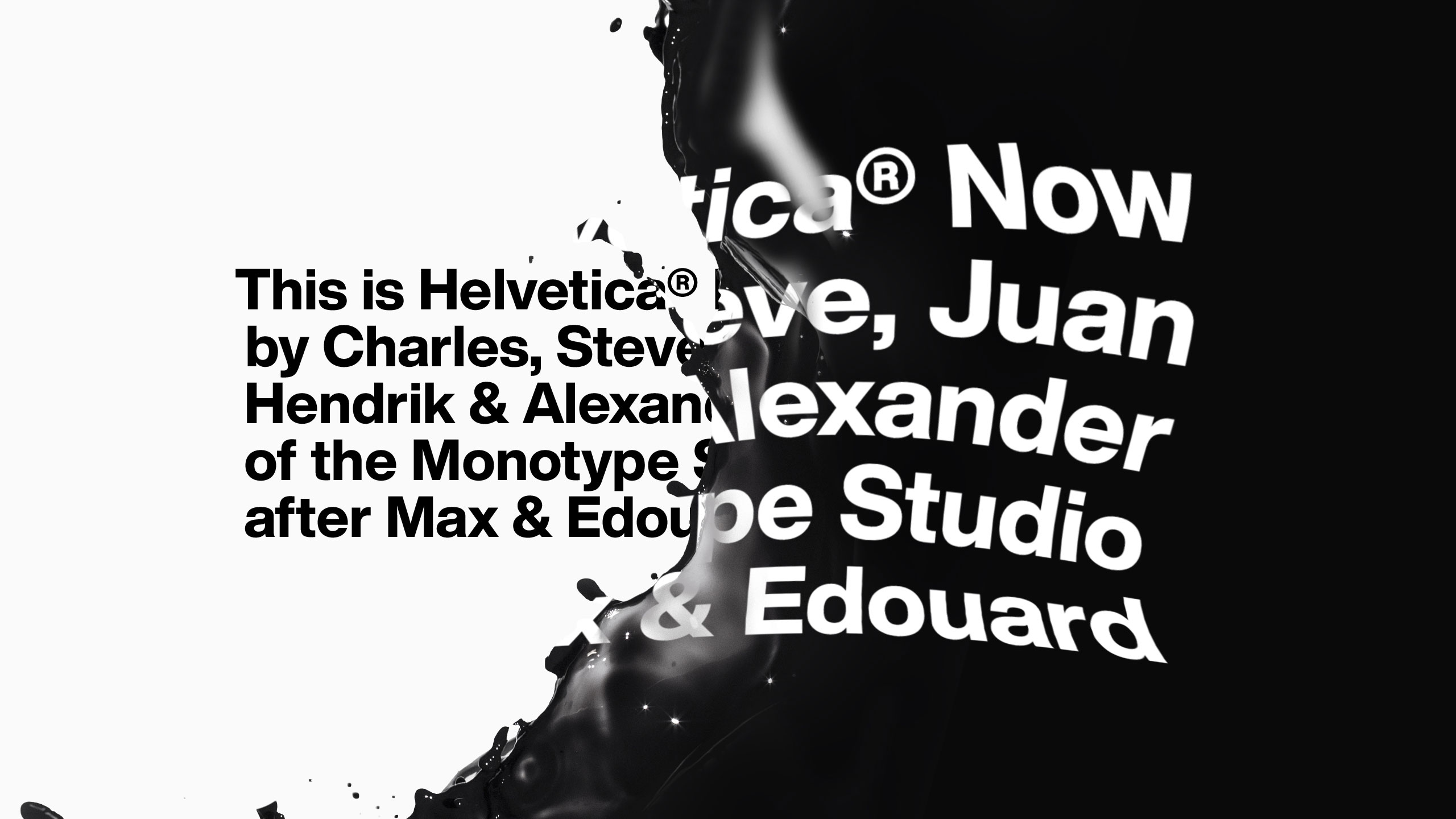
Thanks to its clean and straightforward design, Helvetica has become one of the most ubiquitous typefaces on the planet. The Swiss typeface, which was originally created in 1957 by Max Miedinger and Eduard Hoffmann, has been updated various times over the years to make it fit for purpose. And today sees the launch of an expertly recast Helvetica designed by Monotype that's ready to tackle twenty-first century demands.
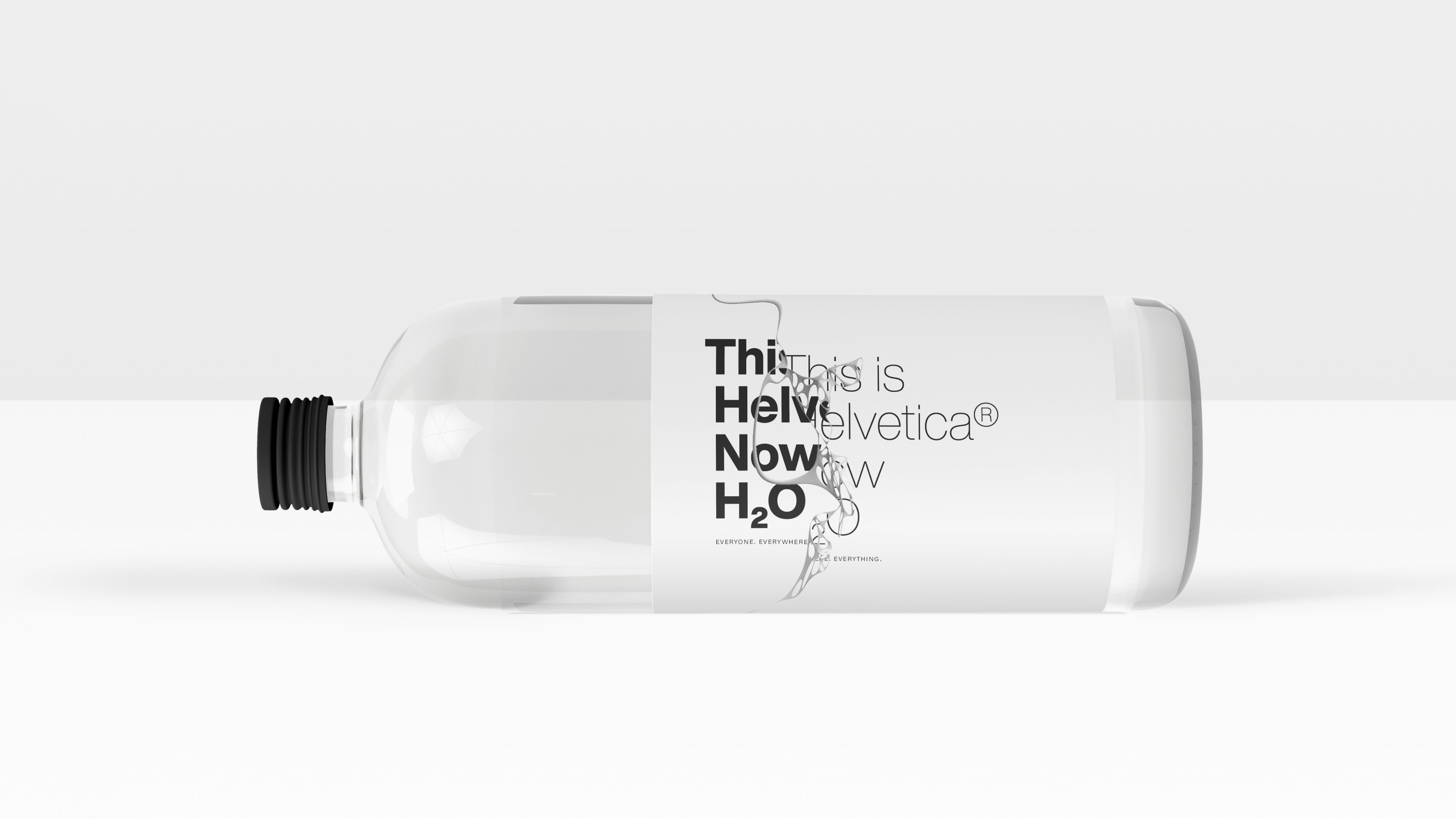
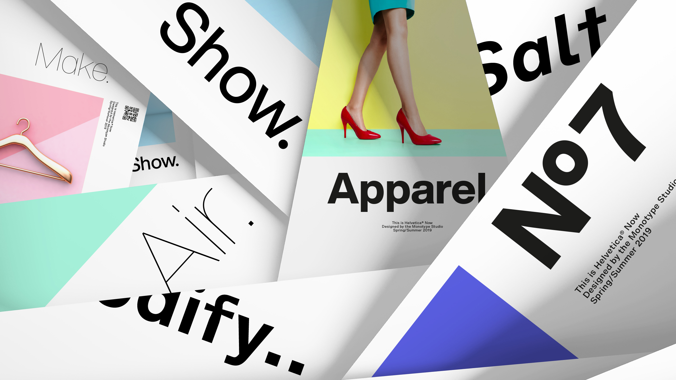
Meet Helvetica Now, the first update to the typeface since 1982's Neue Helvetica. Completed over the course of four years, Helvetica Now is the result of painstaking work that saw every single character carefully redrawn. Designed with legibility in mind, Helvetica Now aims to solve modern branding challenges and work in the digital age.
Made up of 48 fonts and three optical sizes, Helvetica Now has been produced from size-specific drawings and with size-specific spacing. And just as variable fonts are giving typographers more options to work with, Helvetica Now comes with a host of useful alternates to help graphic designers meet contemporary branding challenges.
"Today, we're asking Helvetica to do more than it ever has before," says Charles Nix, type director at Monotype. "Previous versions of the typeface weren’t designed to be used in graphic applications that have developed over the last 30 years. As a result, older versions of the font were lacking in some important areas.
"Helvetica Now solves the legibility and style challenges that brands using Helvetica have consciously and unconsciously faced for years. The design introduces a new chapter in the Helvetica story—expanding its look and utility, while reinvigorating its heritage."
Broken down into three optical sizes, including Micro, Text and Display, Helvetica Now solves the typeface's ongoing spacing and legibility shortcomings. For example, Helvetica Now Micro provides more open apertures, wider forms, and a larger x-height among other changes to provide a font that remains highly legible, even at the smallest of sizes.
On the other end of the spectrum, Helvetica Now Display is perfect for big and bold messages as it eliminates the need to make manual adjustments to the spacing and kerning. Finally, there's Helvetica Now Text, the easy and pleasing to read workhorse of the family. With weights ranging from Thin to Black, plus carefully combed spacing and kerning, this version is ideal for information-rich environments.
Get the Creative Bloq Newsletter
Daily design news, reviews, how-tos and more, as picked by the editors.
On top of these sizes, a range of newly designed alternate glyphs have been introduced throughout the Helvetica Now family. These include a single-story 'a' and a straight-legged capital 'R'. These alternates are available across each weight and optical style, plus there's even a suite of Helvetica arrows.
By redrawing, analysing and testing each of the nearly 40,000 letters, Monotype has created a font that delivers a better reading experience, and one that has more scope for contemporary designers.
"We've introduced a new chapter to the canon I think, which will allow it to become something completely different than it was before, while still capitalising on the heritage that could be its shackles," adds Nix.
"What we've created in Helvetica Now is the potential to see Helvetica completely differently. To make it relevant to a new century."
"I was told in design school that we could use any typeface we wanted, as long as it wasn’t Helvetica. Every government form you've ever seen is set in Helvetica. The most ordinary things in the world are set in Helvetica. If your job, as a creative person, is to amplify, modify or otherwise change the message through its visual presentation, then Helvetica is the thing you'd like to avoid.
The true subversive Helvetica users look at it and say its neutrality is a disguise
Charles Nix
"But if you're on the other side of the spectrum, the Beatrice Warde crystal goblet side, where you're saying the typeface is nothing. It's a container for the message. Then Helvetica is your darling. The true subversive Helvetica users look at it and say its neutrality is a disguise."
Helvetica Now can be found in Monotype's cloud-based font discovery system, Mosaic. Single weights of the Helvetica Now typeface are available for $/€35 or £30 each. The complete typeface family is available for $/€299 or £249.
Related articles:

Thank you for reading 5 articles this month* Join now for unlimited access
Enjoy your first month for just £1 / $1 / €1
*Read 5 free articles per month without a subscription

Join now for unlimited access
Try first month for just £1 / $1 / €1

Dom Carter is a freelance writer who specialises in art and design. Formerly a staff writer for Creative Bloq, his work has also appeared on Creative Boom and in the pages of ImagineFX, Computer Arts, 3D World, and .net. He has been a D&AD New Blood judge, and has a particular interest in picture books.
