Yikes, the new HBO Max rebrand is getting roasted
Farewell, HBO.

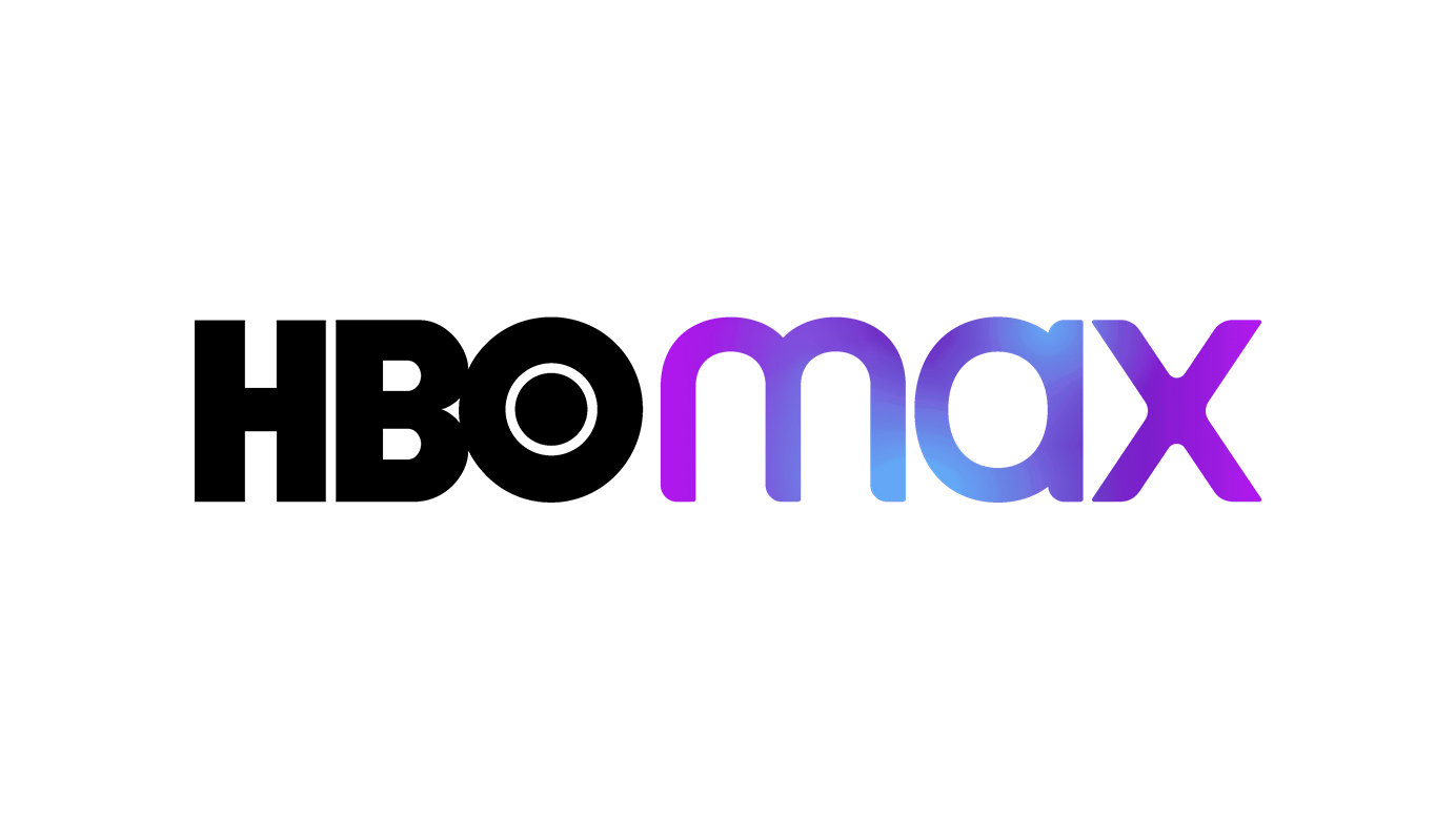
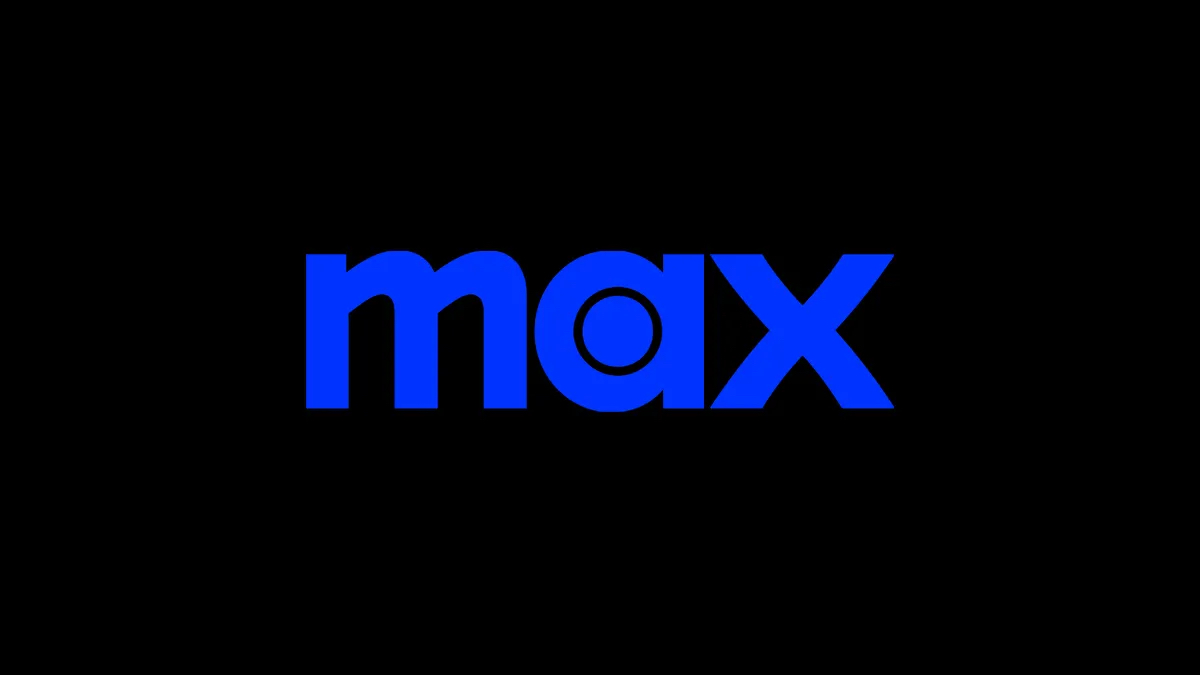
We've seen plenty of significant rebrands in 2023 so far, from the likes of big brands including Nokia and Pepsi. The latest has arrived courtesy of streaming service HBO Max – and as well as a new logo and brand identity, the platform has a new name. And it's getting a little roasted online.
HBO Max is now, simply, Max. Unveiled by Warner Bros this week, the platform now combines the offerings of Discovery+ and the original HBO Max. While it might make sense for the service not to rely on a single brand name after the merge, users are mourning the loss of the HBO name – and the prestige it signifies. (Looking for design inspiration? Check out the best logos of all time.)

At a press conference yesterday, HBO and Max Content Head Casey Bloys told reporters that the prestige associated with HBO was the reason it was pulled from the name. "I understand and appreciate the passion that people feel for the HBO brand... it’s a premium brand. It is not designed to take on everything in the streaming service."
"HBO is not TV. HBO is HBO," said WBD president JB Perrette, "It needs to stay that way, which is why we will privilege it in the product experience and also not push it to the breaking point by forcing it to take on the full breadth of this new content proposition."

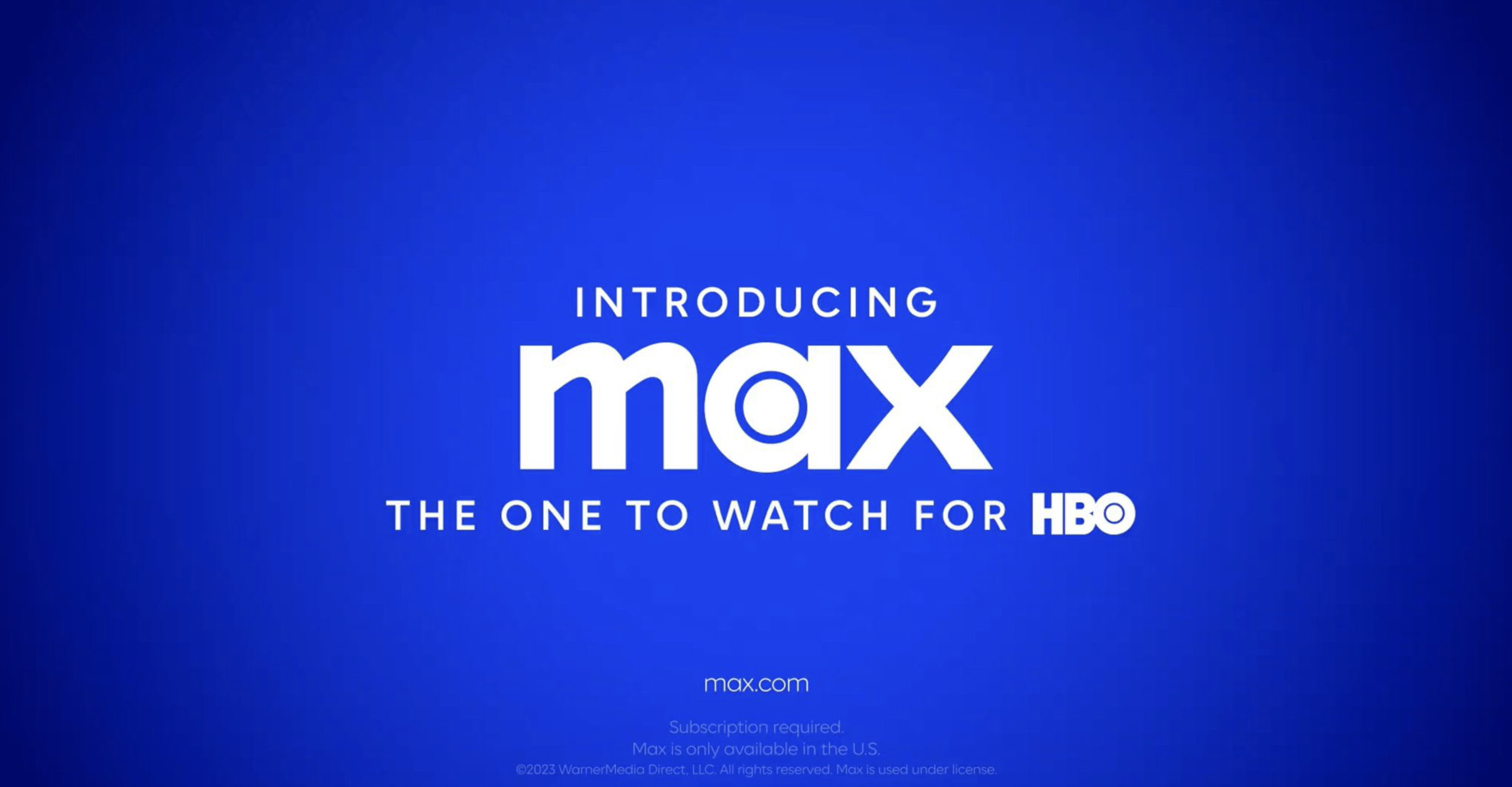
But Twitter seems to be finding the nixing of the HBO brand name categorically dumb. And not helping is the inelegant addition of tagline: "The one to watch for HBO". What next? 'Big Mac: the place to eat McDonald's'?
Dying laughing that the rebrand is from "HBO Max" to "Max is where you can find HBO stuff." pic.twitter.com/Fp4X7t2c4NApril 12, 2023
getting rid of the HBO in HBO Max is probably one of the most insane marketing decisions in tv history https://t.co/v9AAjUVVTLApril 11, 2023
hbo max dropping hbo // people who watch hbo pic.twitter.com/5NDLZQFuJ7April 12, 2023
While it makes sense that the platform wishes to appeal to a broader audience, it's clear that the removal of HBO from the branding isn't sitting well with plenty of TV fans. Like Nokia's move away from mobile, it seems to risk alienating those who have a specific idea of the brand. Still, at least the Max logo is fully legible – which is more than can be said for the recent Kia rebrand.
Read more:
Get the Creative Bloq Newsletter
Daily design news, reviews, how-tos and more, as picked by the editors.

Thank you for reading 5 articles this month* Join now for unlimited access
Enjoy your first month for just £1 / $1 / €1
*Read 5 free articles per month without a subscription

Join now for unlimited access
Try first month for just £1 / $1 / €1

Daniel John is Design Editor at Creative Bloq. He reports on the worlds of design, branding and lifestyle tech, and has covered several industry events including Milan Design Week, OFFF Barcelona and Adobe Max in Los Angeles.
