Can the Halifax rebrand humanise banking?
The bank's uncluttered rebrand aims to engage young people.

Creating a personable brand identity for a bank is no small feat. If you're anything like us, the thought of checking your balance or stepping into a physical high street branch is enough to make you break out into a cold sweat. However, making banking straightforward and personable is at the heart of Halifax's recent rebrand, which launched this week.
Taking its inspiration from financial technology brands, the Halifax redesign keeps things simple across all of touchpoints, including its website, app, and physical assets such as marketing material.
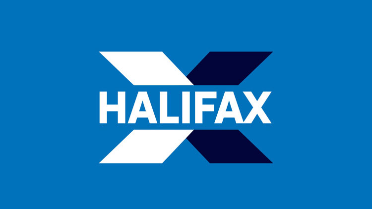
The new Halifax logo design also boasts an uncluttered aesthetic. Whereas before, the bank used a striped letter X, which didn't look too dissimilar to the IBM logo, the new iteration created by Rufus Leonard (above) keeps things clear with block colours. This design will also work better across digital platforms.

Meanwhile, other elements of the rebrand created by Adam&EveDDB, including new adverts, hope to make the bank modern and relevant to younger customers. The studio has done this by establishing a light-hearted tone, with the first commercial featuring a groovy slinky dancing around its new pad.
A soothing colour palette of blue and white also helps to take the edge off dealing with financial matters (and as we revealed yesterday, blue is most relaxing colour in the world). Greens, yellows and pinks feature in the secondary colour palette, along with utilitarian symbols and a free Google typeface, Source Sans, which is used on all communications.
Given that the current economic climate isn't exactly tipped in the favour of young people, Halifax's rebrand has cleverly pitched itself as an approachable yet reliable bank that will allow its customers to pursue what's important to them.
Halifax isn't a stranger when it comes to creating engaging and personable brands. Who could forget Howard Brown, whose all-singing, all-dancing personality won over audiences in the early noughties?
Get the Creative Bloq Newsletter
Daily design news, reviews, how-tos and more, as picked by the editors.
And more recently, the bank has been running a campaign that relied on cleverly altered footage of childhood favourites such as Scooby-Doo and the Wizard of Oz. Although, as some online commentators have pointed out, perhaps Top Cat isn't the best mortgage mascot considering that he famously lives in a bin.
Images via Design Week
Related articles:

Thank you for reading 5 articles this month* Join now for unlimited access
Enjoy your first month for just £1 / $1 / €1
*Read 5 free articles per month without a subscription

Join now for unlimited access
Try first month for just £1 / $1 / €1

Dom Carter is a freelance writer who specialises in art and design. Formerly a staff writer for Creative Bloq, his work has also appeared on Creative Boom and in the pages of ImagineFX, Computer Arts, 3D World, and .net. He has been a D&AD New Blood judge, and has a particular interest in picture books.
