You may think you know it all when it comes to about logo design, but how far back does your knowhow stretch? Many of today's most famous logos began life looking very different – and we've got six great examples.
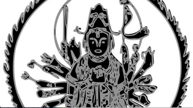
While all of our best logos of all time are instantly recognisable, many of their original versions are anything but. Below, you'll see just a close-up detail of each original logo – can you identify the brand from it?
Once you've settled on your answer, click the right arrow over the image and you'll uncover the original logo in full. This might help to clarify things – or possibly confuse things further. Finally, click the arrow again and you'll find the modern logo for the brand. Good luck!
01. Buddhist beauty
Original logo
Classic logo
Answer: Canon
Japanese camera manufacturer Canon may have been around for almost a century (and made it into our best camera list), but it's not always had the same name.
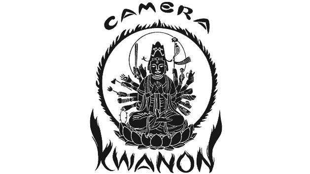
The company was originally founded as Seikikōgaku kenkyūsho, and produced the Kwanon, a prototype for Japan’s first-ever 35mm camera with a focal-plane-based shutter.
The original illustrated logo from 1934 depicts Bodhisattva Kwan'on, the Buddhist Goddess of Mercy, who was said to embody the company's vision of creating the best cameras in the world. And the illustration of "Kwanon with 1,000 Arms", surrounded by flames, is certainly attention grabbing.
Get the Creative Bloq Newsletter
Daily design news, reviews, how-tos and more, as picked by the editors.
When the company began full-scale marketing in 1935, though, they changed their name to Canon and introduced a new, more corporate logo, albeit remarkable for the innovative style of its letter 'C', with a sharp point at the top.
Over the next two decades, the Kwannon brand and its wilder, more expressive logo was gradually phrased out. The current version of the Canon logo, meanwhile, dates back to 1956, which in terms of longevity is pretty impressive to say the least.
02. Monochrome magic


Original logo

Classic logo
Answer: Shell
Yes, energy giant Shell has always had a shell for its logo emblem, albeit a very different looking one to today's well known yellow and red emblem.
The original trademark, a flat, monochrome scallop shell, first appeared in 1891 to represent the kerosene being shipped to the Far East by a small London business Marcus Samuel and Company, which dealt originally in antiques, curios and... you guessed it... oriental seashells.
In 1987, this design inspired the naming of Samuel's newly formed Shell Transport and Trading Company. By 1904 the familiar Pecten seashell logo was introduced, although still in black and white, until the famous palette of yellow and red was added in 1948.
That colour scheme is said to have been inspired by the Spanish flag, and was first used in the new service stations opening up in California; a state with strong connections to the Iberian nation.
03. If the shoe fits...

Original logo

Classic logo
Answer: Adidas
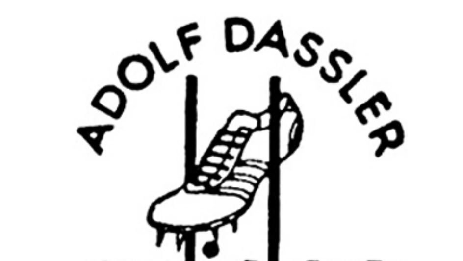
German cobbler Adolf Dassler first began making shoes in 1924 and registered his company's name as "Adi Dassler adidas Sportschuhfabrik" in 1949.
Its original illustrated logo, centred around a black-and-white line drawing of a running shoe, draws attention to the spikes that Dassler was known for making.
You'll notice, too, that it featured the same font that's continued to play a part in Adidas's multiple modern logos. You can learn more about them in our article, How the Adidas logo earned its stripes.
04. Circular logic
Original logo
Classic logo
Answer: IBM
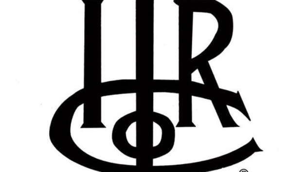
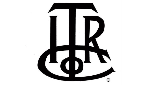
Okay, we tricked you a little bit there: IBM actually began life in 1888 as ITRC, the International Time Recording Company. Its main products were mechanical time recorders invented and patented by Willard L. Bundy.
ITR was later merged into the Computing-Tabulating-Recording Company in 1911, which was then renamed International Business Machines, or IBM, in 1924.
The current IBM logo, designed in 1972, has become an iconic symbol of the computing age over the last half-century. It was created by Paul Rand, one of history's most famous graphic designers, and is beautiful and elegant in its simplicity.
You can see a full rundown of all the IBM logos, and the thinking behind them, in number 9 on our list of the best logos ever.
05. Countryside scene

Original logo

Classic logo
Answer: Apple
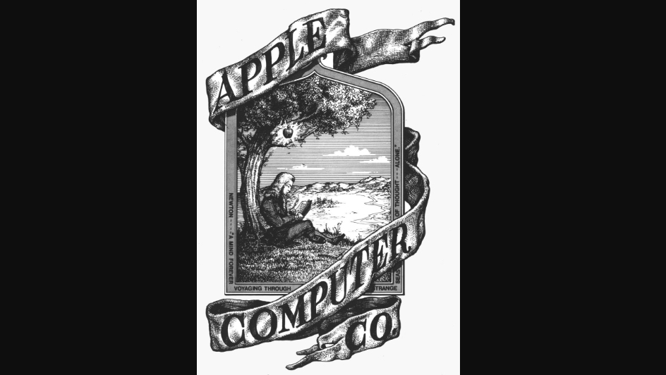
Apple's first ever logo, designed in 1976 by Ronald Wayne, looked more like the illustrated crest of a university or scientific society than a tech company.
Showing Isaac Newton under an apple tree, an apple dangling across his head, this detailed illustration was designed by Apple Computers co-founder Ronald Wayne. The phrase on the outside border reads: "Newton… A Mind Forever Voyaging Through Strange Seas of Thought … Alone.”
It's a lovely design, but Steve Jobs reportedly believed that it was too old-fashioned, and so quickly hired graphic designer Rob Janoff to come up with something more modern.
Launched later in 1976, the 'bitten apple' emblem quickly became iconic and, the odd colour change notwithstanding, remains today as one of the most recognised logos the world over.
06. Feathered friend
06. Feathered friend
Original logo

Classic logo
Answer: Yamaha
Today, famous in equal measure for its electronic keyboards and motorcycles, Yamaha was founded in 1887 by Torakusu Yamaha as a piano and reed organ manufacturer.
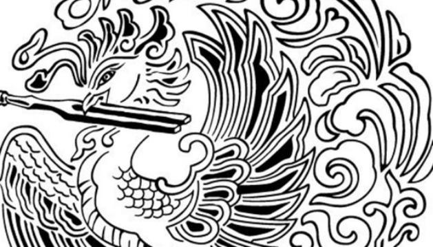
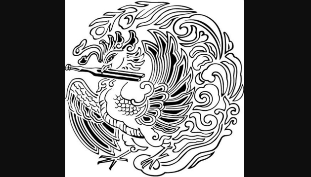
Its original trademark, established in 1898, showed a Chinese phoenix holding a tuning fork in its beak, and was known for being used on top quality organs of the day; a true sign of quality.
The logo has gone through multiple changes since then, but the tuning fork is still represented in Yamaha's modern branding.
The three tuning forks of today's Yamaha logo are said to represent the cooperative relationship that links the three pillars of its business: technology, production, and sales.
How did you do? Want to test yourself some more? Now see if you can spot the errors in these famous logos.
Read more:

Thank you for reading 5 articles this month* Join now for unlimited access
Enjoy your first month for just £1 / $1 / €1
*Read 5 free articles per month without a subscription

Join now for unlimited access
Try first month for just £1 / $1 / €1

Tom May is an award-winning journalist and editor specialising in design, photography and technology. Author of the Amazon #1 bestseller Great TED Talks: Creativity, published by Pavilion Books, Tom was previously editor of Professional Photography magazine, associate editor at Creative Bloq, and deputy editor at net magazine. Today, he is a regular contributor to Creative Bloq and its sister sites Digital Camera World, T3.com and Tech Radar. He also writes for Creative Boom and works on content marketing projects.
