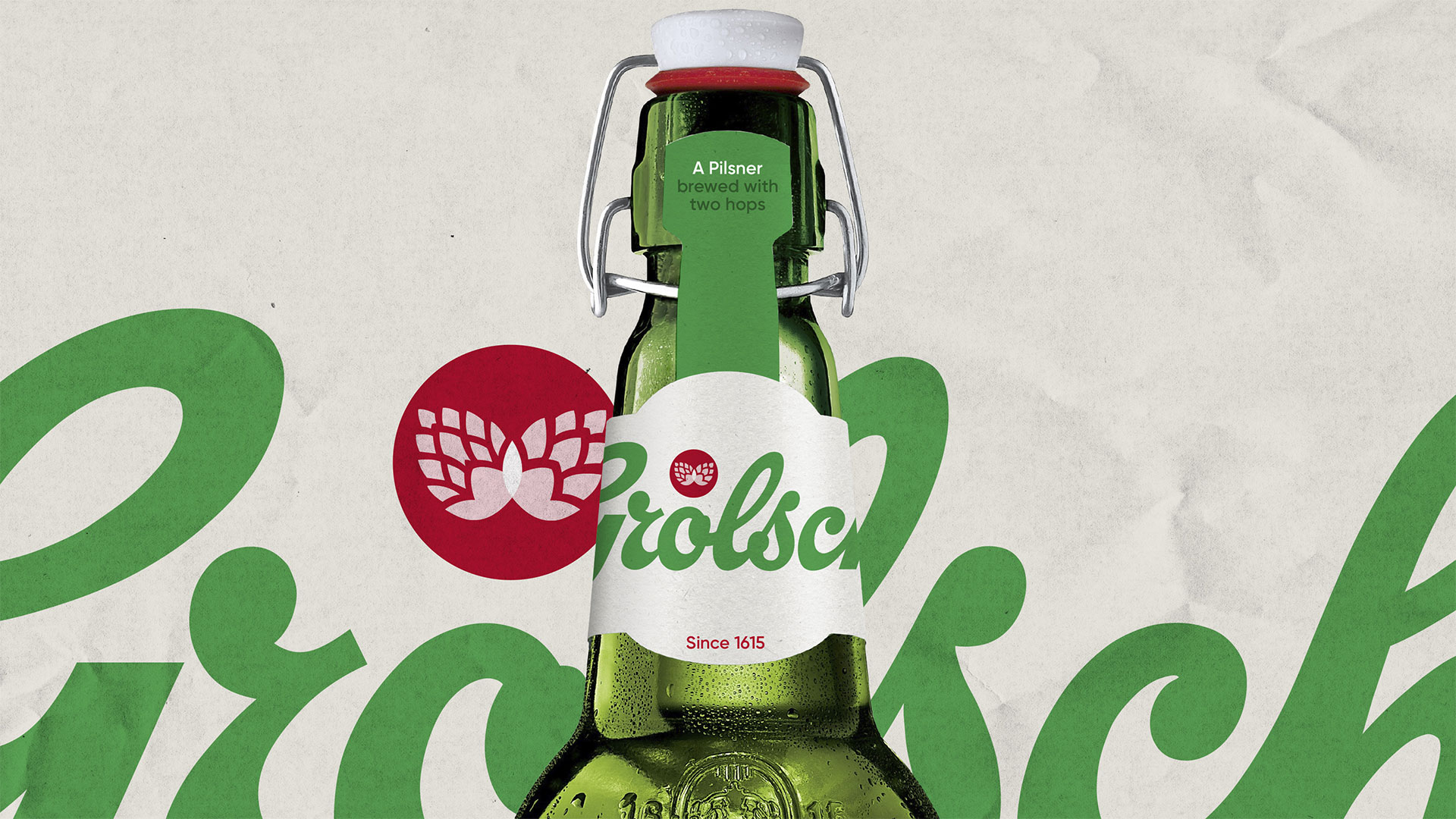
Grolsch rebrand focuses on the essentials
Leading Dutch beer goes back to basics with a functional new look.
It's turning out to be quite the week for beer branding. Yesterday we revealed Carlsberg's self-effacing new campaign, admitting that it probably wasn't actually the best lager in the world, and repositioning itself as a hip new pilsner.
And now Grolsch has unveiled its own rebrand – and it's also now describing itself as a pilsner. We're guessing that lager has become tragically uncool.
The rebrand is the work of freelance graphic designer Dan Lawrence, and at first glance you might mistake it for one of those redesigns that doesn't actually change very much, but in fact it's been given a thorough work-over that concentrates on the brand's essentials.
Like many venerable brands - the Grolsch brewery was founded back in 1615 - Grolsch has been refreshed many times over the years, and its new owners, Asani, felt that its originality and brand story had been lost along the way. Lawrence's job, then, was to bring back Grolsch's traditional values and express its sophisticated but unconventional approach to beer.
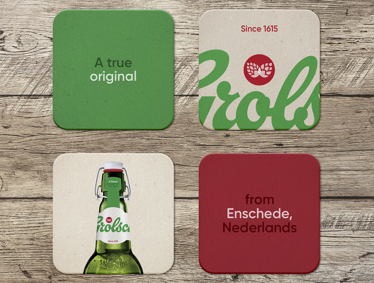
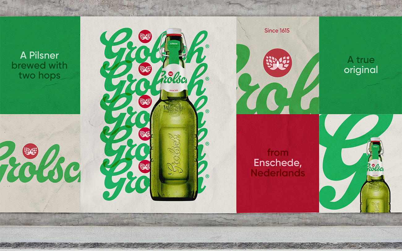
He approached this brief by stripping out everything from the Grolsch branding that served no purpose, and you can see this in the flat wordmark and a new, minimal logo design that still illustrates the fact that Grolsch is brewed using two different hops, but in a much less fussy way than in previous iterations. There's also the bare typographical minimum on the packaging, using a simple sans-serif and highlighting key messaging.
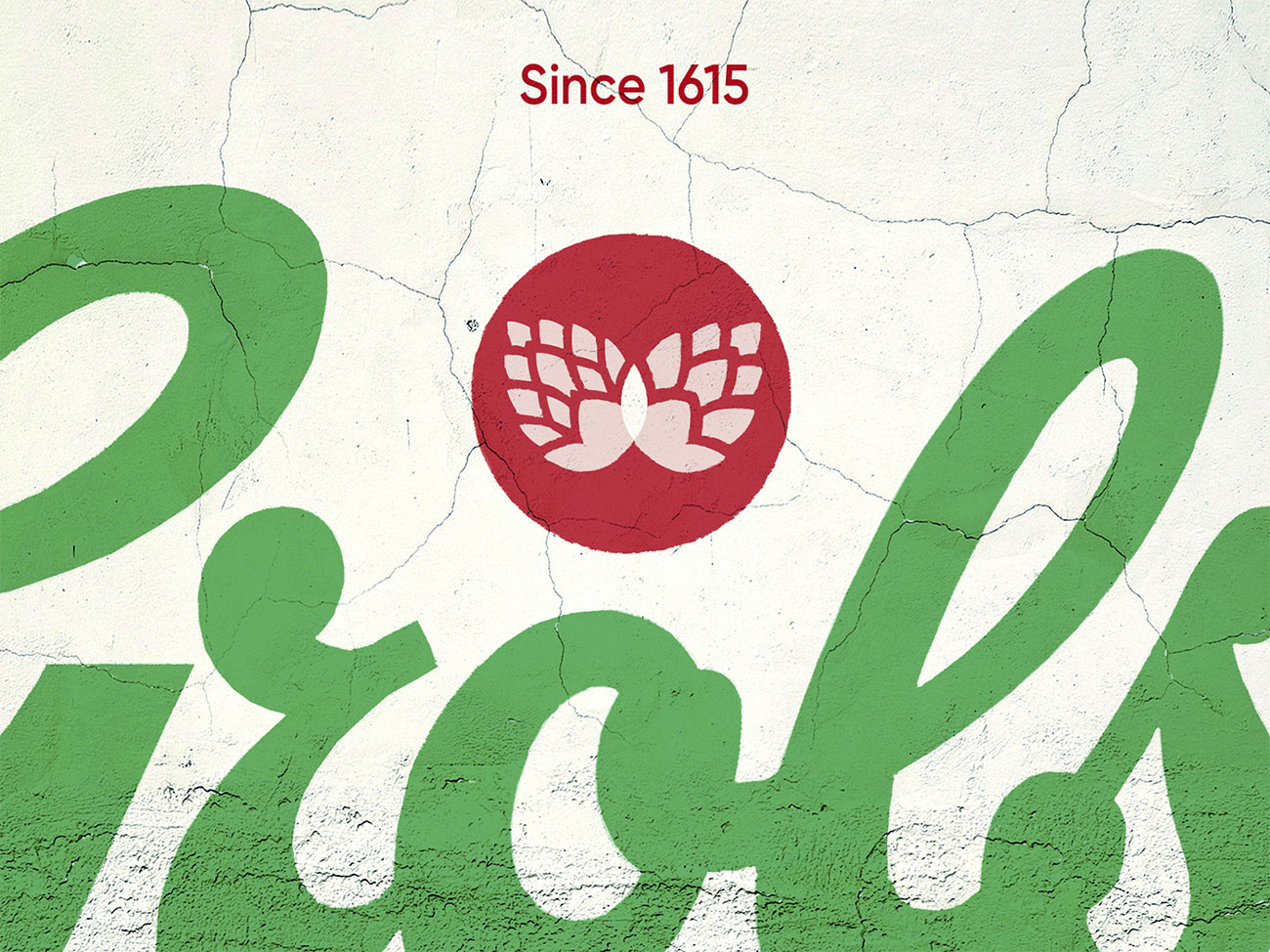
It's not completely minimal, though; a little extra visual interest comes from the use of raw materials in the packaging, and we also like the way that the Grolsch wordmark is sized and positioned so that the edges of it are always cut off in some way, no matter how you look at it. It's a similar approach to the one Kellogg's has recently taken with its newly redesigned cereal boxes; we suspect this is becoming a bit of a trend.
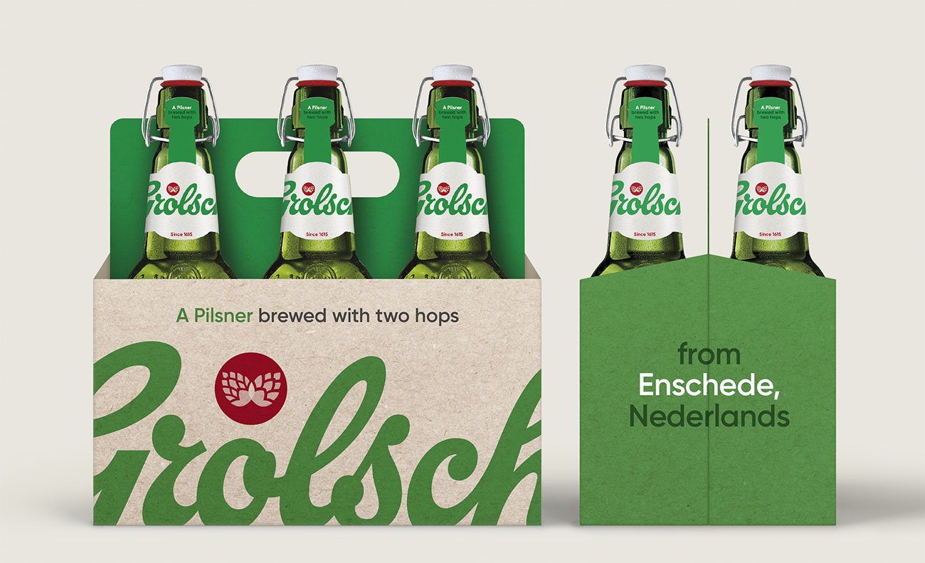
To take a closer look at Dan Lawrence's Grolsch rebrand, head over to his site.
Get the Creative Bloq Newsletter
Daily design news, reviews, how-tos and more, as picked by the editors.
Related articles:

Thank you for reading 5 articles this month* Join now for unlimited access
Enjoy your first month for just £1 / $1 / €1
*Read 5 free articles per month without a subscription

Join now for unlimited access
Try first month for just £1 / $1 / €1
Jim McCauley is a writer, performer and cat-wrangler who started writing professionally way back in 1995 on PC Format magazine, and has been covering technology-related subjects ever since, whether it's hardware, software or videogames. A chance call in 2005 led to Jim taking charge of Computer Arts' website and developing an interest in the world of graphic design, and eventually led to a move over to the freshly-launched Creative Bloq in 2012. Jim now works as a freelance writer for sites including Creative Bloq, T3 and PetsRadar, specialising in design, technology, wellness and cats, while doing the occasional pantomime and street performance in Bath and designing posters for a local drama group on the side.
