This stunning book cover makes awesome use of negative space
And look at that clever typographical trick.

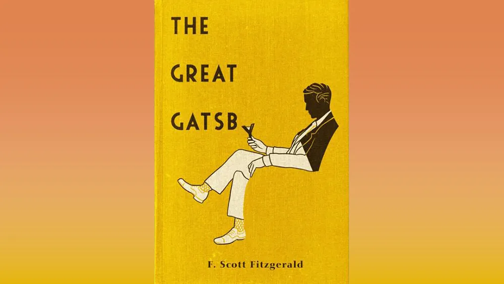
A book cover is designed to both to intrigue and inform, and though you shouldn't judge a book by its cover (apparently), we often do. And we're happy to say we've found a delightful book cover we're judging as brilliant.
This beautiful The Great Gatsby edition cover has a clever illustration that combines an excellent use of negative space with a super-clever use of its typography that forms part of the picture. Check it out below and get inspired.
This Book cover. from r/DesignPorn
A book cover is the perfect chance to show off the style of the contents – and 1920s design is firmly reflected in the cover design. From the way the bottom of the figure forming the seat he sits on, and the way the 'y' falls down into his hand to make a cocktail glass to the general art deco style and typography, this cover design is smart and stylish.
We've seen our fair share of brilliant book covers over time. There was this stunning example of typography on the Dune book cover, and a brilliant optical illusion I promise will fool you, but this one might be my favourite.
Get the Creative Bloq Newsletter
Daily design news, reviews, how-tos and more, as picked by the editors.
Thank you for reading 5 articles this month* Join now for unlimited access
Enjoy your first month for just £1 / $1 / €1
*Read 5 free articles per month without a subscription
Join now for unlimited access
Try first month for just £1 / $1 / €1

Georgia has worked on Creative Bloq since 2018, and has been the site's Editor since 2022. With a specialism in branding and design, Georgia is also Programme Director of CB's award scheme – the Brand Impact Awards. As well as immersing herself with the industry through attending events like Adobe Max and the D&AD Awards and steering the site's content streams, Georgia has an eye on new commercial opportunities and ensuring they reflect the needs and interests of creatives.