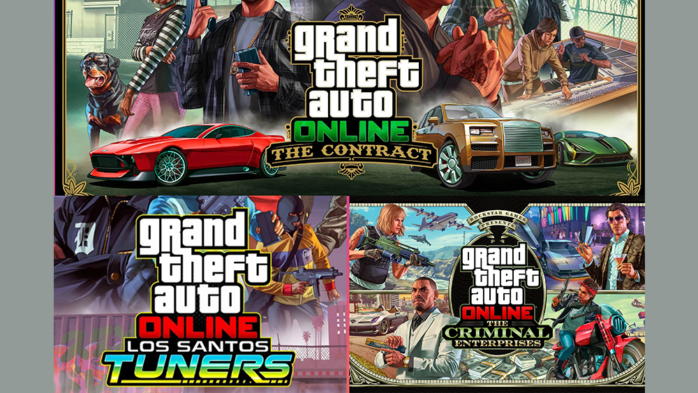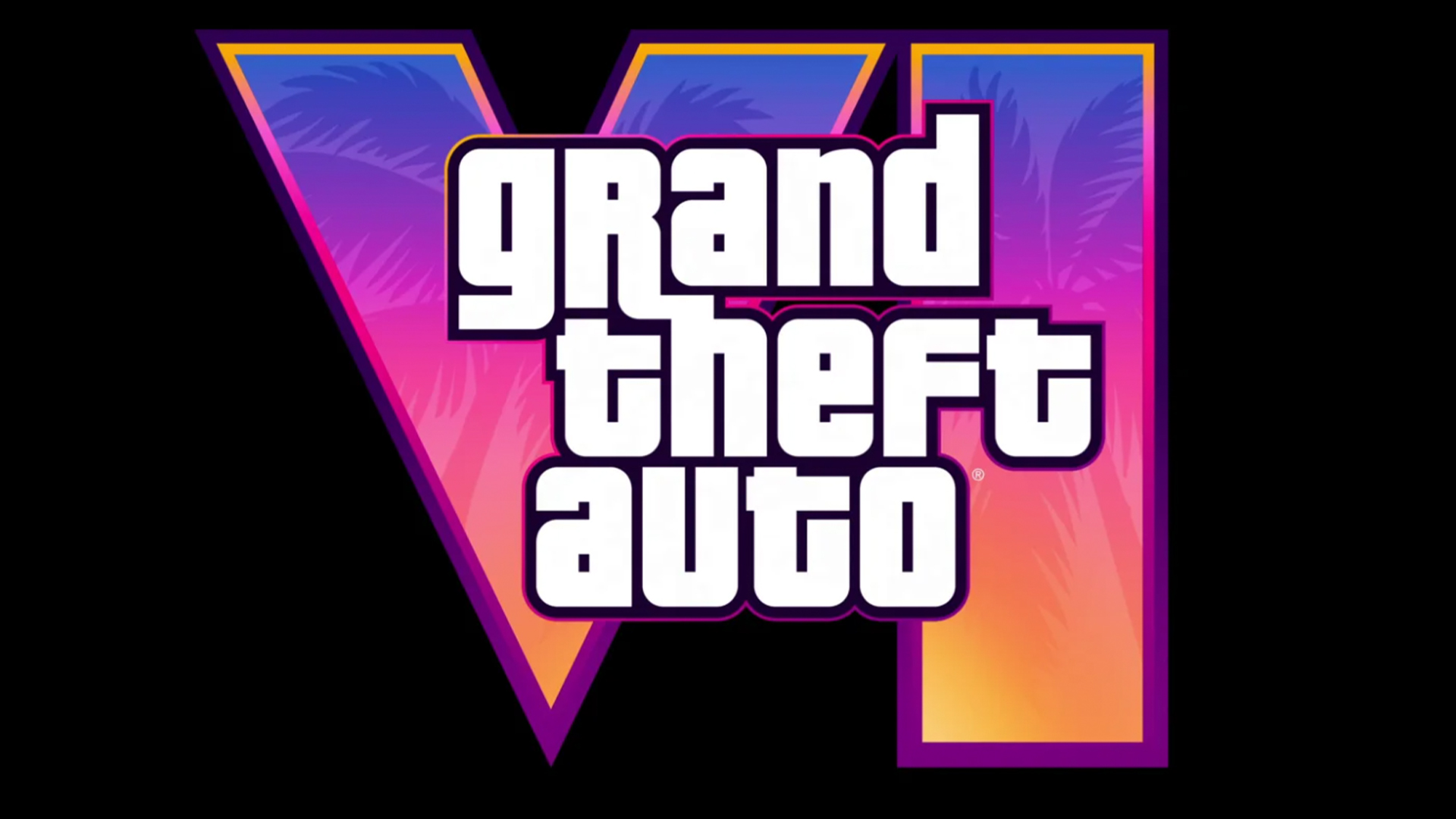
The Grand Theft Auto logo is among the best gaming logos. Now with GTA VI on the way, fans have been poring over previous designs, and they think they've spotted something. There appears to be a theme linking the logos, and it's not the location where they're set. At least until we got to the GTA VI logo, that is.
GTA 6 logo will never look like this fanmade ones. Most of these logos are beautiful but unreadable. You can't even understand the "V" in "VI". Rockstar's logos are always simple, non-busy, readable and yet Beautiful. GTA VI fanmade logo's vs Some GTA Online logo comparison from r/GTA6
Writing on Reddit, Genotropism noted that fan-made GTA 6 logos were "beautiful but unreadable" while Rockstar's Grand Theft Auto logos tend to be simple. But the user went on to note that GTA logos also tended to revolve around the story theme not the location. Thus GTA 5 is about money, the GTA 4 logo is black, referring to a darker storyline, SanAndreas is about gangsters and hip hop, Vice City has an 80's setting and the Chinatown Wars logo has, well, a Chinese theme.

It sounds simple, but the realisation blew some fans away. "I’m shocked that I’ve somehow never thought of it like this," one person wrote. "It’s fairly obvious using GTA V’s logo as an example, but I never really thought that far into it." "This weirdly lines up pretty well looking at all the logos, even the Lost and the Damned and the Ballad of Gay Tony title designs fit in with their respective plot lines, great take man."

Alas, it was a great theory. But has the GTA VI logo gone an ruined it? Fans were holding out for a heart or a rose given that there's apparently going to be a love story in there, with ex-convict Lucia to be the first female playable character in GTA's 3D era. But in the end, the palm trees and neon type feels very much like the logo is merely inspired by Miami.
Grand Theft Auto VI should be released in 2025. Meanwhile, GTA fans also think they spotted a GTA 6 clue in Rockstar's anniversary logo.
For more logo inspiration, see our pick of the best Eurovision logos.
Get the Creative Bloq Newsletter
Daily design news, reviews, how-tos and more, as picked by the editors.

Thank you for reading 5 articles this month* Join now for unlimited access
Enjoy your first month for just £1 / $1 / €1
*Read 5 free articles per month without a subscription

Join now for unlimited access
Try first month for just £1 / $1 / €1

Joe is a regular freelance journalist and editor at Creative Bloq. He writes news, features and buying guides and keeps track of the best equipment and software for creatives, from video editing programs to monitors and accessories. A veteran news writer and photographer, he now works as a project manager at the London and Buenos Aires-based design, production and branding agency Hermana Creatives. There he manages a team of designers, photographers and video editors who specialise in producing visual content and design assets for the hospitality sector. He also dances Argentine tango.
