Google’s homepage design set for dramatic change
First time layout has changed, does it break design trend?

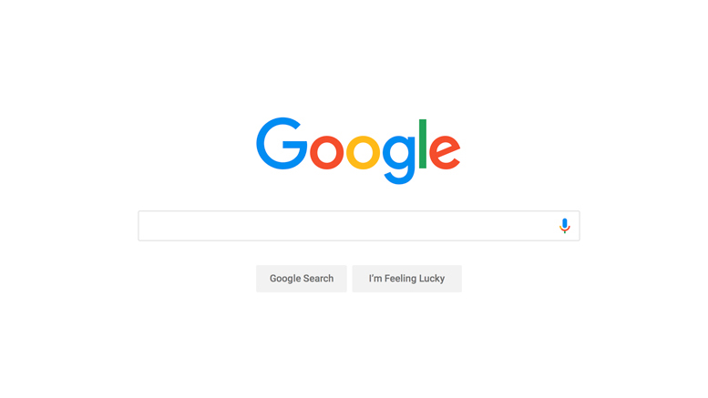
Google’s stripped-back homepage is recognised the world over. The vast white space containing just a simple logo and search box has been in place since the search engine’s launch in 1996, and offers a classic example of extreme minimalism in action.
But is Google about to buck one of 2017’s biggest web design trends with its proposed new design?
According to the Guardian, Google is set to undergo a “radical change” with the addition of a Facebook-style personalised newsfeed in the “near future”. The new design will bring it in line with Google’s mobile apps for Android and iOS, which already feature a news and events-based feed.
“You’ll see cards with things like sports highlights, top news, engaging videos, new music, stories to read and more. And now, your feed will not only be based on your interactions with Google, but also factor in what’s trending in your area and around the world,” said Shashi Thakur, vice president of engineering at Google.
“As the world and your interests change, your feed will continue to grow and evolve along with you. You’ll notice that your feed will also reflect your interest level for various topics – for example, if you’re a photography enthusiast but just casually interested in fitness, your feed will show that.”
Goodbye white space
While there are no firm design details as yet, this news feed experience could lead to a cluttered-looking search engine – which would position Google firmly against the year’s continued web design trends of minimalist design and ample white space.
As yet, however, we don’t know how complex the desktop feed will be. As our sister site TechRadar points out, you might have to log in to your Google account to use the new system – “as personalisation is the name of the game here, particularly when it comes to elements such as linking in your calendar or Gmail inbox to scrape flight booking details and so forth.”
Get the Creative Bloq Newsletter
Daily design news, reviews, how-tos and more, as picked by the editors.
Right now, it’s all eyes on Google for the next few weeks, as we wait to see exactly how radical the new homepage design will be. The company has said the new feed additions will roll out to US users immediately and international users in the next few weeks.
Related articles:

Thank you for reading 5 articles this month* Join now for unlimited access
Enjoy your first month for just £1 / $1 / €1
*Read 5 free articles per month without a subscription

Join now for unlimited access
Try first month for just £1 / $1 / €1

Julia is editor-in-chief, retail at Future Ltd, where she works in e-commerce across a number of consumer lifestyle brands. A former editor of design website Creative Bloq, she’s also worked on a variety of print titles, and was part of the team that launched consumer tech website TechRadar. She's been writing about art, design and technology for over 15 years.
