Google shares its toolkit for creating beautiful design
Material Design gets a new site, a bold new visual identity and a new set of tools as well.
Google has been quietly plugging away at its own design language, Material Design, for a while now, and its rules and conventions have been adopted by most of its mobile and desktop applications.
Based on paper and ink but taking advantage of digital's own unique features, Material Design is a great framework to use if you're building a mobile website or want to make good use of responsive web design. It enables designers to create digital material that can expand and reform intelligently, using seams and shadows to provide meaning about what you can touch.

And now Google is expanding Material Design with a new site and a new suite of tools and open source projects that it hopes will help make product design more productive and inspiring.
The new Material Design site introduces a bold new visual identity for the the Material initiative, inspired by the principles of print-based design and with an emphasis on user actions and motion.
Its striking looks are achieved by constructing everything in a 3D environment containing light, material and cast shadows, with its own rules of how you can position elements and what they can do. It's fascinating stuff; check out its design guidelines to see how it all works.

Alongside the new visual identity, Google is introducing a set of new tools that, it says, focus on different aspects of the product design process and streamline the way teams work, design, and build applications together.
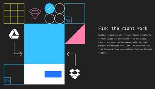
The first, Gallery, is all about simplifying design collaboration, enabling teams to organise their design workflow in one place so that everyone has a clear view of what’s going on, and to easily share and get feedback on everything from visual designs to interactive prototypes, within a system that's accessible, beautifully presented, and securely managed.
Get the Creative Bloq Newsletter
Daily design news, reviews, how-tos and more, as picked by the editors.
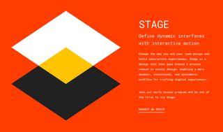
Stage is a new tool that's designed to help you build dynamic interfaces with interactive motion. Created by the teams behind Pixate and Form, it promises to change the way you build interactive experiences, with a more dynamic, intentional, and systematic workflow for crafting digital experiences.

Finally, Remixer enables you to refine your digital products' interfaces in real-time, adjusting everything from colours to animation timing on iOS, Android and web interfaces, and rolling out tweaks across multiple devices.
If you want to get involved, Remixer is available now on GitHub, while Gallery and Stage are currently in early access; you can request an invite here.

Thank you for reading 5 articles this month* Join now for unlimited access
Enjoy your first month for just £1 / $1 / €1
*Read 5 free articles per month without a subscription

Join now for unlimited access
Try first month for just £1 / $1 / €1
Jim McCauley is a writer, performer and cat-wrangler who started writing professionally way back in 1995 on PC Format magazine, and has been covering technology-related subjects ever since, whether it's hardware, software or videogames. A chance call in 2005 led to Jim taking charge of Computer Arts' website and developing an interest in the world of graphic design, and eventually led to a move over to the freshly-launched Creative Bloq in 2012. Jim now works as a freelance writer for sites including Creative Bloq, T3 and PetsRadar, specialising in design, technology, wellness and cats, while doing the occasional pantomime and street performance in Bath and designing posters for a local drama group on the side.
