Does it matter that Google's colourful 'G' symbol isn't a perfect circle?
This article was originally published in September 2017.
Back in September 2015, Google waved goodbye to the serifed logo that had served it well for years. In its place was a chunkier, sans-serif typeface, complete with a 'G' symbol used across apps and other web domains. While it didn't take long to get used to the new logo, the 'G' letter symbol has been niggling keyboard critics over on Reddit.
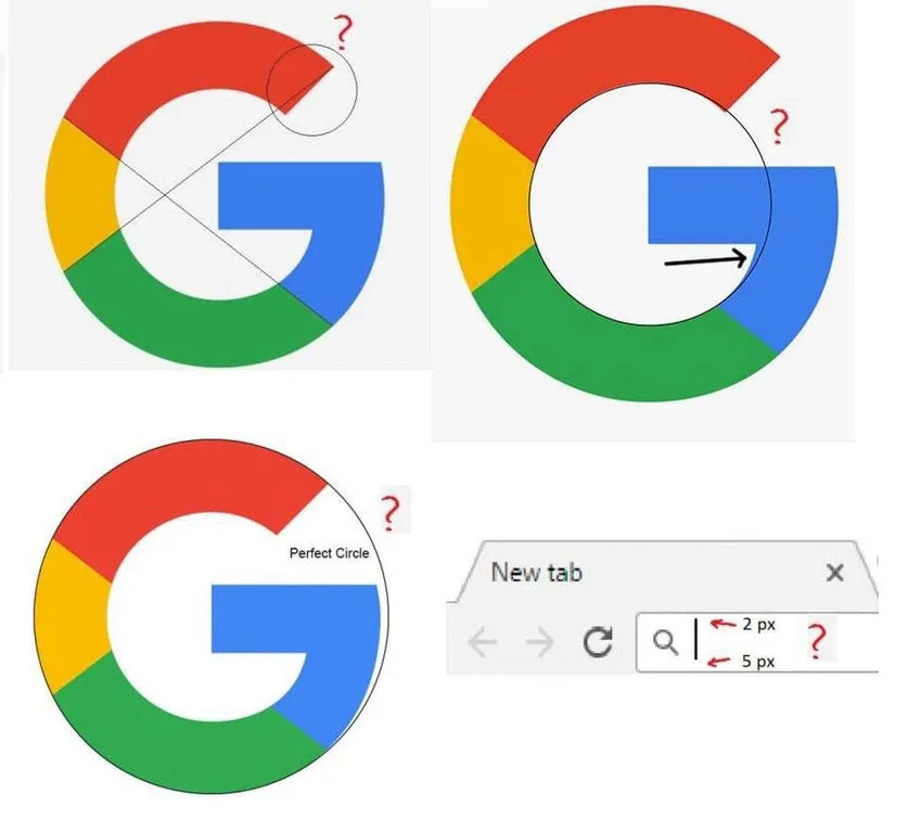
Brought to light in a thread by Reddit user A_freakin_t-rex, the images (shown above) question the mathematics behind the shape and colour of Google's 'G' symbol.
Latest Videos From Creative Bloq
And while A_freakin_t-rex claims not to have made the image (taking credit only for posting it on Reddit's 'mildly infuriating' board), a stream of comments on the thread shows that other designers have taken issue with the symbol design.
But what's the problem with the letter? Everyone can read it clearly; the colours communicate the main Google wordmark. Does a great logo design – or any design, for that matter – always have to be geometrically perfect?
A closer look
As you can see in the images above, the 'G' symbol isn't quite as circular as it appears on first sight. Where it curves in towards the limb, the bowl is slightly squeezed in as well. On top of that, the angles between the lettering and the colours don't line up.
Thanks to grid theory and principles like the Golden Ratio, we know that establishing a set of guidelines for type, and the way in which elements should be positioned within a layout, creates visual harmony and helps viewers understand a design.
Get the Creative Bloq Newsletter
Daily design news, reviews, how-tos and more, as picked by the editors.
The problem is that design principles like these are often slapped over photos or pieces of art by commentators as a stamp of endorsement; as if by obeying this set of logical design rules – and this set alone – the image in question is of good quality. Which isn't always the case, especially with type.
Optical vs metrical design
A key part of typeface design involves managing the friction between reality (what your eyes see) and optics (what your eyes think they see). Take Helvetica’s ‘H’. The crossbar is positioned ever-so slightly above the centre – but it appears to be central.
That’s because for a given weight of line, horizontal lines appear heavier than vertical lines. If you positioned Helvetica’s crossbar mathematically in the centre, it wouldn’t appear to be central. Many letterforms therefore need to be optically corrected so that they appear correct to readers – the same principle is involved in kerning.
Google itself explains the decision on its Evolving the Google Identity document: "The Google G is directly derived from the logotype ‘G,’ but uses increased visual weight to stand up at small sizes and contexts where it needs to share space with other elements.
"Designed on the same grid as our product iconography, the circular shape was optically refined to prevent a visual 'overbite' at the point where the circular form meets the crossbar. The colour proportions convey the full spectrum of the logotype and are sequenced to aid eye movement around the letterform.”
See how Google's real logo (left) compares to a geometrically perfect version by maxt0r (right)
To illustrate the point, user maxt0r created a new Google 'G' symbol that stays circular and divides its colours more evenly. The result is a subtly different logo with uneven visual weighting. Other users commented that the real logo has more character.
Of course, this isn't the first time a global brand has sparked designers' obsessive tendencies. Back in 2012, Twitter unveiled a new logo that relied entirely on two different sized circles for the shape of its bird icon.
Circles are the secret behind Twitter's current logo
As Google's 'G' symbol suggests, there's a time for maths – and there's a time for optical trickery.
Dom Carter is a freelance writer who specialises in art and design. Formerly a staff writer for Creative Bloq, his work has also appeared on Creative Boom and in the pages of ImagineFX, Computer Arts, 3D World, and .net. He has been a D&AD New Blood judge, and has a particular interest in picture books.