People are still just discovering the tiny imperfection in Google's logo

Remember the fuss about the Google logo? No? Well, don't worry if you missed it the first time around because it hasn't gone away. Eight years after the logo emerged, people are still making the shocking discovery that Google's circular G isn't actually a circle – at least not quite.
The discovery led Google's maths to design prowess to be questioned at the time, and it's still making headlines today. But is Google really breaking any of the rules of how to design a logo. Let's take a closer look.

Google's such a huge brand that every logo it creates for even the most minor products tends to get dissected (see our history of the Google logo and the debate about the Gmail logo for more). It should be no surprise then that it's main mark continues to come under scrutiny.
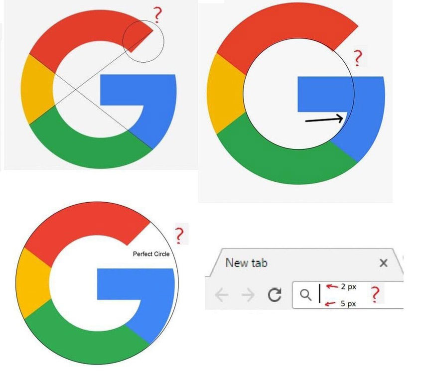
We first reported back in 2018 on how designers had noticed that the Google's G logo is not a perfect circle. While it's circular on the left of the design, on the right, it's slightly off perfect, as shown in the image above.
The Sun newspaper is the latest publication to finally discover the supposed design flaw, apparently thinking it's discovered a secret nobody had noticed. Describing the imperfect logo as an 'optical illusion' with a hidden "mistake", it says the design is "slightly off-perfect to trick your brain."

What Google actually did is use the fairly common typography technique of optical balancing to make the design look right, even if mathematically it isn't. As we noted at the time, a key part of typeface design involves managing the friction between reality (what your eyes see) and optics (what your eyes think they see). A classic example is Helvetica’s ‘H’, in which the crossbar is positioned slightly above the centre but appears to be central.
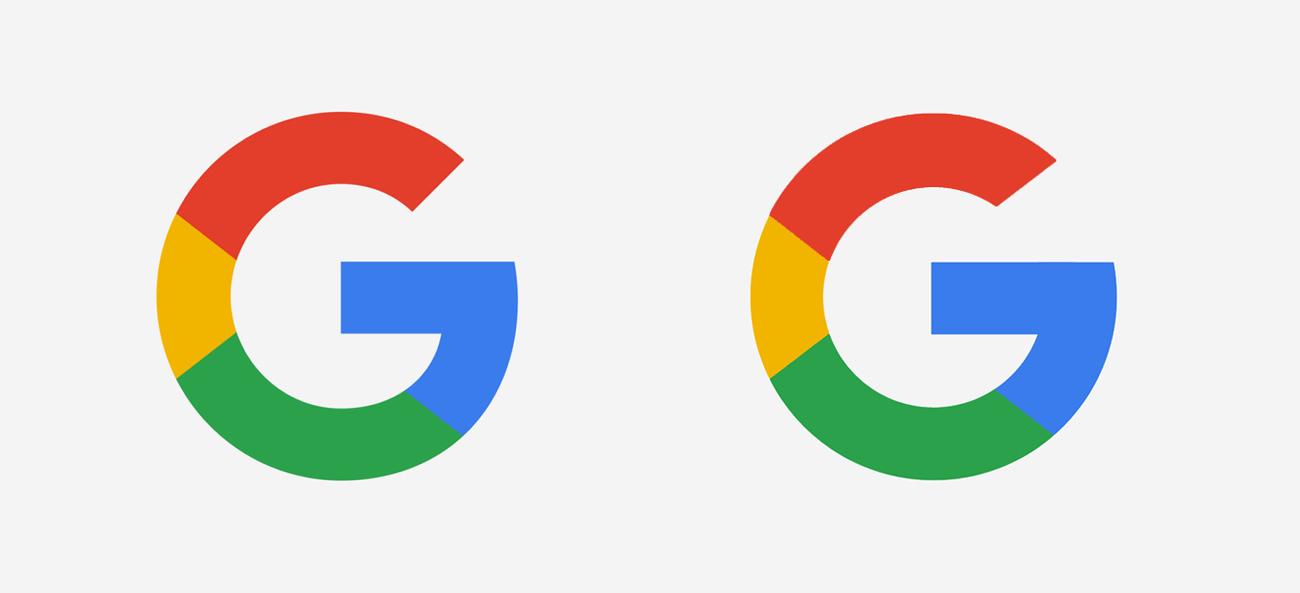
Typographers and logo designers do this because certain lines can appear to be heavier than others even if they're not, and sometimes perfectly centred designs 'look' off when placed in situ. In the case of the Google logo, the optical refinement is made to prevent a visual 'overbite' where the circular form meets the horizontal crossbar of the G. Note that the angles between the lettering and the colours also don't line up, again intentional. The image above created by Reddit user maxt0r shows what the Google 'G' symbol would look like if it were perfectly circular and its colours were divided more evenly. It actually looks more uneven.
Sign up to Creative Bloq's daily newsletter, which brings you the latest news and inspiration from the worlds of art, design and technology.
For more logo controversy, see our pick of the most unbelievable logo fails of 2022. And don't miss our piece on the current adaptive logos trend. You might also want to see these big brand logos that never saw the light of day.
Read more:

Joe is a regular freelance journalist and editor at Creative Bloq. He writes news, features and buying guides and keeps track of the best equipment and software for creatives, from video editing programs to monitors and accessories. A veteran news writer and photographer, he now works as a project manager at the London and Buenos Aires-based design, production and branding agency Hermana Creatives. There he manages a team of designers, photographers and video editors who specialise in producing visual content and design assets for the hospitality sector. He also dances Argentine tango.

