The first Google logo was not pretty... and nor was the second.
(Image credit: Google)
The Google logo has become one of the most recognised logos in the world. It's certainly one of the most seen. Pretty much anyone who uses the internet (so pretty much anyone, period) sees the Google logo on a daily basis every time they look for a restaurant, pub quiz trivia or the meaning of life on the world's most popular search engine (unless you're really using Bing).
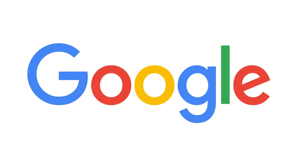
Today, the Google logo is a masterclass in design. Its use of colours and a clear, simple but distinctive typeface make it memorable, instantly recognisable, attractive, (or at least not displeasing) to see on a screen every day, and infinitely modifiable as we see in Google's wider family of logos and its regular doodles. But it wasn't always that way. Oh no, the early Google logos are quite hard to look at today.
But look at them we will, because they illustrate a series of sound design decisions that were made to get the Google logo to where it is today. For more logo trivia and history, see our look back at the YouTube logo history, but for now, here's the Google logo through the ages.
Latest Videos From Creative Bloq
The Google logo history: September 1997
Ouch, my eyes! This was the first Google logo (Image credit: Google)
The first Google logo is hard to believe today, but it looks kind of retro even for when it was made. An example of how ugly the early days of the internet were, fortunately, it only lasted very briefly, from 15 September to 27 September 1997, while Google remained a university research project. But we're glad it had that little moment of glory. It offers strong nostalgia value for just how ugly the internet used to be (Geocities, anyone) but also that early excitement about what the internet could bring.
Google logo history: October 1997
The Google logo already started to look recognisable in 1997, but those colours! (Image credit: Google)
Perhaps we could consider this the first Google logo proper. When Larry Page and Sergey Brin decided to make Google public, they realised they were going to need a slightly better logo, but they weren't ready to bring in graphic designers yet. Brin apparently knocked up the logo himself using the open-source image editor GIMP.
It's already starting to look like the Google logo we know today, although the colour combination is different with the initial Baskerville Bold G in a garish green rather than blue. It's interesting to see just how quickly Google went through iterations of its logo in these early days, almost as though it realised that getting the logo design right was almost as important as perfecting its search engine. This one lasted a little longer, but not much, seeing use from 28 September to October 29, 1997.
Google logo history: October 1997 – May 1999
In 1999, everything needed an exclamation mark. Even the Google logo (Image credit: Google)
Finally a logo with some staying power. The third Google logo lasted for a whole seven months, from 30 October 30 1997 to 30 May 1999. This was an exciting time, when the use of the internet was becoming more generalised for both work and play. It was a time for exclamation marks, and Google wasn't going to go without one.
Get the Creative Bloq Newsletter
Daily design news, reviews, how-tos and more, as picked by the editors.
The letters also became more rounded, with heavier and most distanced shadow, and the hues were tweaked. The initial G became blue, setting the order of colours that we know today, although the hues are still very different. They're now all primary colours apart from the wild green 'L'. Google finally gave this logo the shove in May 1999, perhaps deciding that it was just a bit too 'Yahoo!' Want to see what the Google logo in 1998 looked like in situ. Just type 'Google in 1998' into the search engine for a surprise treat.
Google logo history: May 1999 – August 2015
The Google logo reaches maturity (Image credit: Google)
Now we're talking! After its brief rebellious adolescence, the Google logo grew up in 1999. This is the logo that many people will remember from when they began using Google at the start of the present century. It was designed by the Stanford assistant professor Ruth Keda. She experimented with a huge range of logos, but finally Brin and Page settled for one of the options that was most similar to the existing design.
The exclamation mark was sensibly dropped and the typeface was switched to Catull for a more elegant and mature-looking logo. The shadow remained but it was more refined and the whole thing looked more professional and apt for a company that was fast on its way to becoming a tech giant. This one was a keeper remaining in place from 31 May 1999 to 5 May 2010 – an incredible 11 years. Even after that, the next couple of tweaks were relatively minor, as we'll see below, with the core design remaining the same until 2015.
Google logo history: May 2010 – September 2013
The Google logo becomes brighter and happier (Image credit: Google)
The shadow and 3D lettering were starting to look a bit dated by 2013, so the Google logo was tweaked a little. Both effects were kept, but their intrusiveness was reduced. The hues were also changed slightly to make the logo brighter – happier even. Most obviously the second 'O' was made a warmer hue of yellow.
Google logo history: September 2013 – August 2015
The Google logo we came to love (Image credit: Google)
The history of the Google logo is also the history of logos and design in general over the past two decades. By 2013, the fashion for 3D logos was starting to pass and it was generally decided that simpler, flat logos worked better for digital use. The cleaner looks also became associated with a modern feel in general. Google was part of the first raft of brands making the move, flattening its lettering and removing the drop shadows. This logo remained in place for almost two years, from 19 September 19, 2013 to 31 August, 2015.
The Google logo history: 2015 – to present
The current Google logo wasn't a hit initially (Image credit: Google)
The big change came in 2015, when we first saw the Google logo that its still in use today. The process involved was very different this time. By now, Google was much more than just a search engine and it needed a logo that could form part of a wider visual identity system that would cover a wide range of products, from cloud services to email and Google Meet. It ran a week-long design sprint with Google designers that resulted in a host of icons and a very different Google logo.
If the 2013 logo was flat, the 2015 logo feels even flatter, if such a thing is possible. The search and now all-round tech giant dropped the last complication in its logo – the serifs – and went for a simple, thick, sans serif font, its very own Product Sans. The new Google logo caused a minor controversy initially, with some feeling that it looked childlike and immature, but the colours popped and it gave the company a more approachable look that could be replicated in other variations such as the multi-coloured G as its favicon and app icon.
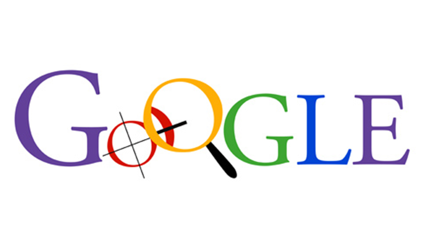
The Google logos that didn't make it
Image 1 of 2
Rejected Google logo designs(Image credit: Google Inc)
Rejected Google logo designs(Image credit: Google)
Of course, as with any brand, Google threw out many logo designs that never made it to use. We saw one of them in our piece on the big brand logos that never saw the light of day. In 1998, Ruth Kedar produced a wide range of more radical designs for the Google logo. Those that didn't make it still used the Catull font but some had different colours, and even icons such as magnifying glasses and target crosshairs. The Crosshairs were intended to represent the accuracy of Google's algorithm, but they make us think of target practice. There was also a design with a Chinese fingertrap.
Larry and Sergey apparently liked the ideas, but thought they were a bit busy. We think they made the right choice. There's so much going on in the design that it seems impossible that these designs would have lasted to today had they been chosen. There's also the problem that the symbolism is too specific to Google's original product – its search engine. When designing a logo, it can be useful to have a crystal ball to be able to see where a brand's headed and avoid restricting it to an association with its current products.
Joe is a regular freelance journalist and editor at Creative Bloq. He writes news, features and buying guides and keeps track of the best equipment and software for creatives, from video editing programs to monitors and accessories. A veteran news writer and photographer, he now works as a project manager at the London and Buenos Aires-based design, production and branding agency Hermana Creatives. There he manages a team of designers, photographers and video editors who specialise in producing visual content and design assets for the hospitality sector. He also dances Argentine tango.