Turns out those Google logo colours mean more than you think
The green ‘L’ has quite the backstory.

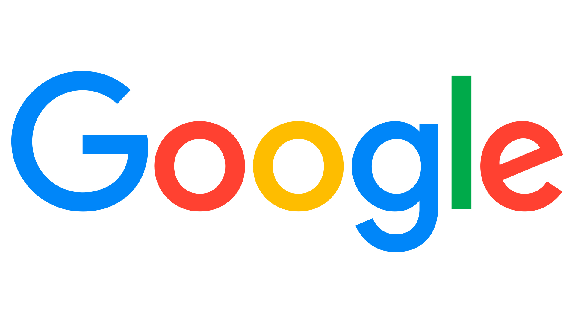
It's one of the most recognisable logos around, and perhaps, at first glance, one of the most rudimentary. Ask anyone to describe the Google logo and they'll probably tell you it's the word Google in different colours. They'd be right – but it turns out there's a little more going on with those hues.
The Google logo is made up of primary colours – except, of course, for that green 'L'. And according to the company, that was a very deliberate decision. (Looking for more design inspiration? Check out the best logos of all time.)

The first version of the Google logo was created on free graphic design software GIMP in 1997, and it looks very, er, 1997. It wasn't until the next year that the iconic blue-red-yellow-blue-green-red colour scheme emerged, and the logo hasn't changed a great deal since then. Sure, like most logos over the last few years, it's become flatter and undergone a few typographical tweaks, but the design has remained remarkably similar for 24 years.

So if the rest of the colours are primary, why the green 'L'? "There were a lot of different colour iterations," graphic designer Ruth Kedar told Wired in 2000. "We ended up with the primary colours, but instead of having the pattern go in order, we put a secondary colour on the L, which brought back the idea that Google doesn’t follow the rules."
While we're not sure many casual viewers will see that non-primary-coloured 'L' and instantly think, 'what a rebel' – but it's always a delight to find out the secrets behind some of our favourite logos. From Walmart to Starbucks, we learn new things about some of the most recognisable designs almost every week.
But speaking of not following the rules, perhaps Google would do well to remember the number one rule of logo design – that your design shouldn't easily be mistaken for another. Judging by the response to the confusingly similar new Google Workspace logos, the company hasn't exactly designed them to easily tell apart. Inspired to create your own design? Take a look at our guide on how to download Photoshop.
Read more:
Get the Creative Bloq Newsletter
Daily design news, reviews, how-tos and more, as picked by the editors.

Thank you for reading 5 articles this month* Join now for unlimited access
Enjoy your first month for just £1 / $1 / €1
*Read 5 free articles per month without a subscription

Join now for unlimited access
Try first month for just £1 / $1 / €1

Daniel John is Design Editor at Creative Bloq. He reports on the worlds of design, branding and lifestyle tech, and has covered several industry events including Milan Design Week, OFFF Barcelona and Adobe Max in Los Angeles.
