Social distancing Google doodle is ingeniously simple
Reddit user's concept art hits the spot.
Sign up to Creative Bloq's daily newsletter, which brings you the latest news and inspiration from the worlds of art, design and technology.
You are now subscribed
Your newsletter sign-up was successful
Want to add more newsletters?
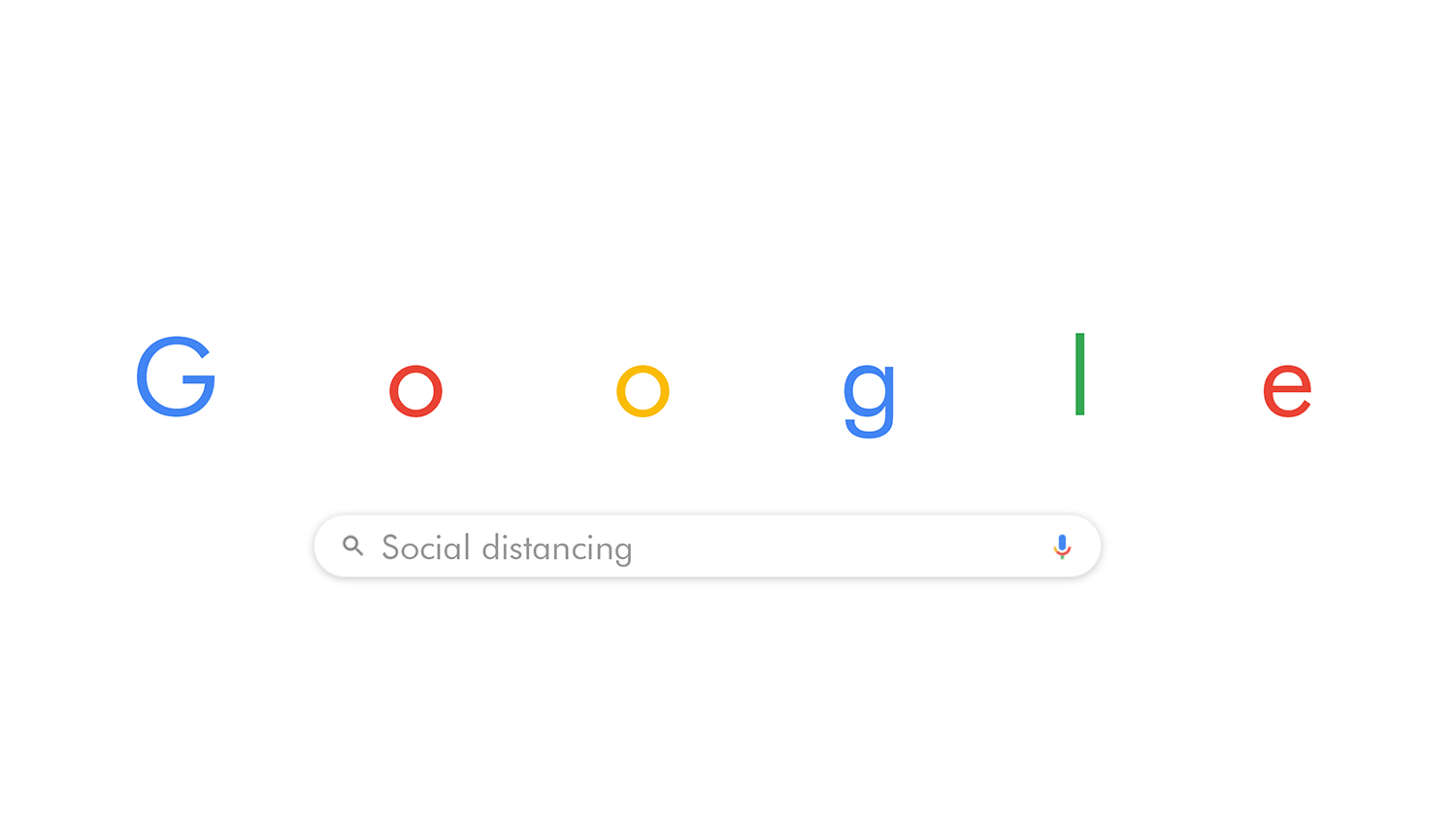
We've seen lots of creative responses to coronavirus and the rise of self-isolation over the past few days, and this Google doodle concept by Reddit user NumericalMiracle is an ingeniously simple addition. "If I were a Designer on the Google team," they say, "this is what my doodle would be for now. Simple, but communicates what needs to happen."

While Google doodles have come in all shapes and sizes over the years (check out our list of the best Google Doodle designs) , this is one of the most simple yet effective concepts we've seen. By simply increasing the kerning of the existing 'Google' letters, NumericalMiracle pushes them into their own state of self-isolation. While it might not be blatantly clear at first glance why the letters have been separated, with all the talk of quarantine and isolation right now, it surely wouldn't take long for the penny to drop – and the search box has been autofilled 'social distancing' to drive the message home.
"Petition for this to become a real google doodle!" one user comments, while another adds, "Send it please to Google, wait does Google have Gmail address?" The doodle concept has certainly captured Reddit's imagination, and we'd love to see it on the Google homepage – as well as being ingeniously simple, it communicates a useful message about importance of social distancing at this time.
Article continues below 
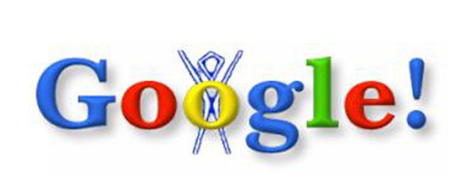
The first Google doodle appeared in 1998, when founders Larry Page and Sergey Brin were going to the Burning Man festival, and wanted to notify users of their absence in case the servers crashed. They added a Burning Man figure to the logo (as a fun out-of-office message) People loved it, and the Google Doodle was born.
Read more:
- Illustrators depict their perfect self-isolation scenario
- Drawings of mythical Amabie flood social media
- 13 of the best Google Easter Eggs
Sign up to Creative Bloq's daily newsletter, which brings you the latest news and inspiration from the worlds of art, design and technology.

Daniel John is Design Editor at Creative Bloq. He reports on the worlds of design, branding and lifestyle tech, and has covered several industry events including Milan Design Week, OFFF Barcelona and Adobe Max in Los Angeles. He has interviewed leaders and designers at brands including Apple, Microsoft and Adobe. Daniel's debut book of short stories and poems was published in 2018, and his comedy newsletter is a Substack Bestseller.
