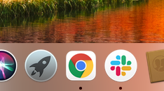
Google wants you to pick the new Chrome icon for MacOS
Which do you prefer?
When it comes to releasing new icons, Google has been on a roll in 2020. From Gmail to Google Photos, the entire Google Workspace suite has been given a new, minimal look – but not every new icon has gone down well online. And now, in a rare move, the tech giant has invited feedback on its latest design.
If you're a Mac user, you might have noticed a new Chrome icon in your dock, featuring the app's logo within a new white border. The icon is designed to match the aesthetic of the newly released MacOS Big Sur, but it seems Google remains open to the idea of tweaking it further. (If you're looking for icon inspiration, our logo design guide is a great place to start.)
As many of you noticed, we introduced a new Chrome icon for macOS Big Sur today ✨ The team has also been exploring some further macOS-aligned options (some examples here), and we’re interested in hearing what you think about them 🙏 pic.twitter.com/dUS70OZdCrNovember 17, 2020
Google Chrome designer @elvin_not_11 took to Twitter (above) to share three different versions the company is considering. While all three depict the same basic Chrome logo on a white background, each features a different level of shadow and texture. Much like many of MacOS Big Sur's controversial icons, two of the icons have a distinctly 3D look, while the other is flatter.

The designer also shares other concepts from the design process, including different sizings of the Chrome logo (below). They explain that the design team tried closely matching Apple's own icon sizing conventions, but felt that the Gmail logo looked too large. Several users have since commented that the unused larger version (below) would be more consistent with the rest of Big Sur.
We tried a version that strictly follows Apple's icon grid, and noticed the Chrome logo looked too big, so we made it smaller in the one we shipped today for visual balance, but maybe there's room for us to adjust even more :) pic.twitter.com/9VtNN8oNAINovember 18, 2020
As for the three different icons, it seems many users are torn between options B and C. The latter is our favourite, sitting somewhere between the flat design of option A, and the perhaps overly textured option B. Seeing as Apple can't seem to make its mind up between flat and 3D design with MacOS Big Sur, it seems appropriate to choose a combination of both.
It's a rare and fascinating treat to be given such an insight into the design process of a company like Google – and it reveals just how much a touch of extra shadow can impact an overall design. Time will tell whether Google will act on Twitter's feedback and opt for a larger and more 3D Chrome icon. And while the company is in a listening mood, perhaps it's time to take on board users' criticism of that confusing Gmail icon.
If you're looking for the ultimate Big Sur experience, check out today's best M1 Mac deals below. And for all the best Apple deals in one place, head to our Apple Black Friday page
Get the Creative Bloq Newsletter
Daily design news, reviews, how-tos and more, as picked by the editors.
Read more:

Thank you for reading 5 articles this month* Join now for unlimited access
Enjoy your first month for just £1 / $1 / €1
*Read 5 free articles per month without a subscription

Join now for unlimited access
Try first month for just £1 / $1 / €1

Daniel John is Design Editor at Creative Bloq. He reports on the worlds of design, branding and lifestyle tech, and has covered several industry events including Milan Design Week, OFFF Barcelona and Adobe Max in Los Angeles. He has interviewed leaders and designers at brands including Apple, Microsoft and Adobe. Daniel's debut book of short stories and poems was published in 2018, and his comedy newsletter is a Substack Bestseller.
