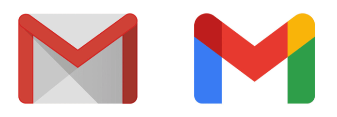
Google's new Gmail logo leaves users fuming
Is it supposed to be this confusing?
After weeks of hinting that a new look was in store for Gmail, Google has revealed a brand new logo for the hugely popular email service. The company has also announced a new name for its G Suite collection of apps: Google Workspace. Gmail's new look brings it very much in line with the rest of Google Workspace – something that's proving a point of contention among users.
Clearly taking logo design inspiration from the likes of Google Maps, Google Photos and more, Gmail's new 'M' features the brand's signature blue, red, green and yellow colour scheme. It also does away with the original's envelope backdrop. It's certainly consistent with the rest of Google's icons, but this consistency is exactly why some users are unhappy.

Just as we predicted, the new Gmail logo is a much more minimal version of the existing logo. Just like the recent Google Maps and Google Photos logo updates, it retains a single design element and adds Google's four-colour aesthetic. On its own, we'd say the new logo is a winner – it's a clean, colourful and contemporary take on the original. But the problems begin when it is placed next to the other Google Workspace icons.
Angry users have taken to Twitter to complain that the Google Workspace icons simply look too similar. Just like Adobe Creative Cloud's recent icon overhaul, the consensus is that the designs are too easy to mistake for one another – something that isn't exactly conducive to a smooth workflow.
Gmail’s new logo is a JOKE. A homogeneous color scheme for their entire suite of apps is a terrible idea. The red envelope stuck out much better. Now every app looks the same at a squint with the exact same colors. I hope they don’t touch up docs sheets and slides. SAD! pic.twitter.com/FdrlTayb7DOctober 6, 2020
Google scale: take 5 iconic, visually distinct logos and ruin all of them at once. pic.twitter.com/yttToio8NVOctober 6, 2020
The lack of cohesive iconography is sending me. pic.twitter.com/Iw7xhPQQR6October 6, 2020
Google says that the new logo is designed to reflect "a more connected, helpful, and flexible experience," and the fact that Google's Workspace apps are "part of the same family". Judging by the response from users, it seems Google may have achieved this a little too effectively. Indeed, perhaps the most non-negotiable quality of our best logos of all time is that none are in danger of mistaken for anything else.
Read more:
- Apple reveals iPhone 12 event – but does the invite hide a secret?
- Creative Cloud gets huge price cut in killer Adobe deal
- Instagram's new icons are a glorious blast from the past
Get the Creative Bloq Newsletter
Daily design news, reviews, how-tos and more, as picked by the editors.

Thank you for reading 5 articles this month* Join now for unlimited access
Enjoy your first month for just £1 / $1 / €1
*Read 5 free articles per month without a subscription

Join now for unlimited access
Try first month for just £1 / $1 / €1

Daniel John is Design Editor at Creative Bloq. He reports on the worlds of design, branding and lifestyle tech, and has covered several industry events including Milan Design Week, OFFF Barcelona and Adobe Max in Los Angeles.
