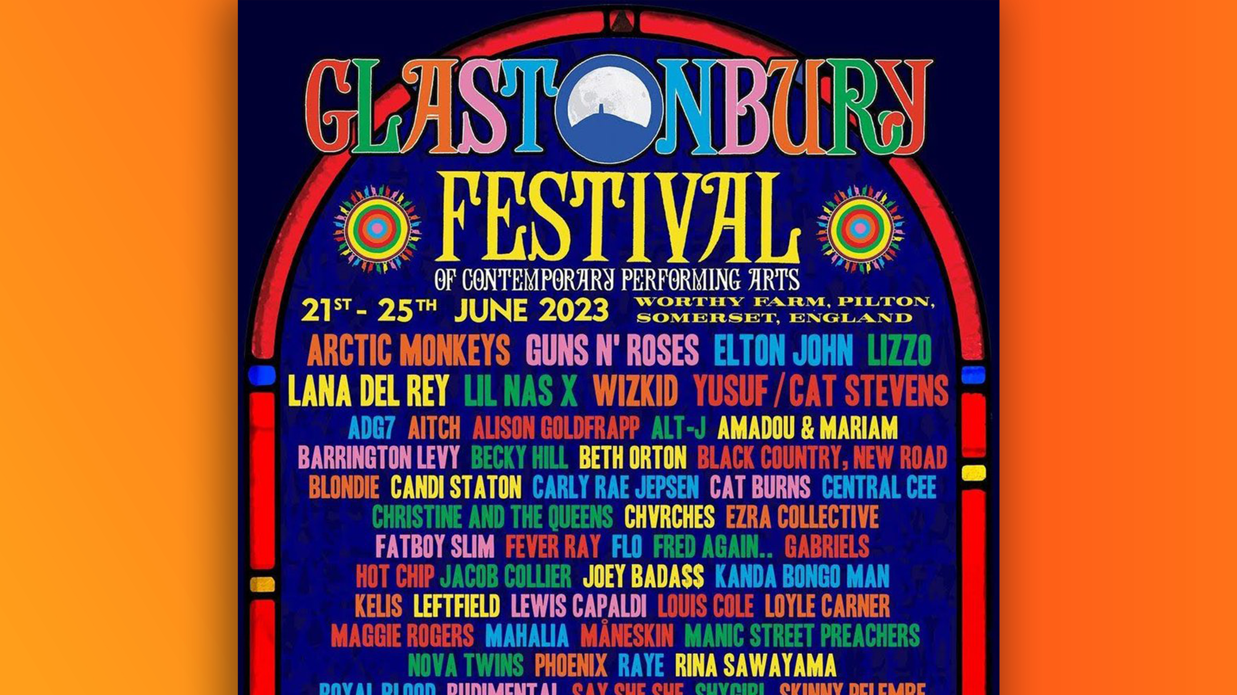
The real Glastonbury poster controversy is the kerning
Forget Lana Del Rey.

The 'big' Glastonbury news this week is that, apparently after a complaint from the artist herself, Lana Del Rey's name has been unsurreptitiously elevated in a new version of the poster for Glastonbury festival 2023. But less pop-centric designers are spotting an altogether less forgivable sin.
Del Rey is reported to have suggested on Instagram that she might pull out of the festival the original poster didn't give her high enough billing to reflect her headline spot on the second largest stage – and a new version (below) features her name in the requisite place. But enough about Lana Del Rey, let's talk about your friend and mine, kerning.
A post shared by Glastonbury Festival (@glastofest)
A photo posted by on
Designers have noticed that the spacing between the letters on this thing is... a little all over the place. From EL Ton John to Rudiment AL, we're discovering quite a few artists on here that we've never heard of.
Can we have a chat about how bad the kerning on the @glastonbury poster is?! pic.twitter.com/7NIqPBZC1HMarch 16, 2023
"Looks like a cheapie DaFont font, with sloppy kerning as standard," one Twitter user comments, while another adds, "The kerning is lost. This is a really nice font that is totally mistreated." Others meanwhile, have kindly suggested that the typeface might be attempting to copy the output of a real letterpress, in which letters are printed using blocks.
Unless Lana Del Rey speaks up to demand an explanation, we'll probably never know quite what the typographical intention (or lack thereof) was here. For now, we'll add it to the pile of Mildly Infuriating Kerning Incidents, where it joins the likes of the new Avatar wordmark, and that hilarious(ly bad) Twitter Blue logo.
Read more:
- The MLB logo features a subtle yet genius optical illusion
- The internet still can't get over Pepsi's brilliant optical illusion logo
- People are still just discovering the tiny imperfection in Google's logo
Get the Creative Bloq Newsletter
Daily design news, reviews, how-tos and more, as picked by the editors.

Thank you for reading 5 articles this month* Join now for unlimited access
Enjoy your first month for just £1 / $1 / €1
*Read 5 free articles per month without a subscription

Join now for unlimited access
Try first month for just £1 / $1 / €1

Daniel John is Design Editor at Creative Bloq. He reports on the worlds of design, branding and lifestyle tech, and has covered several industry events including Milan Design Week, OFFF Barcelona and Adobe Max in Los Angeles.
