Ghostrunner 2's world 'changes the more Jack discovers'
Sign up to Creative Bloq's daily newsletter, which brings you the latest news and inspiration from the worlds of art, design and technology.
You are now subscribed
Your newsletter sign-up was successful
Want to add more newsletters?

Five times a week
CreativeBloq
Sign up to Creative Bloq's daily newsletter, which brings you the latest news and inspiration from the worlds of art, design and technology.

Once a week
By Design
Sign up to Creative Bloq's daily newsletter, which brings you the latest news and inspiration from the worlds of art, design and technology.
Once a week
State of the Art
Sign up to Creative Bloq's daily newsletter, which brings you the latest news and inspiration from the worlds of art, design and technology.

Seasonal (around events)
Brand Impact Awards
Sign up to Creative Bloq's daily newsletter, which brings you the latest news and inspiration from the worlds of art, design and technology.
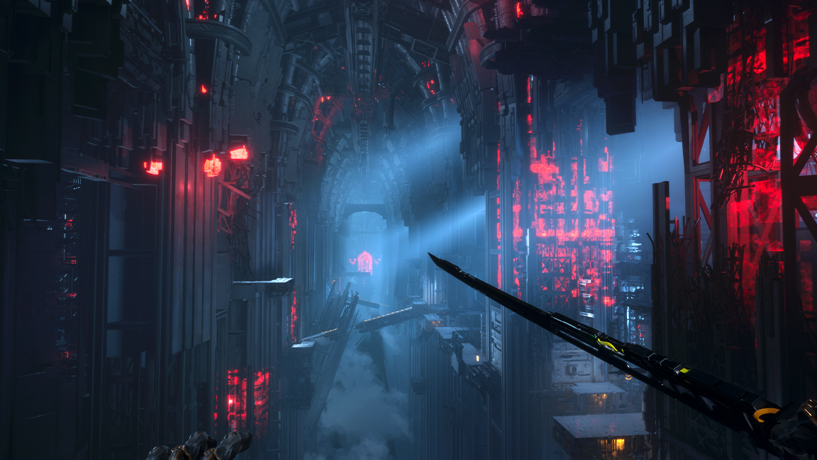
Upcoming PS5 game Ghostrunner 2 is using colour and light in a unique way to bring its world to life, as well as guide and shape the player's experience. The game's lead level artist, Dariusz Kułak, tells me how and why the team are making clever design changes for this sequel.
"In the game itself, the light is intended to set the general tone of background events and emphasise the passage of time," says Dariusz Kułak, offering an eye-catching example: "The more Jack knows about the origins of the cult, the game gets darker and grittier."
In my recent interview with Ghostrunner 2's art director Wojciech Wilk I learned about the influences that have inspired the game. Now Kułak reveals how colour and light is being used to tonally shift and change the game the more of its world you uncover, and while the story is presented in a HUB area, the art team are giving each non-player character (NPC) their own colour palette, "to emphasis their role and character throughout the story".
Ghostrunner 2's colour theory
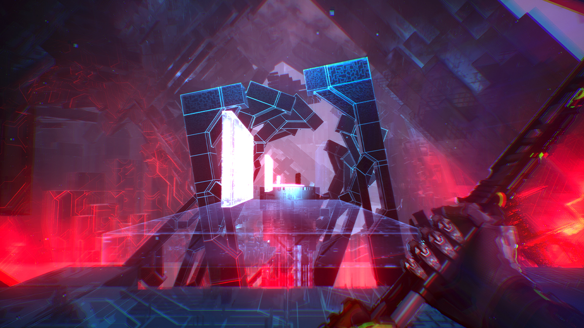
Ghostrunner 2 is a fast-paced parkour game where players take on the role of a cybernetic ninja. Gameplay is designed around speed and the use of platforms to race around large, puzzle-like environments. Considering the pace of the game colour also plays an essential part in guiding the player.
"It is not easy," confesses Kułak, "but it is very important to define the palette for each setting and find one colour that will guide the player throughout the game. It is important that this colour is only used for this purpose and never placed as a background element."
As in the first Ghostrunner game, the colour yellow is used to mark any places that the player is supposed to focus on. Aside from this element, Kułak says the art team have worked to make players feel uncomfortable. He says: "Our main goal was to move away from the environments players were familiar with in the first game, and to replace them with something completely new and fresh. Of course, it had to fit in with the existing game mechanics and story."
Kułak continues: "Once we had chosen the general idea for each environment, we started to think about how levels from the same environment could be distinguished from each other. It could be a specific theme for the whole level or a palette of colours used. In the end, it seems to me that each level has its own character and it's hard to confuse it with something else in the game."
Sign up to Creative Bloq's daily newsletter, which brings you the latest news and inspiration from the worlds of art, design and technology.
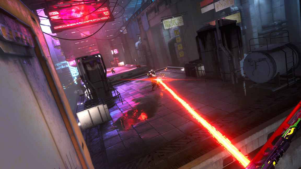
One of these new environments is the Temple. Originally the design team created an environment and levels that referenced traditional mediaeval cathedrals, but it became evident this was too out of step with the futuristic tower and cyberpunk world of Ghostrunner 2.
"So we started experimenting with monolithic structures," says Kułak. "However, this did not give us the proper Temple feeling we wanted to achieve. So we started adding some elements that could be found in cathedral architecture but modified for a futuristic setting."
The lead level artist adds: "We added huge steel columns, statues and stained glass windows to the level. Ultimately, the effect is amazing and is a compromise between what different departments in the company wanted."
Ghostrunner 2 is efficient with detail
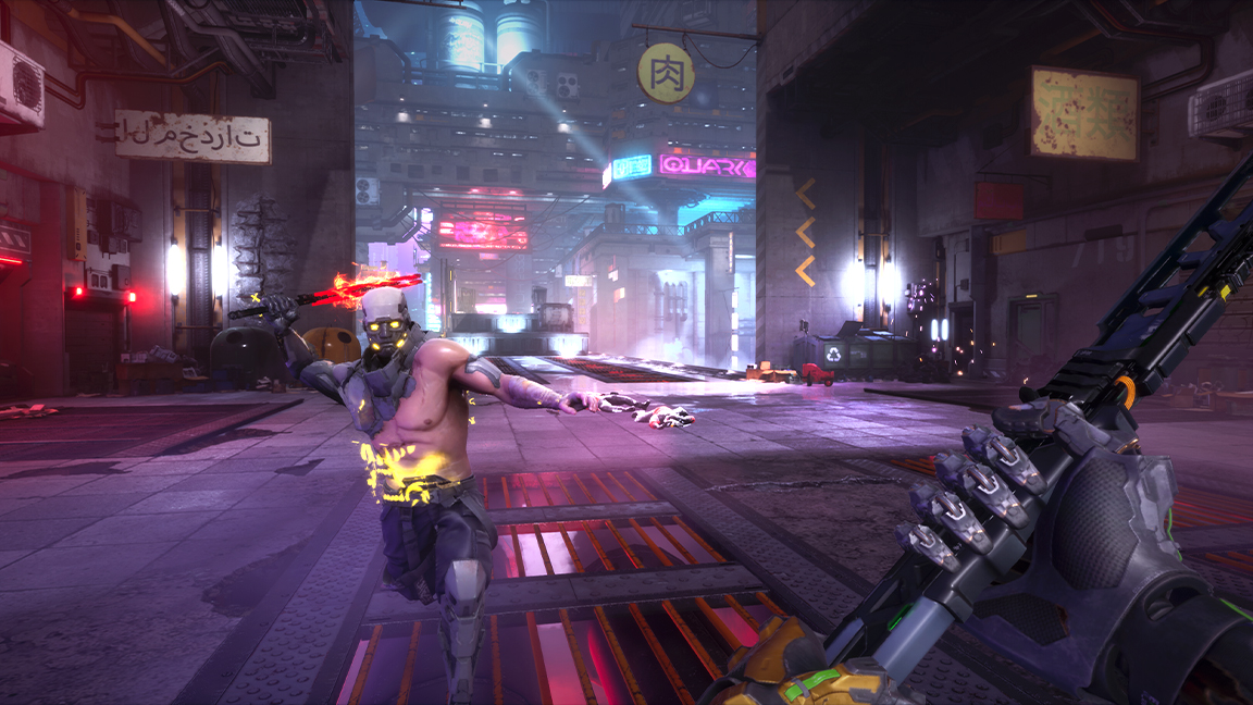
Ghostrunner 2 is designed to be a larger game than the original, with more places ro explore both horizontally and vertically. The level design of this sequel is more ambitious, but Kułak stresses how this doesn't mean adding needless detail.
He shares a good piece of advice, saying while the game "puts more emphasis on exploration, so there are more places in the levels where you can find something 'interesting'," good design needs to put the player first, saying: "All visual elements must be very straightforward, because the player doesn't want to stop and search for details. It's a game about running after all."
Ghostrunner 2 releases 26 October on PS5 and Xbox Series X, and there's a demo on PlayStation now to try for yourself and see Kułak's work in action. If you've not yet got a new games console, read my PlayStation 5 review and Xbox Series X review.

Ian Dean is Editor, Digital Arts & 3D at Creative Bloq, and the former editor of many leading magazines. These titles included ImagineFX, 3D World and video game titles Play and Official PlayStation Magazine. Ian launched Xbox magazine X360 and edited PlayStation World. For Creative Bloq, Ian combines his experiences to bring the latest news on digital art, VFX and video games and tech, and in his spare time he doodles in Procreate, ArtRage, and Rebelle while finding time to play Xbox and PS5.
