Designer claims new video game controller could fix the industry
Sony, Nintendo, Microsoft: take note.

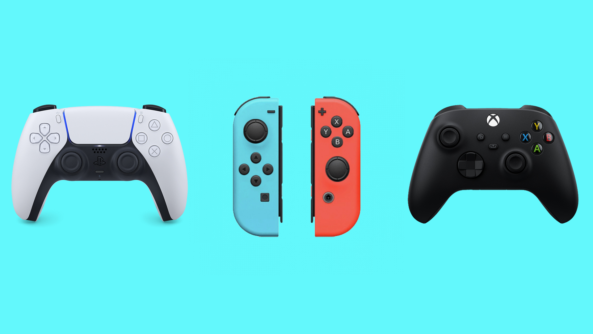
Unless you're a staunch supporter of a single machine, you've probably played more than one video console in your time. And if you often alternate between consoles, you're no doubt all too familiar with one of the most common design complaints – there's just no consistency between those symbol buttons.
In short, if you play Switch, PS5 and Xbox, the 'X' button is in three different places. So if a game instructs you to 'Press X', you'd better remember which console you're using at that particular time. But what if there was another way? (Ready to start gaming? Check out today's best Nintendo Switch deals)
Game designer Alex Camilleri has shared a design for a button layout created by his wife on Twitter, and claims it could "fix the game industry". Instead of the random assortment of letters and shapes thrown at us right now, it suggests adopting compass points: N, S, E and W. Indeed, if this became a universal standard across all controllers, surely we could say goodbye to which-button-should-I-press confusion.
Yesterday my wife casually fixed the game industry pic.twitter.com/hgzWRichEnOctober 27, 2022
"This is actually genius why hasn't any of the companies tried this yet?" One Twitter user comments, while another adds, "I've been thinking this for years!" That said, there are some who can't help but read the four co-ordinates as the word 'NEWS'.
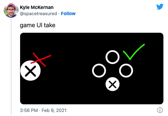
While it might seem trivial, button-gate is a pretty controversial issue among gamers. Last year, it was suggested that when instructing the user to press a button, the game UI should always show it in context (below). If anything, this is a clear sign that things are just too complicated – for users of the three main consoles, finding the 'X' button to press can feel like a game in itself.

Still, there are plenty of strides being made in the world of game controllers – from Sony's wild new controller concept to Apple's smartphone controller design. Whether they'll ever find common ground in terms of symbols, however, is another matter entirely.
Read more:
Get the Creative Bloq Newsletter
Daily design news, reviews, how-tos and more, as picked by the editors.

Thank you for reading 5 articles this month* Join now for unlimited access
Enjoy your first month for just £1 / $1 / €1
*Read 5 free articles per month without a subscription

Join now for unlimited access
Try first month for just £1 / $1 / €1

Daniel John is Design Editor at Creative Bloq. He reports on the worlds of design, branding and lifestyle tech, and has covered several industry events including Milan Design Week, OFFF Barcelona and Adobe Max in Los Angeles. He has interviewed leaders and designers at brands including Apple, Microsoft and Adobe. Daniel's debut book of short stories and poems was published in 2018, and his comedy newsletter is a Substack Bestseller.
