Futura font gets a modern makeover (and you won’t believe how good it looks)
Updated design proves classics shouldn’t always be left alone.
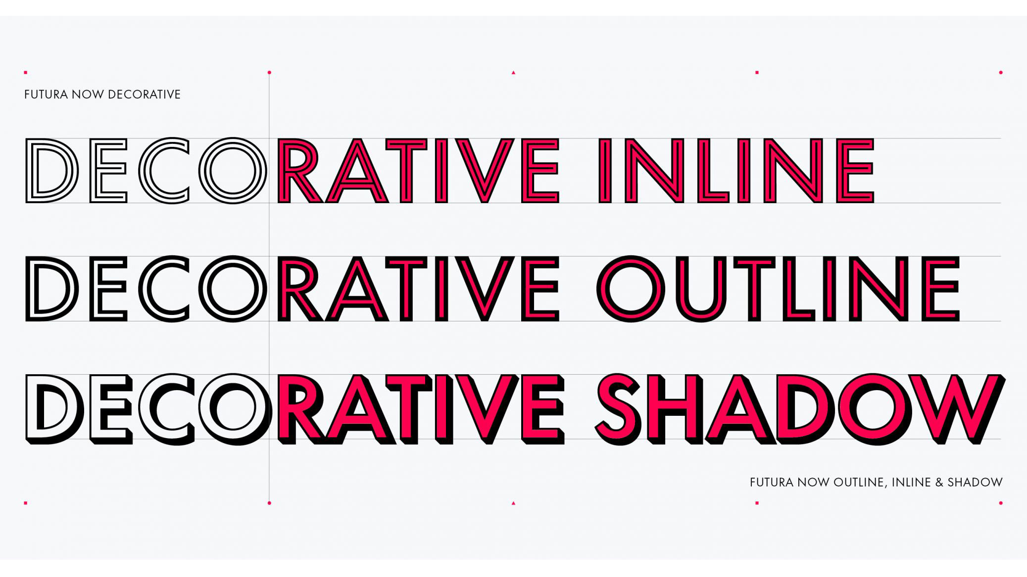
Futura has long been one of the most-loved fonts in the design world. But, as you'll know if you've tried to use it digitally, it's somewhat of a struggle to do it effectively. Its problematic spacing and every-so-slightly odd range of weights mean that the only typeface to live on the moon is not adapting well to modern applications.
Enter: Futura Now. An adaptation of the vintage Futura, which was introduced back in 1927 when Bauhaus was the only trend to follow, it's succeeded in making the font accessible and useable again. It's so good, it rivals those on our list of the best web fonts.
Futura Now has an impressive 102 styles, as well as five variable fonts, which aim to bring renewed vigour to the typeface family, with a reduced digital footprint and vastly shorter web loading times (hurrah). There are eight additional subfamilies, including Text and Headline (all beautifully spaced), and new weights and styles for Script and Display. You'll be able to use new decorative variants, too – Outlines, Inlines, Shadows and Stencil.
Support for 89 languages means the typeface can be used globally, and the whole set is available in industry-standard Open-Type fonts. Futura Now has the honour of also the first Futura to be available in the Variable font format.
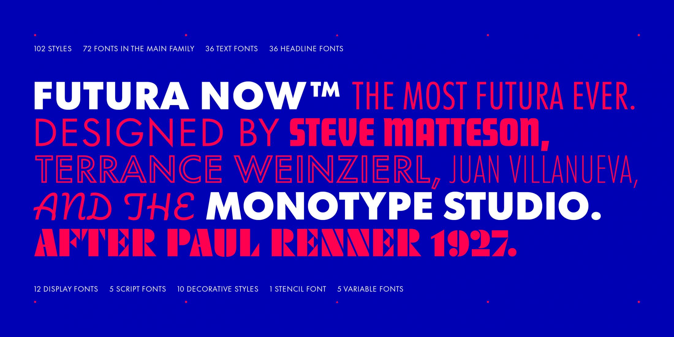
"Futura Now will inspire creatives to explore new uses for one of their favourite designs – perhaps one of the first typefaces they ever learned about," says Steve Matteson, Monotype's creative type director. "This family demonstrates how even timeless designs can benefit from contemporary refinement without disrupting the nature of the original."
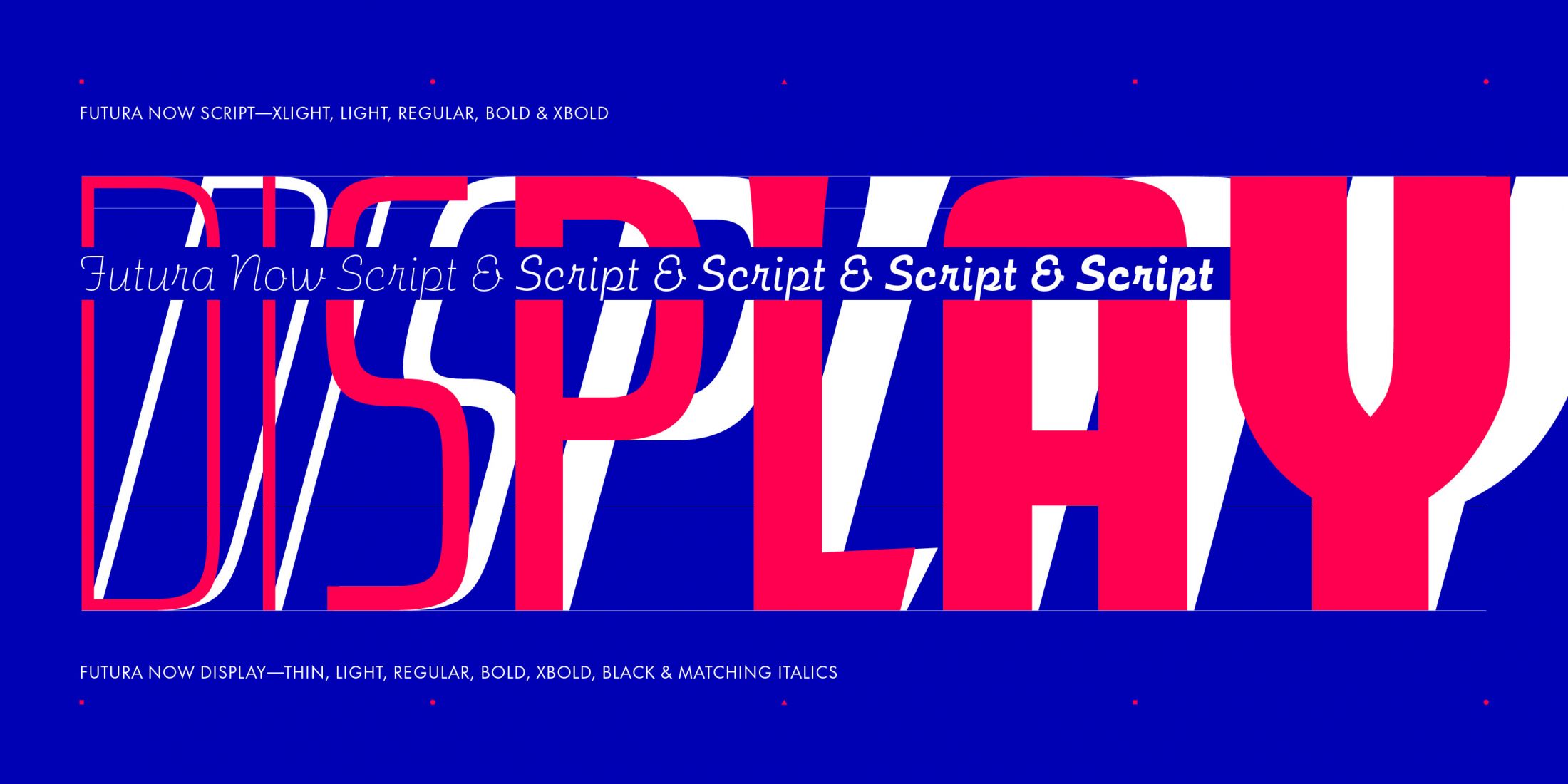
And Mark Davis, independent type consultant and art director at Tronvig, thinks Futura Now will offer a whole new set of tools for designers who want to "bolster their typographic playbook".
"For digital environments, logotypes, and brand identities that want to imbue the timeless elegance of the bauhaus and deco styles, " he says, "this collection of typefaces maintains the legacy of one of my favourite typefaces while giving it a well-deserved revival."
Get the Creative Bloq Newsletter
Daily design news, reviews, how-tos and more, as picked by the editors.
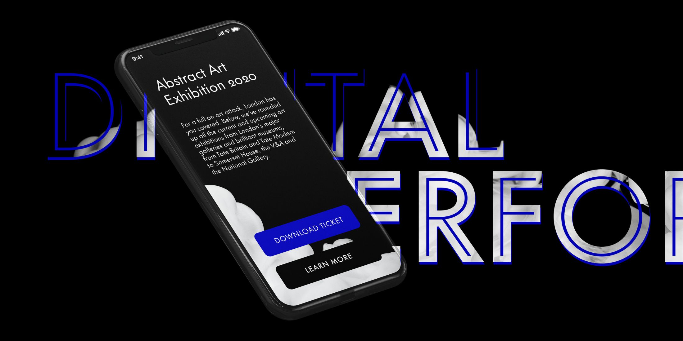
We're delighted to see a digital-first version of this iconic font, which Monotype has dubbed 'The most Futura ever', and we can imagine its use across a range of design projects that call for a timeless, classic yet future-forward vibe. Monotype has scored again with another successful digital transformation for a well-loved font (remember the fantastic job done with Helvetica?).
You can license Futura Now through myfonts.com, and it's currently on sale with a massive 75 per cent off. Or, you can use Futura Now Script Regular and Futura Now Headline Bold for free until 19 November 2020. Don't mind if we do.
Read more:

Thank you for reading 5 articles this month* Join now for unlimited access
Enjoy your first month for just £1 / $1 / €1
*Read 5 free articles per month without a subscription

Join now for unlimited access
Try first month for just £1 / $1 / €1

Georgia has worked on Creative Bloq since 2018, and has been the site's Editor since 2022. With a specialism in branding and design, Georgia is also Programme Director of CB's award scheme – the Brand Impact Awards. As well as immersing herself with the industry through attending events like Adobe Max and the D&AD Awards and steering the site's content streams, Georgia has an eye on new commercial opportunities and ensuring they reflect the needs and interests of creatives.
