This funeral director rebrand is surprisingly beautiful

Rebranding a chain of funeral directors may not seem like the kind of headline-grabbing job a creative agency would most relish. However, it's the kind of challenge that demands some exceptional creative thinking, as well as a particular sensitivity.
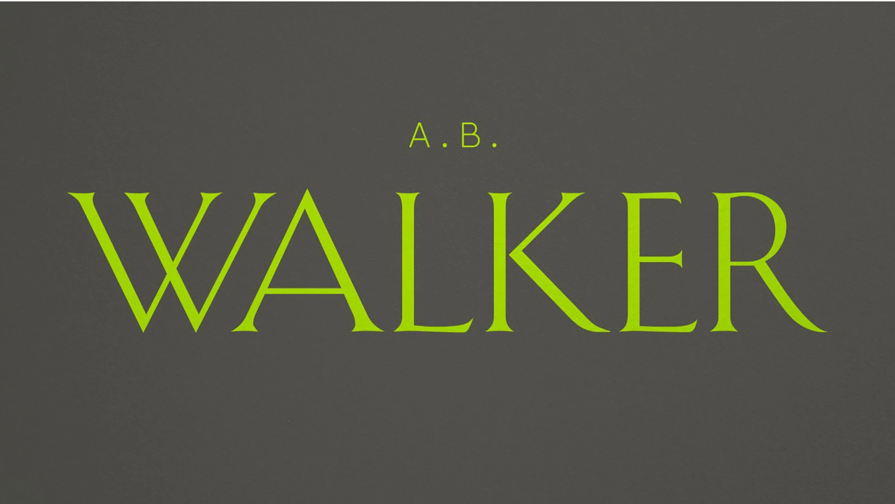
OurFriends were brought in to rebrand the family-run UK chain A.B. Walker, which has been in business since 1826. And the result is sober and calming, but it also includes a brand asset that is quite mesmerising (see our pick of the best branding books for more inspiration).
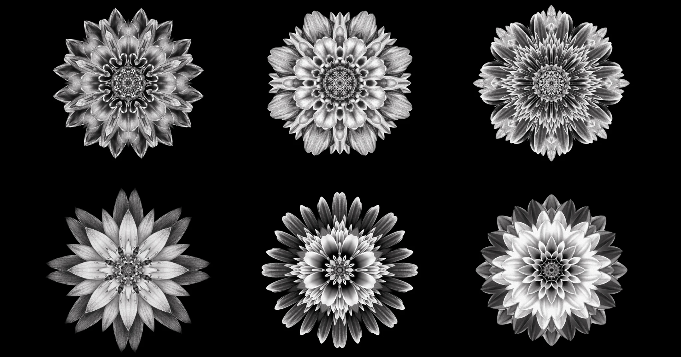
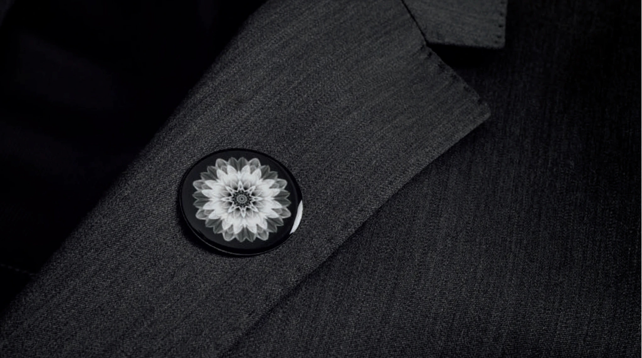
OurFriends' work for A.B Walker put a modern twist on the brand's long heritage by stripping things back and focusing on a flower petal kaleidoscope. Appearing in windows and consulting rooms, the petals constantly bloom and grow, timed to the speed of a clock, in order to show that the beauty of life continues on, and can really leave the viewer transfixed.
Article continues belowWriting about the project on LinkedIn, OurFriends' founder and CEO Peter Hale said the direction was motivated by a personal experience of loss. "What's worse than the death of a loved one? For me it was waiting in front of a funeral director's desk surrounded by racks of leaflets, piles of forms and headstone samples just days after my Mum died," he revealed. "This practical yet inadvertently insensitive set-up managed to bring the full horror of loss crashing in on me."


"Later that year I had the chance to rebrand a large chain of funeral directors in the UK," Peter continues. "The 200-year-old firm were famous for their remarkable and compassionate staff, but suffered many of the same issues. Realising that doing less was the most powerful thing to do, we removed the desk, the leaflets, the ticking clock and the coffins on the walls (yes really).
"In their place a calm and contemplative space where clients and staff sit next to, rather than opposite, each other. Our flower petal kaleidoscope underpinned it all. An artful centrepiece that on closer inspection, it’s moving, constantly blooming and growing in a never-ending cycle. It creates a contemplative mood and demonstrates the that the beauty of life continues on – we like to think of it as nature's clock made real."

Although it's a few years old now, the work demonstrates some important things. Firstly, that branding is about much more than just a logo and brand colour palette. The most successful approaches consider the whole user experience, including details of both physical and online settings where customers meet the brand. It also shows the importance of sensitivity and personal experience, and it demonstrates that the most creative projects aren't always for high-profile or 'sexy' brands.
Sign up to Creative Bloq's daily newsletter, which brings you the latest news and inspiration from the worlds of art, design and technology.
For more inspiration, see our pick of the best and worst rebrands of 2023 and four ways to approach rebranding challenges.

Joe is a regular freelance journalist and editor at Creative Bloq. He writes news, features and buying guides and keeps track of the best equipment and software for creatives, from video editing programs to monitors and accessories. A veteran news writer and photographer, he now works as a project manager at the London and Buenos Aires-based design, production and branding agency Hermana Creatives. There he manages a team of designers, photographers and video editors who specialise in producing visual content and design assets for the hospitality sector. He also dances Argentine tango.
