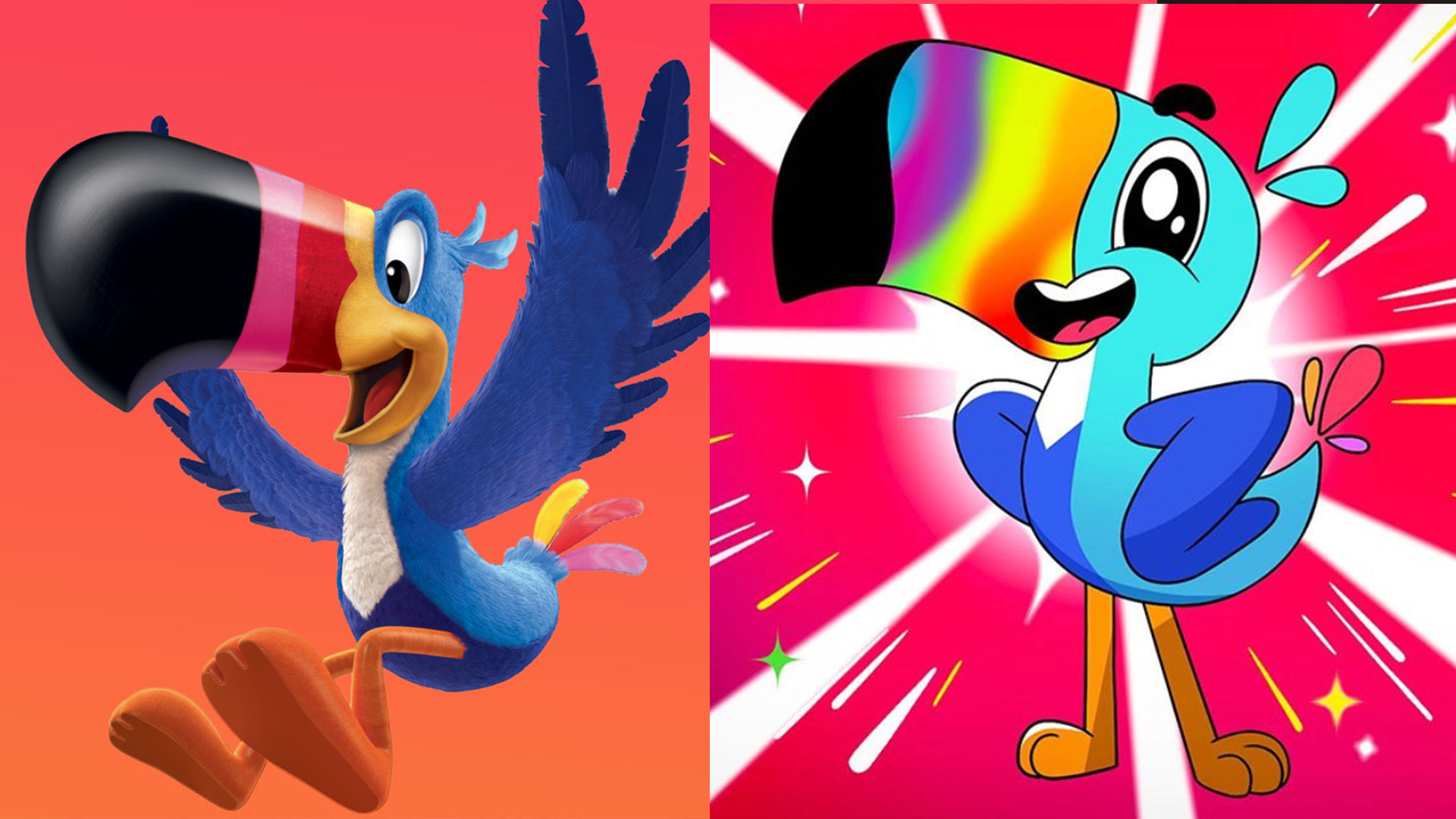
Kellogg's redesigns Fruit Loops mascot Toucan Sam – and people are NOT happy
New mascot is more frightening than friendly.

Look, we're all making questionable decisions at the moment (most often in our case involving repeat visits to the fridge) – there's just a lot going through everybody's minds right now. At least, that seems to be the only possible explanation for Kellogg's Froot Loops' decision to redesign its beloved mascot, Toucan Sam, into something entirely unrecognisable and, quite frankly, terrifying.
The breakfast cereal brand took to Instagram this week (below) to reveal Toucan Sam's new look, and the reception was less than warm. The thousands of comments are all along the general lines of, "NOPE," "NO," "PLEASE," and "STOP". We have a feeling Kellogg's didn't read our guide to character design before going into this.
Explore the excitingly colorful and frooty Froot Loops world #ThroughTheLoop Kellogg's Froot Loops
A photo posted by @frootloops on May 8, 2020 at 5:29pm PDT
So what exactly has Kellogg's done to its poor, innocent Froot Loops mascot? For a start it has removed an entire dimension. Gone is the 3D design, replaced by a rudimentary 2D cartoon. For some reason, he now has an abnormally large eye. There's also a headache-inducing, psychedelic beak, along with a mouth that simply doesn't fit. The whole nightmare makes us feel a mixture of scared and trippy (and the huge eye suggests Sam's feeling it too).
To add insult to injury, we'd say the old Toucan Sam is... fine? He certainly looks more friendly than frightening (which we'd say is important for a children's breakfast cereal mascot). And perhaps the greatest design crime here is that the new Sam is completely unrecognisable. Old Sam has appeared in countless TV adverts and could easily be spotted on a busy supermarket shelf.
One positive outcome is that some illustrators have taken it upon themselves to provide their own takes on Toucan Sam (below), which manage to maintain the original, recognisable design while adopting the flatter style it seems Froot Loops' designers were going for.
Okay, this is how I would redesign Toucan Sam based on this and his past iterations. One, don't use gradients, they look tacky and distracting. Two, I took from this design and his 1960s design giving a more defined shape that doesn't have the weird mouth pasted on. https://t.co/22getfVqS5 pic.twitter.com/GdPzlQMic0May 11, 2020
After seeing the Toucan Sam redesign & @bobjinx ‘s posts just analyzing it, I really just wanted to draw em! You know, for fun! pic.twitter.com/8gjMBOGkQIMay 11, 2020
With such a fierce backlash, perhaps we'll see Kellogg's backtrack on the new design (who can forget the infamous movie version of Sonic the Hedgehog and its subsequent redesign?). If it doesn't, only time will tell whether the new Toucan Sam affects Fruit Loops sales – he might look scary, but we'd hate him to see him become a cereal killer.
Read more:
Get the Creative Bloq Newsletter
Daily design news, reviews, how-tos and more, as picked by the editors.

Thank you for reading 5 articles this month* Join now for unlimited access
Enjoy your first month for just £1 / $1 / €1
*Read 5 free articles per month without a subscription

Join now for unlimited access
Try first month for just £1 / $1 / €1

Daniel John is Design Editor at Creative Bloq. He reports on the worlds of design, branding and lifestyle tech, and has covered several industry events including Milan Design Week, OFFF Barcelona and Adobe Max in Los Angeles.
